Dark Mode Toggle Button Plugin For Bootstrap - bs-darkmode
| File Size: | 94.4 KB |
|---|---|
| Views Total: | 1114 |
| Last Update: | |
| Publish Date: | |
| Official Website: | Go to website |
| License: | MIT |
Dark mode is an increasingly popular theme and one that can become a central part of your overall user experience. Being able to switch between these modes depending on the environment or context helps you to design a website with ease and efficiency.
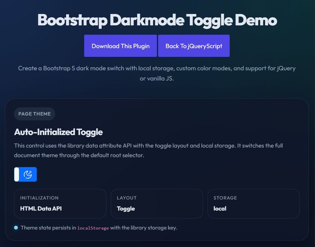
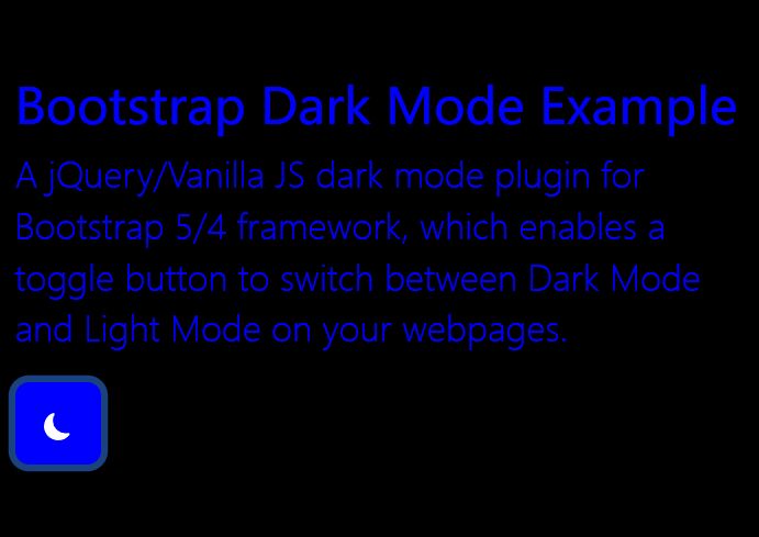
In this article, we're going to look at a fresh new jQuery/Vanilla JS dark mode plugin for Bootstrap 5/4 framework, which enables a toggle button to switch between Dark Mode and Light Mode on your webpages. This is done by overring the default CSS variables introduced in Bootstrap framework when you click the dark mode toggle button.
It also has the ability to get user preferred color scheme and apply dark or light mode to your website automatically.
Since Bootstrap 5 has built-in dark mode, I’ve stopped updating this plugin. If you're still on Bootstrap 4, it’ll work just fine.
If you’ve moved to Bootstrap 5, you should definitely switch over to bs-darkmode-toggle instead.
See Also:
How to use it:
1. Load the bs-darkmode plugin's files in your Bootstrap framework.
<!-- jQuery Is Optional -->
<script src="/path/to/cdn/jquery.slim.min.js"></script>

<!-- Bootstrap Framework -->
<link rel="stylesheet" href="/path/to/cdn/bootstrap.min.css" />
<script src="/path/to/cdn/bootstrap.bundle.min.js"></script>

<!-- bs-darkmode's Stylesheet -->
<link href="css/bs-darkmode.min.css" rel="stylesheet" />

<!-- jQuery Version -->
<script src="js/bs-darkmodejquery.min.js"></script>

<!-- Vanilla JS Version -->
<script src="js/bs-darkmode.ecmas.min.js"></script>
2. To create a basic dark mode toggler, just add the data-plugin="bsdarkmode" attribute to the button you specify and the plugin will do the rest.
<button class="btn btn-primary" data-plugin="bsdarkmode"></button>
3. You can also initialize the dark mode toggler via JavaScript.
<button class="btn btn-primary" id="example"></button>
$(function () {
  $('#example').bsDarkmode({
    // options here
  });
})
4. Then you can override the default CSS variables for Dark Mode & Light Mode as follows. All available CSS variables:
- blue
- indigo
- purple
- pink
- red
- orange
- yellow
- green
- teal
- cyan
- gray
- gray-dark
- gray-100
- gray-200
- gray-300
- gray-400
- gray-500
- gray-600
- gray-700
- gray-800
- gray-900
- primary
- secondary
- success
- info
- warning
- danger
- light
- dark
- primary-rgb
- secondary-rgb
- success-rgb
- info-rgb
- warning-rgb
- danger-rgb
- light-rgb
- dark-rgb
- black
- white
- white-rgb
- black-rgb
- body-color-rgb
- body-bg-rgb
- white
- black
<button class="btn btn-primary"
        data-plugin="bsdarkmode"
        data-lightvars='{"primary":"#ffffff","secondary":"#000000"}'
        data-darkvars='{"primary":"#000000","secondary":"#ffffff"}'>
</button>
// OR Via JavaScript
$(function () {
  $('#example').bsDarkmode({
    lightvars: '{
      "primary":"#000000",
      "secondary":"#ffffff",
      // ...
    }',
    darkvars: '{
      "primary":"#ffffff",
      "secondary":"#000000"
      // ...
    }'
  });
})
5. Set the initial state: dark or light.
<button class="btn btn-primary"
        data-plugin="bsdarkmode"
        data-state="dark">
</button>
// OR Via JavaScript
$(function () {
  $('#example').bsDarkmode({
    state: false,
  });
})
6. Customize the label displayed in the button.
<button class="btn btn-primary"
        data-plugin="bsdarkmode"
        darklabel="HTML Label Here"
        lightlabel="HTML Label Here">
</button>
// OR Via JavaScript
$(function () {
  $('#example').bsDarkmode({
    lightlabel: 'HTML Label Here',
    darklabel: 'HTML Label Here',
  });
})
7. Set the root element in which the plugin toggles between CSS variables.
<button class="btn btn-primary"
        data-plugin="bsdarkmode"
        data-root="#container">
</button>
// OR Via JavaScript
$(function () {
  $('#example').bsDarkmode({
    root: '#container',
  });
})
8. Determine whether to store the current state using cookies. Default: false.
$(function () {
  $('#example').bsDarkmode({
    allowsCookie: true,
  });
})
9. API methods.
// initialize the plugin
$('#example').bsDarkmode();

// enable Light Mode
$('#example').bsDarkmode('light');

// enable Dark Mode
$('#example').bsDarkmode('dark');

// toggle between Dark Mode and Light Mode
$('#example').bsDarkmode('toggle');

// enable cookies (true/false)
$('#example').bsDarkmode('setCookieAutorization', status)
9. Execute a function when the mode is changed.
$('#example').change(function() {
  // do something
})
Changelog:
v2.0.0 (2022-09-12)
- Add support for Bootstrap 5.
v1.2.0 (2022-08-31)
- All bootstrap components colors are supposed to be mapped in the plugin.
- feat: Set preferred color schema in a cookie
- fix: List Group style colors are not override
v1.1.1 (2022-08-22)
- fix: Component render out of the root element
- fix: Jumbotron style colors are not override
- fix: Cards style colors are not override
- fix: Table styles colors are not override
- fix: Form and input group style colors are not override
- fix: Breadcrumb style colors are not override
- fix: Navbar and Navs style colors are not override
v1.1.0 (2022-08-14)
- Feat: preserve rgb CSS var for themes colors
- Added default dark theme
- feat: Get user preferred color scheme
- fix: The change event is not fired when an action performed
- fix: Light CSS vars aren't applyed correctly
This awesome jQuery plugin is developed by palcarazm. For more Advanced Usages, please check the demo page or visit the official website.