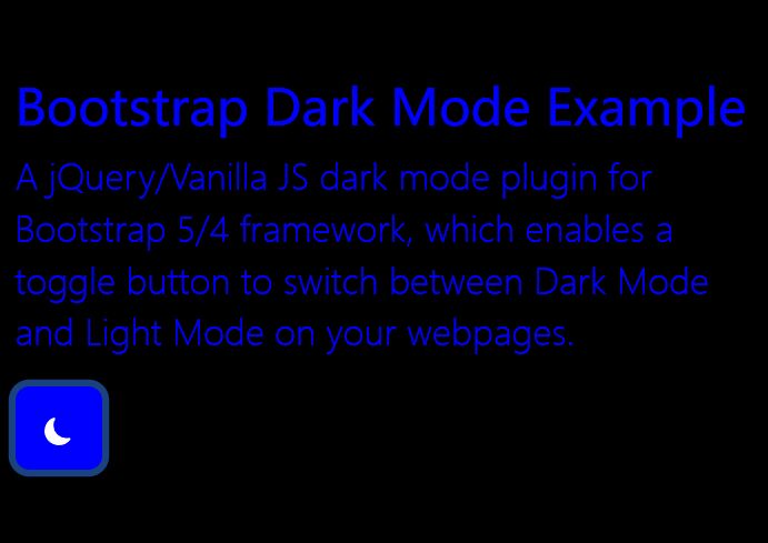
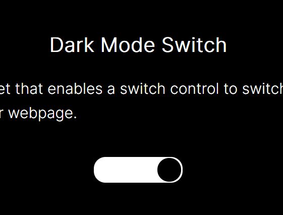
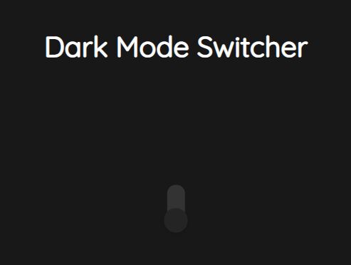
Minimalist Customizable Dark Mode Toggle Switcher In jQuery
| File Size: | 4.41 KB |
|---|---|
| Views Total: | 983 |
| Last Update: | |
| Publish Date: | |
| Official Website: | Go to website |
| License: | MIT |
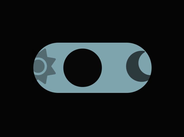
A minimalist yet highly customizable dark mode switcher built on top of jQuery and checkbox input.
You can tweak the colors, icons, slider styles, and more by editing the provided CSS or adding your own CSS styles.
How to use it:
1. Create a checkbox input for the dark mode switcher.
<label class="toggle-switch">
  <input type="checkbox">
  <span class="slider"></span>
  <!-- Replace the icons here -->
  <span class="mode-icon">
    <i class="fas fa-sun sun-icon"></i>
    <i class="fas fa-moon moon-icon"></i>
  </span>
</label>
2. Transform the checkbox into a custom slider.
.toggle-switch {
  display: inline-block;
  position: relative;
  width: 80px;
  height: 34px;
  overflow: hidden;
}

.toggle-switch input {
  display: none;
}

.slider {
  position: absolute;
  cursor: pointer;
  top: 0;
  left: 0;
  right: 0;
  bottom: 0;
  background-color: #b3b0b0;
  border-radius: 34px;
  transition: 0.4s;
}

.slider:before {
  content: "";
  position: absolute;
  height: 26px;
  width: 26px;
  left: 4px;
  bottom: 4px;
  background-color: rgb(7, 7, 7); /* Cor fixa da bolinha (laranja) */
  border-radius: 50%;
  transition: 0.4s;
}

.toggle-switch input:checked + .slider {
  background-color: #f5f382; /* Cor de fundo quando ligado */
}

.toggle-switch input:checked + .slider:before {
  transform: translateX(46px); /* Aumentando a distância para acomodar o ícone da lua */
}

.mode-icon {
  display: flex;
  justify-content: center;
  align-items: center;
  position: absolute;
  height: 100%;
  width: 80px; /* Tamanho igual ao botão */
  top: 0;
  left: 0;
  transition: transform 0.4s;
}

.sun-icon,
.moon-icon {
  font-size: 24px; /* Tamanho do ícone */
  transition: opacity 0.4s;
  position: absolute;
  top: 4px;
  opacity: 0; /* Inicialmente oculto */
}

.moon-icon {
  right: 4px;
}

.visible {
  opacity: 1;
}

.sun-icon {
  left: -18px;
}
3. Load the needed jQuery library right before the closing body tag.
<script src="/path/to/cdn/jquery.slim.min.js"></script>
4. The main script to enable the dark mode switcher.
(function ($) {
  $.fn.toggleSwitch = function () {
    return this.each(function () {
      const $toggleSwitch = $(this);
      const $slider = $toggleSwitch.find('.slider');
      const $modeIcon = $toggleSwitch.find('.mode-icon');
      const $sunIcon = $toggleSwitch.find('.sun-icon');
      const $moonIcon = $toggleSwitch.find('.moon-icon');
      const updateUI = () => {
        const isChecked = $toggleSwitch.find('input[type="checkbox"]').prop('checked');
        // modify colors here
        const backgroundColor = isChecked ? '#f5f382' : '#3d78c5';
        const bodyColor = isChecked ? '#ffffff' : '#050505';
        const iconPosition = isChecked ? '26px' : '0';
        $slider.css('background-color', backgroundColor);
        $('body').css('background-color', bodyColor);
        $modeIcon.css('transform', `translateX(${iconPosition})`);
        $sunIcon.toggleClass('visible', isChecked);
        $moonIcon.toggleClass('visible', !isChecked);
      };
      updateUI();
      $toggleSwitch.find('input[type="checkbox"]').on('change', updateUI);
      $toggleSwitch.find('input[type="checkbox"]').on('keydown', function (event) {
        if (event.key === 'Enter') {
          $toggleSwitch.find('input[type="checkbox"]').trigger('change');
        }
      });
    });
  };
}(jQuery));
$('.toggle-switch').toggleSwitch();
Changelog:
2024-05-22
- v1.0.4
See Also:
This awesome jQuery plugin is developed by Biasiolo. For more Advanced Usages, please check the demo page or visit the official website.