Specify Different CSS Rules Based On Devices - Device.js
| File Size: | 10.2KB |
|---|---|
| Views Total: | 1189 |
| Last Update: | |
| Publish Date: | |
| Official Website: | Go to website |
| License: | MIT |
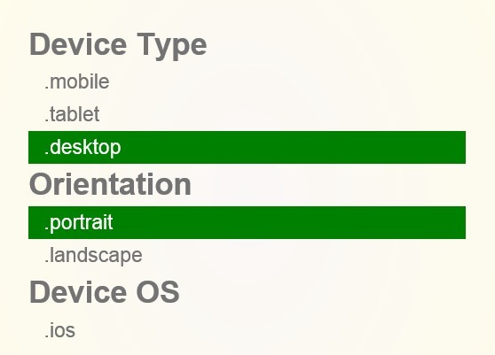
device.js is a smart javascript library that automatically inserts appropriate CSS classes into the <html> element, based on device operating system (iOS, Android, Blackberry, Windows, Windows Phone), orientation (Portrait vs. Landscape), and type (Tablet vs. Mobile). So that you can write conditional CSS and/or JavaScript for different devices.
Usage:
1. Just include device.js script on your web page
<script src="device.js"></script>
2. Device CSS Class Names
- iPad: ios ipad tablet
- iPhone: ios iphone mobile
- iPod: ios ipod mobile
- Android Phone: android mobile
- Android Tablet: android tablet
- BlackBerry Phone: blackberry mobile
- BlackBerry Tablet: blackberry tablet
- Windows Phone: windows mobile
- Windows Tablet: windows tablet
- Desktop: desktop
3. Orientation CSS Class Names
- Landscape: device.landscape()
- Portrait: device.portrait()
4. Device JavaScript Methods
- Mobile: device.mobile()
- Tablet: device.tablet()
- iOS: device.ios()
- iPad: device.ipad()
- iPhone: device.iphone()
- iPod: device.ipod()
- Android: device.android()
- Android Phone: device.androidPhone()
- Android Tablet: device.androidTablet()
- BlackBerry: device.blackberry()
- BlackBerry Phone: device.blackberryPhone()
- BlackBerry Tablet: device.blackberryTablet()
- Windows: device.windows()
- Windows Phone: device.windowsPhone()
- Windows Tablet: device.windowsTablet()
5. Orientation JavaScript Methods
- Landscape: device.landscape()
- Portrait: device.portrait()
This awesome jQuery plugin is developed by matthewhudson. For more Advanced Usages, please check the demo page or visit the official website.