jQuery Plugin For Smart Image Delivery - Responsive Pictures
| File Size: | 3.74 KB |
|---|---|
| Views Total: | 487 |
| Last Update: | |
| Publish Date: | |
| Official Website: | Go to website |
| License: | MIT |

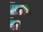
A lightweight, smart jQuery responsive image solution that automatically delivers a perfect resolution image depending on the screen size. Works only on modern browsers which support HTML5 <picture> element and window.matchMedia API.
How to use it:
1. Add both jQuery library and the jQuery Responsive Pictures plugin to the webpage.
<script src="/path/to/jquery.min.js"></script>
<script src="responsivePictures.js"></script>
2. Create an HTML <picture> element and specify the images for different screen solutions using the media attribute as follow:
<picture>
  <source media="(min-width: 60em)" srcset="large.jpg">
  <source media="(min-width: 35em)" srcset="medium.jpg">
  <source src="small.jpg">
  <img src="small.jpg" alt="SEO text here">
</picture>
3. That's it. The plugin will automatically replace all <picture> elements with <img> elements with correct src.
This awesome jQuery plugin is developed by richard-parnaby-king. For more Advanced Usages, please check the demo page or visit the official website.

