Mobile-friendly Collapsible List With jQuery - responsiveLists
| File Size: | 7.63 KB |
|---|---|
| Views Total: | 665 |
| Last Update: | |
| Publish Date: | |
| Official Website: | Go to website |
| License: | MIT |
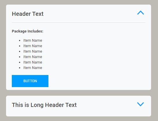
A mobile-friendly, fully responsive list solution that automatically transforms the long list into an accordion-style sliding dropdown on small screens.
How to use it:
1. Add a header toggle to your long list.
<header id="toggle">
  <h3>Header Text</h3>
  <span class="arrow">
    <img src="chev.jpg">
  </span>
</header>
<div id="content">
  <ul>
    <li>Item Name</li>
    <li>Item Name</li>
    <li>Item Name</li>
    <li>Item Name</li>
    <li>Item Name</li>
    <li>Item Name</li>
    <li>Item Name</li>
    <li>Item Name</li>
    <li>Item Name</li>
    <li>Item Name</li>
  </ul>
</div>
2. The necessary CSS styles.
#content.mobile {
  display: none;
}

header {
  padding: 10px 0;
}

header.header-mobile {
  border-bottom: none;
  cursor: pointer;
}

.arrow {
  display: none;
}

header.header-mobile .arrow {
  display: inline-grid;
  text-align: right;
  float: right;
  margin: 0px 5px;
  transform: rotate(180deg);
  transform-origin: 50% 60%;
}

header.header-mobile .arrow.flipped {
  transform: rotate(0deg);
  transform-origin: 50% 60%;
}
3. Load the latest version of jQuery library at the end of the document.
<script src="https://code.jquery.com/jquery-3.3.1.min.js"
        integrity="sha384-tsQFqpEReu7ZLhBV2VZlAu7zcOV+rXbYlF2cqB8txI/8aZajjp4Bqd+V6D5IgvKT"
        crossorigin="anonymous">
</script>
4. Detect the viewport size on window resize and add corresponding CSS classes:
(function($) {

  var $window = $(window),
      $content = $("#content"),
      $header = $("#toggle"),

  $window.resize(function resize() {
    if ($window.width() < 568) {
      return $content.addClass('mobile'), $header.addClass('header-mobile');
    }
    $content.removeClass('mobile');
    $header.removeClass('header-mobile');
    $('#content').removeAttr("style");
  }).trigger('resize');

})(jQuery);
5. Enable the header toggle to open/close the collapsed list on mobile view.
$("#toggle").click(function() {
  $("#content.mobile").slideToggle('fast');
  $('#toggle .arrow').toggleClass("flipped");
  return false;
});
This awesome jQuery plugin is developed by timperk. For more Advanced Usages, please check the demo page or visit the official website.