Smart Mobile-friendly Sticky Sidebar In jQuery - smartSticky
| File Size: | 3.30 KB |
|---|---|
| Views Total: | 1128 |
| Last Update: | |
| Publish Date: | |
| Official Website: | Go to website |
| License: | MIT |
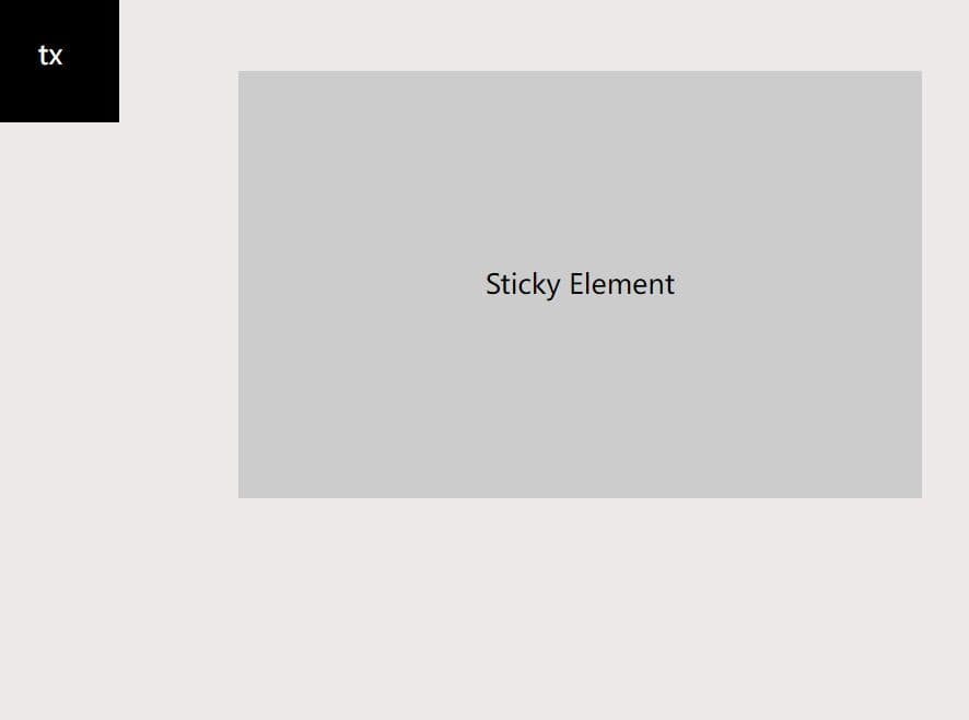
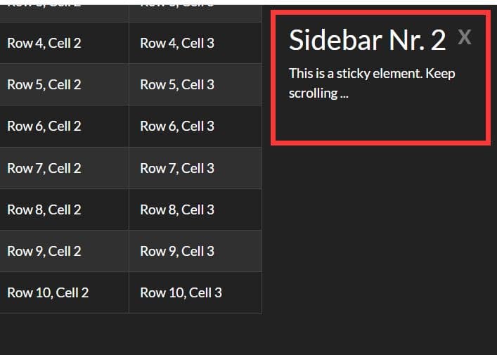
smartSticky is a cross-browser and mobile-friendly jQuery plugin which makes the sidebar widget always be visible when scrolling down until the widget reaches a specific element (typically the bottom of the main content).
Easy to use and ultra lightweight. Just weight in 1kb (minified).
How to use it:
1. Insert the smartSticky plugin after loading the latest jQuery library.
<script src="/path/to/jquery.min.js"></script>
<script src="/path/to/jquery.smartsticky.min.js"></script>
2. Attach the plugin to the sidebar widget and specify the Stop element as follows:
<div class="main">
  <div class="sidebar">
    <div class="sticky_box" id="mySticky"></div>
  </div>
  <div class="content"></div>
  <div class="footer" id="myFooter"></div>
</div>
$(function(){
  $('#mySticky').sticky({
    stopOn: '#myFooter'
  });
});
3. Set the distance from the top when the widget is stuck on the top.
$(function(){
  $('#mySticky').sticky({
    stopOn: '#myFooter',
    top: 20
  });
});
4. Set the distance from the Stop element.
$(function(){
  $('#mySticky').sticky({
    stopOn: '#myFooter',
    bottom: 20
  });
});
5. Disable the Sticky behavior when the screen size is smaller than a specific value.
$(function(){
  $('#mySticky').sticky({
    stopOn: '#myFooter',
    disableOn: 768
  });
});
This awesome jQuery plugin is developed by ebrahimfallah. For more Advanced Usages, please check the demo page or visit the official website.