3D Stack Card Slider With jQuery And CSS3
| File Size: | 3.35 KB |
|---|---|
| Views Total: | 16849 |
| Last Update: | |
| Publish Date: | |
| Official Website: | Go to website |
| License: | MIT |
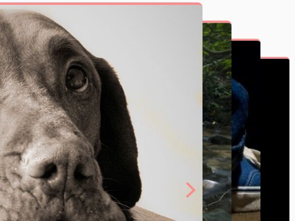
An excellent, responsive, stacked card slider/carousel written in jQuery/CSS3 that flips through images (with descriptive content) in a 3D space.
How to use it:
1. Add slides together with navigation arrows and pagination bullets to the slider.
<div id="slider">
  <div class="dp-wrap">
    <div id="dp-slider">

      <div class="dp_item" data-class="1" data-position="1">
        <div class="dp-content">

          <h2>Slide 1</h2>
          <p> This is Slide 1 </p>
          <a href="#" class="site-btn">Read More…</a>
        </div>
        <div class="dp-img">
          <img class="img-fluid" src="1.jpg" alt="investing">
        </div>
      </div>

      <div class="dp_item" data-class="2" data-position="2">
        <div class="dp-content">

          <h2>Slide 2</h2>
          <p> This is Slide 2 </p>
          <a href="#" class="site-btn">Read More…</a>
        </div>
        <div class="dp-img">
          <img class="img-fluid" src="2.jpg" alt="investing">
        </div>
      </div>

      <div class="dp_item" data-class="3" data-position="3">
        <div class="dp-content">

          <h2>Slide 3</h2>
          <p> This is Slide 3 </p>
          <a href="#" class="site-btn">Read More…</a>
        </div>
        <div class="dp-img">
          <img class="img-fluid" src="3.jpg" alt="investing">
        </div>
      </div>

      <div class="dp_item" data-class="4" data-position="4">
        <div class="dp-content">

          <h2>Slide 4</h2>
          <p> This is Slide 4 </p>
          <a href="#" class="site-btn">Read More…</a>
        </div>
        <div class="dp-img">
          <img class="img-fluid" src="4.jpg" alt="investing">
        </div>
      </div>
    </div>

    <span id="dp-next">
      <svg xmlns="http://www.w3.org/2000/svg" viewBox="0 0 51.401 51.401">
        <defs>
          <style>
            .cls-1 {
              fill: none;
              stroke: #fa8c8c;
              stroke-miterlimit: 10;
              stroke-width: 7px;
            }
          </style>
        </defs>
        <path id="Rectangle_4_Copy" data-name="Rectangle 4 Copy" class="cls-1" d="M32.246,0V33.178L0,31.953" transform="translate(0.094 25.276) rotate(-45)"/>
      </svg>
    </span>

    <span id="dp-prev">
      <svg xmlns="http://www.w3.org/2000/svg" viewBox="0 0 51.401 51.401">
        <defs>
          <style>
            .cls-1 {
              fill: none;
              stroke: #fa8c8c;
              stroke-miterlimit: 10;
              stroke-width: 7px;
            }
          </style>
        </defs>
        <path id="Rectangle_4_Copy" data-name="Rectangle 4 Copy" class="cls-1" d="M32.246,0V33.178L0,31.953" transform="translate(0.094 25.276) rotate(-45)"/>
      </svg>
    </span>


    <ul id="dp-dots">
      <li data-class="1" class="active"></li>
      <li data-class="2"></li>
      <li data-class="3"></li>
      <li data-class="4"></li>
    </ul>
  </div>
</div>
2. The necessary CSS/CSS3 rules.
.dp-wrap {
  margin: 0 auto;
  position: relative;
  perspective: 1000px;
  height: 100%;
}

.dp-slider {
  height: 100%;
  width: 100%;
  position: absolute;
  transform-style: preserve-3d;
}

.dp-slider div { transform-style: preserve-3d; }

.dp_item {
  display: block;
  position: absolute;
  text-align: center;
  color: #FFF;
  border-radius: 10px;
  transition: transform 1.2s;
}

.dp-img img { border-left: 1px solid #fff; }

#dp-slider .dp_item:first-child {
  z-index: 10 !important;
  transform: rotateY(0deg) translateX(0px) !important;
}

.dp_item[data-position="2"] {
  z-index: 9;
  transform: rotateY(0deg) translateX(10%) scale(0.9);
}

.dp_item[data-position="3"] {
  z-index: 8;
  transform: rotateY(0deg) translateX(20%) scale(0.8);
}

.dp_item[data-position="4"] {
  z-index: 7;
  transform: rotateY(0deg) translateX(30%) scale(0.7);
}

#dp-next,  #dp-prev {
  position: absolute;
  top: 50%;
  right: 16%;
  height: 33px;
  width: 33px;
  z-index: 10;
  cursor: pointer;
}

#dp-prev {
  left: 15px;
  transform: rotate(180deg);
}

#dp-dots {
  position: absolute;
  bottom: 25px;
  z-index: 12;
  left: 38%;
  cursor: default;
}

#dp-dots li {
  display: inline-block;
  width: 13px;
  height: 13px;
  background: #fff;
  border-radius: 50%;
}

#dp-dots li:hover {
  cursor: pointer;
  background: #FA8C8C;
  transition: background .3s;
}

#dp-dots li.active { background: #FA8C8C; }

.dp_item { width: 85%; }

.dp-content,  .dp-img { text-align: left; }

.dp_item {
  display: flex;
  align-items: center;
  background: #fff;
  border-radius: 10px;
  overflow: hidden;
  border-top: 5px solid #FA8C8C;
}

.dp-content {
  padding-left: 100px;
  padding-right: 0;
  display: inline-block;
  width: 100%;
}

.dp-content h2 {
  color: #41414B;
  font-family: Circular Std Bold;
  font-size: 48px;
  max-width: 460px;
  margin-top: 8px;
  margin-bottom: 0px;
}

.dp-content p {
  color: #74747F;
  max-width: 490px;
  margin-top: 15px;
  font-size: 24px;
}

.dp-content .site-btn {
  margin-top: 15px;
  font-size: 13px;
  padding: 19px 40px;
}

.dp-img:before {
  background: -webkit-linear-gradient(-90deg, rgba(255, 255, 255, 0.25), rgba(255, 255, 255, 0));
  background: -o-linear-gradient(-90deg, rgba(255, 255, 255, 0.25), rgba(255, 255, 255, 0));
  background: -moz-linear-gradient(-90deg, rgba(255, 255, 255, 0.25), rgba(255, 255, 255, 0));
  background: linear-gradient(-90deg, rgba(255, 255, 255, 0.75), rgba(255, 255, 255, 0));
  content: "";
  position: absolute;
  height: 100%;
  width: 25%;
  z-index: 1;
  top: 0;
  pointer-events: none;
  background: -webkit-linear-gradient(-90deg, rgba(255, 255, 255, 0), rgba(255, 255, 255, 0.75));
  background: -o-linear-gradient(-90deg, rgba(255, 255, 255, 0), rgba(255, 255, 255, 0.75));
  background: -moz-linear-gradient(-90deg, rgba(255, 255, 255, 0), rgba(255, 255, 255, 0.75));
  background: linear-gradient(-90deg, rgba(255, 255, 255, 0), rgb(255, 255, 255));
}

.dp-img img {
  object-fit: cover;
  object-position: right;
}

#dp-slider,  .dp-img img { height: 738px; }

#dp-slider .dp_item:hover:not(:first-child) { cursor: pointer; }

.site-btn {
  color: #fff;
  font-size: 18px;
  font-family: "Circular Std Medium";
  background: #FA8282;
  padding: 14px 43px;
  display: inline-block;
  border-radius: 2px;
  position: relative;
  top: -12px;
  text-decoration: none;
}

.site-btn:hover {
  text-decoration: none;
  color: #fff;
}
3. Insert the latest version of jQuery JavaScript library into the document.
<script src="https://code.jquery.com/jquery-3.3.1.min.js"
        integrity="sha384-tsQFqpEReu7ZLhBV2VZlAu7zcOV+rXbYlF2cqB8txI/8aZajjp4Bqd+V6D5IgvKT"
        crossorigin="anonymous">
</script>
4. The main JavaScript (jQuery script) to activate the slider.
jQuery(document).ready(function(){

function detect_active(){
    // get active
    var get_active = $("#dp-slider .dp_item:first-child").data("class");
    $("#dp-dots li").removeClass("active");
    $("#dp-dots li[data-class="+ get_active +"]").addClass("active");
  }
  $("#dp-next").click(function(){
    var total = $(".dp_item").length;
    $("#dp-slider .dp_item:first-child").hide().appendTo("#dp-slider").fadeIn();
    $.each($('.dp_item'), function (index, dp_item) {
      $(dp_item).attr('data-position', index + 1);
    });
    detect_active();

  });

  $("#dp-prev").click(function(){
    var total = $(".dp_item").length;
    $("#dp-slider .dp_item:last-child").hide().prependTo("#dp-slider").fadeIn();
    $.each($('.dp_item'), function (index, dp_item) {
      $(dp_item).attr('data-position', index + 1);
    });

    detect_active();
  });

  $("#dp-dots li").click(function(){
    $("#dp-dots li").removeClass("active");
    $(this).addClass("active");
    var get_slide = $(this).attr('data-class');
    console.log(get_slide);
    $("#dp-slider .dp_item[data-class=" + get_slide + "]").hide().prependTo("#dp-slider").fadeIn();
    $.each($('.dp_item'), function (index, dp_item) {
      $(dp_item).attr('data-position', index + 1);
    });
  });


  $("body").on("click", "#dp-slider .dp_item:not(:first-child)", function(){
    var get_slide = $(this).attr('data-class');
    console.log(get_slide);
    $("#dp-slider .dp_item[data-class=" + get_slide + "]").hide().prependTo("#dp-slider").fadeIn();
    $.each($('.dp_item'), function (index, dp_item) {
      $(dp_item).attr('data-position', index + 1);
    });

    detect_active();
  });
});
About Author:
Author: Dipesh Thapa
Website: http://dpes.com.np
This awesome jQuery plugin is developed by dpesofficial. For more Advanced Usages, please check the demo page or visit the official website.


