Lightweight jQuery Responsive Carousel Plugin
| File Size: | 338 KB |
|---|---|
| Views Total: | 3045 |
| Last Update: | |
| Publish Date: | |
| Official Website: | Go to website |
| License: | MIT |
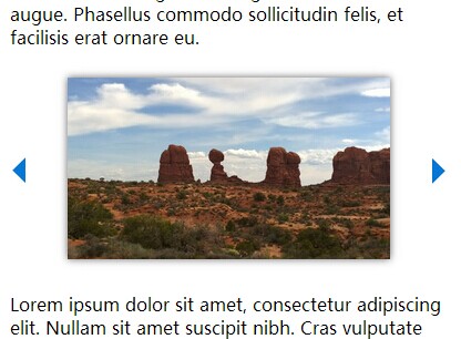
Just another simple lightweight jQuery plugin that loops through a gallery of images (or any other Html elements) in a fully responsive slider/carousel interface. The plugin allows you to show multiple items as many as possible in one slide with navigation based on your screen size.
Basic Usage:
1. Include the responsiveCarousel.js into your web page and make sure to have jQuery library loaded as well.
<script src="http://ajax.googleapis.com/ajax/libs/jquery/1.11.1/jquery.min.js"></script>
<script src="responsiveCarousel.js"></script>
2. Create an image carousel following the Html structure like this:
<div id="carousel" class="carousel">
<a class="nav prev" href="#">prev</a>
<div class="carousel_items_holder">
<ul class="carousel_items">
<li><img src="images/1.jpg" /></li>
<li><img src="images/2.jpg" /></li>
<li><img src="images/3.jpg" /></li>
...
</ul>
</div>
<a class="nav next" href="#">next</a> </div>
3. The sample CSS to style the image carousel.
.carousel {
height: auto;
}
.carousel ul {
list-style: none;
padding: 0;
margin: 0;
}
.carousel li {
margin: 0;
padding: 0;
float: left;
display: block;
}
.carousel img {
width: 100% !important;
height: auto !important;
-webkit-box-shadow: 0px 0px 10px 0px rgba(50, 50, 50, 0.75);
-moz-box-shadow: 0px 0px 10px 0px rgba(50, 50, 50, 0.75);
box-shadow: 0px 0px 10px 0px rgba(50, 50, 50, 0.75);
margin: 10px 0;
}
.carousel .nav {
display: block;
width: 4%;
height: 100%;
float: left;
text-indent: -9999px;
}
.carousel .prev {
background: url(images/button_prev.jpg) center center no-repeat;
background-size: 80%;
}
.carousel .next {
background: url(images/button_next.jpg) center center no-repeat;
background-size: 80%;
}
.carousel .carousel_items_holder {
width: 92%;
overflow: hidden;
float: left;
height: 100%;
position: relative;
}
.carousel .carousel_items {
position: absolute;
}
4. Call the plugin on the parent element to initialize the carousel with default settings.
$('#carousel').responsiveCarousel();
5. Customization options. Defaults to 5 items; 3 items; 2 items at breakpoints
carousel_item_width_default: .16,
carousel_item_padding_default: .02,
carousel_item_width_481: .40,
carousel_item_padding_481: .05,
carousel_item_width_768: .27,
carousel_item_padding_768: .03
This awesome jQuery plugin is developed by dividemysky. For more Advanced Usages, please check the demo page or visit the official website.


