Touch-enabled jQuery Carousel Slider For Bootstrap - Bootslider
| File Size: | 3.5 KB |
|---|---|
| Views Total: | 5575 |
| Last Update: | |
| Publish Date: | |
| Official Website: | Go to website |
| License: | MIT |

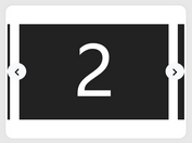
Bootslider is a dead simple jQuery plugin used to create a responsive, touchable, multi-column slider carousel using Bootstrap 3 grid system.
How to use it:
1. Download the plugin, unzip it and include the bootslider.js script into your Bootstrap project.
<script src="bootslider.js"></script>
2. Wrap your slider items into the carousel using Bootstrap's fluid grid system as follow.
<div class="row slider-gallery" id="demo">
  <div class="col col-sm-4 col-xs-6">
    1<img class="img-responsive thumbnail" src="1.jpg">
  </div>
  <div class="col col-sm-4 col-xs-6">
    2<img class="img-responsive thumbnail" src="2.jpg">
  </div>
  <div class="col col-sm-4 col-xs-6">
    3<img class="img-responsive thumbnail" src="3.jpg">
  </div>
  <div class="col col-sm-4 col-xs-6">
    4<img class="img-responsive thumbnail" src="4.jpg">
  </div>
  <div class="col col-sm-4 col-xs-6">
    5<img class="img-responsive thumbnail" src="5.jpg">
  </div>
  <div class="col col-sm-4 col-xs-6">
    6<img class="img-responsive thumbnail" src="6.jpg">
  </div>
</div>
3. Initialize the plugin and done.
$("#demo").bootslider();
4. Set your preferred options to customize the slider carousel.
$("#demo").bootslider({

  // snap to item
  snapToItem: true,

  // CSS selectors for next / prev links
  next: false,
  previous: false

});
This awesome jQuery plugin is developed by jonshutt. For more Advanced Usages, please check the demo page or visit the official website.
