Simple jQuery Responsive Text Replacement Plugin - Responsive Text
| File Size: | 37.7 KB |
|---|---|
| Views Total: | 647 |
| Last Update: | |
| Publish Date: | |
| Official Website: | Go to website |
| License: | MIT |
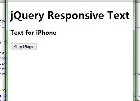
Responsive Text is a jQuery plugin used to display appropriate text/markup from a set of child span nodes with data-for attribute for different screen sizes. Useful for replacing long text on small screen devices.
How to use it:
1. Include the latest version of jQuery library and the jQuery responsive text plugin in the document.
<script src="http://ajax.googleapis.com/ajax/libs/jquery/1.11.1/jquery.min.js"></script>
<script src="jquery.responsivetext.min.js" type="text/javascript"></script>
2. Create a set of child span nodes for different screen sizes.
<span class="responsive-text">
<span data-for="ipad">Text for iPad</span>
<span data-for="iphone">Text for iPhone</span>
<span data-for="bigscreen">Text can also <em>contain markup</em></span>
</span>
3. Setup the Javascript like this.
$(document).ready(function () {
$.responsiveText('start', {
selector: '.responsive-text',
sizes: {
'ipad': [1024, 481],
'iphone': [480, 320],
'bigscreen': [Number.POSITIVE_INFINITY, 1280]
},
delay: 100
});
});
4. The required CSS style.
.responsive-text {
display: none;
speak: none;
}
This awesome jQuery plugin is developed by randomknowledge. For more Advanced Usages, please check the demo page or visit the official website.