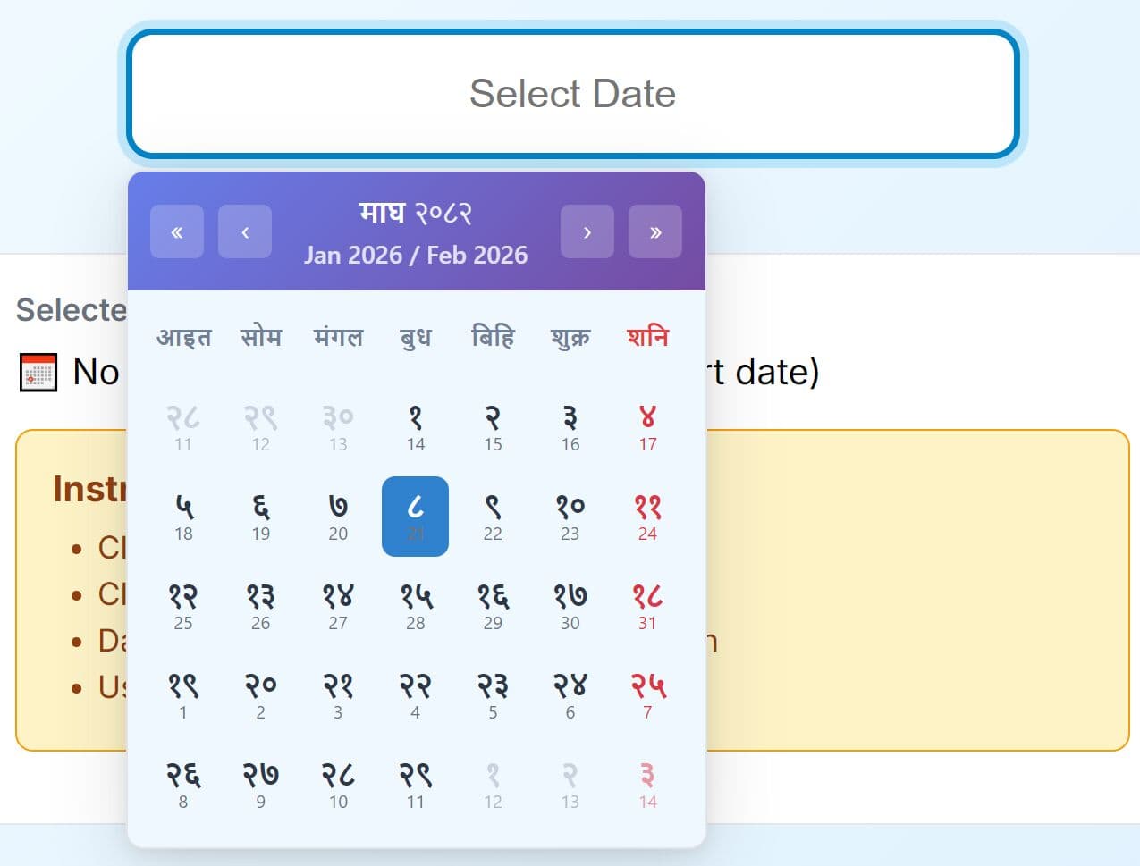
Accessible Data Picker Plugin For Bootstrap - ab-datepicker
| File Size: | 970 KB |
|---|---|
| Views Total: | 16272 |
| Last Update: | |
| Publish Date: | |
| Official Website: | Go to website |
| License: | MIT |
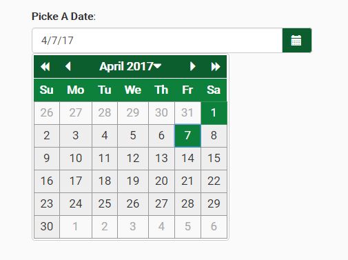
ab-datepicker is an accessible, highly-customizable, multi-language jQuery date picker plugin for Bootstrap 4 and Bootstrap 3 that complies with the recommendations of the W3C WAI-ARIA Authoring Practices.
Keyboard Interaction:
Keyboard navigation on days that are not included the currently displayed month should move to the month automatically and lead to the day in the next or previous month.
Tab: Like other widgets, the date picker widget receives focus by tabbing into it. Once focus is received, focus is repositioned on today's date in a grid of days and weeks. A second tab will take the user out of the date picker widget. Focus initially is placed on today's date.Shift+Tab: reverses the direction of the tab order. Once in the widget, a Shift+Tab will take the user to the previous focusable element in the tab order.Up Arrow and Down Arrow: goes to the same day of the week in the previous or next week respectively. If the user advances past the end of the month they continue into the next or previous month as appropriate.Left Arrow and Right Arrow: advances one day to the next, also in a continuum. Visually focus is moved from day to day and wraps from row to row in a grid of days and weeks.Control+Page Up: Moves to the same date in the previous year.Control+Page Down: Moves to the same date in the next year.Space: Singleton Mode: acts as a toggle either selecting or deselecting the date; Contiguous Mode: Similar to selecting a range of text. Space selects the first date. Shift+Arrows add to the selection. Pressing Space again deselects the previous selections and selects the current focused date.Home: Moves to the first day of the current month.End: Moves to the last day of the current month.Page Up: Moves to the same date in the previous month.Page Down: Moves to the same date in the next month.Enter: If the the calendar is a popup attached to some other widget (e.g., a text field), then Enter dismisses the popup, and the selected date(s) are shown in the associated widget; If the calendar is a static region on the page, then Enter confirms the selected date(s).Escape: in the case of a popup date picker, closes the widget without any action.
WAI-ARIA Roles, States, and Properties:
The current month has a label representing the month and year. It is advisable to use a role heading but is not essential. This "label" should have a unique ID. If the author would like to ensure that a label is announced by a screen reader, as the label changes, include live region properties with the label element: aria-live="assertive" and aria-atomic="true".
The container for the day of week headers and numeric days of the week has a role of grid. The grid has an aria-labelledby property with a value equivalent to the id of the label for the grid. Each name for the day of the week has a role columnheader and is not navigable via the keyboard. Each numeric day of the week has the role grid cell.
When a day is selected its aria-selected is set to true, otherwise it is set to false or removed. Changes in aria states, identified here, as well as focus, are clearly styled to show the user where their point of regard is and what days are selected.
When the datepicker is active a calender day of the week always has focus. This can be achieved by setting the tabindex on that day as appropriate and then using script to give it focus. The grid container set aria-activedescendant to the id of the currently focused grid cell.
How to use it:
1. Include the primary JavaScript and CSS files on your Bootstrap webpage.
<link href="/path/to/datepicker.css" rel="stylesheet">
<script src="/path/to/jquery.min.js"></script>
<script src="/path/to/bootstrap.min.js"></script>
<script src="/path/to/datepicker.js"></script>
2. Include an i18n file of your choice on the webpage.
<script src="js/locales/en.js"></script>
3. Default plugin settings to customize the date picker.
$('#date').datepicker({

  // Determines the first column of the calendar grid
  firstDayOfWeek: Date.dp_locales.firstday_of_week,

  // Display format of the weekday names - values are 'short' or 'narrow'
  weekDayFormat: 'short',

  // Initial calendar - values are 0 or 'days', 1 or 'months', 2 or 'years'
  startView: 0,

  // Array of the week days number to disable
  daysOfWeekDisabled: [],

  // Array of the dates to disable
  datesDisabled: [],

  // callbacks
  isDateDisabled: null,
  isMonthDisabled: null,
  isYearDisabled: null,

  // Custom formats
  inputFormat: [Date.dp_locales.short_format],
  outputFormat: Date.dp_locales.short_format,
  titleFormat: Date.dp_locales.full_format,

  // Title attribute for the calendar button
  buttonTitle: Date.dp_locales.texts.buttonTitle,

  // Accessibility label : 'aria-labelledby' attribute for the calendar button
  buttonLabel: Date.dp_locales.texts.buttonLabel,

  // Place the calendar button to the left of the text field
  buttonLeft: false,

  // Accessibility label : 'aria-labelledby' attribute for the previous month button
  prevButtonLabel: Date.dp_locales.texts.prevButtonLabel,

  // Accessibility label : 'aria-labelledby' attribute for the previous year button
  prevMonthButtonLabel: Date.dp_locales.texts.prevMonthButtonLabel,

  // Accessibility label : 'aria-labelledby' attribute for the previous years range button
  prevYearButtonLabel: Date.dp_locales.texts.prevYearButtonLabel,

  // Accessibility label : 'aria-labelledby' attribute for the next month button
  nextButtonLabel: Date.dp_locales.texts.nextButtonLabel,

  // Accessibility label : 'aria-labelledby' attribute for the next year button
  nextMonthButtonLabel: Date.dp_locales.texts.nextMonthButtonLabel,

  // Accessibility label : 'aria-labelledby' attribute for the next years range button
  nextYearButtonLabel: Date.dp_locales.texts.nextYearButtonLabel,

  // Accessibility label : title attribute for the calendar title when the current month is displayed
  changeMonthButtonLabel: Date.dp_locales.texts.changeMonthButtonLabel,

  // Accessibility label : title attribute for the calendar title when the current year is displayed
  changeYearButtonLabel: Date.dp_locales.texts.changeYearButtonLabel,

  // Accessibility label : title attribute for the calendar title when the current years range is displayed
  changeRangeButtonLabel: Date.dp_locales.texts.changeRangeButtonLabel,

  // Title attribute for the close button when the calendar is displayed in modal mode
  closeButtonTitle: Date.dp_locales.texts.closeButtonTitle,

  // Accessibility label : 'aria-labelledby' attribute for the close button when the calendar is displayed in modal mode
  closeButtonLabel: Date.dp_locales.texts.closeButtonLabel,

  // Called when the input box has been updated by the datepicker
  onUpdate: function (value) {},

  // bootstrap3 or bootstrap4
  markup: 'bootstrap3',

  // Name of the theme
  // 'green', 'blue', 'maroon' or 'bootstrap'
  theme: 'default',

  // Link the target input of the datepicker to the input of another datepicker that represents the start date of a range
  previous: null,

  // Link the target input of the datepicker to the input of another datepicker that represents the end date of a range
  next: null,

  // The calendar must be opened in modal mode, that is it keeps the focus until the user selects a date or clicks the close button
  modal: false,

  // Display the datepicker inline inside a given div
  inline: false,

  // Auto gets focus
  gainFocusOnConstruction: true,

  // The minimum/earliest date that can be selected
  min: null,

  // The maximum/latest date that can be selected
  max: null,

  // allows the same date
  allowSameDate: true,

});
4. API methods.
// Get the current Datepicker date object
$('#date').datepicker('getDate');

// Returns the internal date object of the datepicker
$('#date').datepicker('setDate', date);

// Define the smallest date the user can enter.
// The value of "date" (type: string) must conform to one of the formats defined with the "inputFormat" option.
$('#date').datepicker('min', date);

// Define the biggest date the user can enter.
// The value of "date" (type: string) must conform to one of the formats defined with the "inputFormat" option
$('#date').datepicker('max', date);

// show the calendar portion of the datepicker
$('#date').datepicker('show');

// hide the calendar portion of the datepicker
$('#date').datepicker('hide');

// go to the next
$('#date').datepicker('next', selector);

// back to the previous
$('#date').datepicker('previous', selector);

// where value (type: integer) is the day of week (0: Sunday, 1: Monday, 2: Tuesday, ...)
$('#date').datepicker('firstDayOfWeek', value);

// where value (type: array of number) is the list of days of the week that should be disabled.
$('#date').datepicker('daysOfWeekDisabled', value);

// where value (type: string) is one of this value : 'short' (first letter) or 'narrow' (first two letters)
$('#date').datepicker('weekDayFormat', value);

// where formats (type: array of string) contains the acceptable input formats according to CLDR Date Time patterns
$('#date').datepicker('inputFormat', formats);

// where format (type: string) contains the output format according to CLDR Date Time patterns
$('#date').datepicker('outputFormat', format);

// where name (type: string) contains the name of your theme
$('#date').datepicker('theme', name);

// Defines the opening mode (modal or not) of the calendar portion of the datepicker. bool can be true or false.
$('#date').datepicker('modal', bool);

// Display the datepicker inline inside a given div. value can be the id of a div, a jQuery object of a div or false.
$('#date').datepicker('inline', value);

// Enable the date picker
$('#date').datepicker('enable');

// Disable the date picker
$('#date').datepicker('disable');

// where view (type: string|int) is the value of new start view: 'days', 'months', 'years'
// 0 for days, 1 for months and 2 for years
$('#date').datepicker('startview', view);

// Sets a specific date or an array of dates to be disabled.
$('#date').datepicker('datesDisabled', dates);

// Define the date as the start date of a period.
$('#date').datepicker('next', selector);

// Define the date as the end date of a period.
$('#date').datepicker('previous', selector);
5. Event handlers.
$('#date').datepicker()
  .on( "change", function(){
    // fired  once the date is changed
  })
  .on( "ab.datepicker.opening", function(){
    // fired  once the date picker is opening
  })
  .on( "ab.datepicker.opened", function(){
    // fired  once the date picker is opened
  })
  .on( "ab.datepicker.closed", function(){
    // fired  once the date picker is closed
  });
Changelog:
v2.2.0 (2020-09-21)
- Replacement of deprecated functions of jQuery
v2.1.8 (2019-10-18)
- Added option 'allowSameDate'
v2.1.7 (2019-10-16)
- Fixed: Can't tab out of the calendar
v2.1.6 (2019-10-07)
- Fixed: when weekend are disabled pressing on up arrow previous 7th day is selected instead of 5th
- Fixed: When weekends are disabled , moving between months using left and right key skips complete month
v2.1.5 (2019-08-20)
- Added buttonLeft option.
v2.1.4 (2019-05-03)
- Added the 'next' and 'previous' methods
v2.1.13 (2019-04-30)
- Added bootstrap 4 compatibility
- Added the 'next' and 'previous' methods
v2.1.12 (2019-04-28)
- Fixed issues positioning calendar with and without labels
2018-09-11
- Fixed: Calendar loses focus when switching months with Pg Up and Pg Down keyboard controls
2018-08-29
- change to 200px of the min-width property for the bootstrap theme
2017-12-17
- Added 'next' and 'previous' options and 'startview' method
2017-12-11
- Added the ability to disable dates
- Added 'isMonthDisabled' and 'isYearDisabled' callback functions
2017-12-09
- Fixed Onload issue - Calender is showing for a fraction of seconds in the time of loading.
2017-12-08
- Replacement of Ctrl+PgUp and Ctrl+PgDn by Alt+PgUp et Alt+PgDn
2017-12-05
- Fix greedy unbind
2017-11-12
- fixed bug in createDateFromFormat for non-numeric date format
2017-06-24
- Remove Focus. There is a new option, gainFocusOnConstruction, and you can choose if you want the datepicker to gain focus when constructed.
2017-05-26
- Added startView option
2017-05-07
- added methods getDate and setDate
This awesome jQuery plugin is developed by eureka2. For more Advanced Usages, please check the demo page or visit the official website.