Fullscreen Expanding Accordion / Slider With jQuery And CSS3
| File Size: | 2.9 KB |
|---|---|
| Views Total: | 11031 |
| Last Update: | |
| Publish Date: | |
| Official Website: | Go to website |
| License: | MIT |
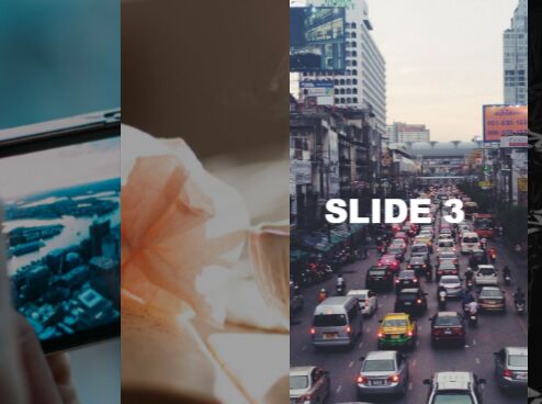
A jQuery & CSS/CSS3 based responsive fullscreen accordion/slider where the child slides will smoothly collapse and expand on mouse move.
How to use it:
1. Add your custom slides to the accordion slider following the html structure as this:
<div class="container">
  <div data-target='1' class="slide slide--1">
    <div class="slide__text slide__text--1">Slide 1</div>
    <div class="slide__bg"></div>
    <div class="slide__img">
      <div class="slide__close"></div>
      <div class="slide__img-wrapper"> </div>
    </div>
    <div class="slide__bg-dark"></div>
  </div>
  <div data-target='2' class="slide slide--2">
    <div class="slide__text">Slide 2</div>
    <div class="slide__bg"></div>
    <div class="slide__img">
      <div class="slide__close"></div>
      <div class="slide__img-wrapper"> </div>
    </div>
    <div class="slide__bg-dark"></div>
  </div>
  <div data-target='3' class="slide slide--3">
    <div class="slide__text">Slide 3</div>
    <div class="slide__bg"></div>
    <div class="slide__img">
      <div class="slide__close"></div>
      <div class="slide__img-wrapper"> </div>
    </div>
    <div class="slide__bg-dark"></div>
  </div>
  <div data-target='4' class="slide slide--4">
    <div class="slide__text">Slide 4</div>
    <div class="slide__bg"></div>
    <div class="slide__img">
      <div class="slide__close"></div>
      <div class="slide__img-wrapper"> </div>
    </div>
    <div class="slide__bg-dark"></div>
  </div>
</div>
2. The primary CSS styles for the accordion slider.
.container {
  position: relative;
  height: 100vh;
  overflow: hidden;
}

.slide {
  position: absolute;
  top: 0;
  left: 0;
  width: 100%;
  height: 100%;
  will-change: transform;
  overflow: hidden;
  cursor: pointer;
}

.slide__bg {
  position: absolute;
  top: 0;
  left: 0;
  -webkit-transform-origin: center left;
  transform-origin: center left;
  width: 100%;
  height: 100%;
  background-color: #161616;
  z-index: 1;
  -webkit-transition: 950ms;
  transition: 950ms;
  will-change: transform;
}

.slide__img {
  position: relative;
  height: 100%;
}

.slide__img-wrapper {
  position: absolute;
  top: -10%;
  left: -10%;
  width: 125%;
  height: 120%;
  -webkit-transform: translate3d(0, 0, 0);
  transform: translate3d(0, 0, 0);
  -webkit-transition: 950ms;
  transition: 950ms;
  will-change: transform;
}

.slide__bg-dark {
  position: absolute;
  top: 0;
  left: 0;
  width: 100%;
  height: 100%;
  background-color: rgba(0, 0, 0, 0.5);
  opacity: 0;
  -webkit-transition: 350ms;
  transition: 350ms;
  z-index: 2;
}

.slide__text {
  position: absolute;
  top: 50%;
  left: 5%;
  width: 23%;
  text-transform: uppercase;
  word-wrap: break-word;
  color: #fff;
  font-size: 45px;
  font-weight: 800;
  -webkit-transform: translate3d(0, -50%, 0) rotate(0.01deg);
  transform: translate3d(0, -50%, 0) rotate(0.01deg);
  will-change: transform, opacity;
  -webkit-transition: 750ms;
  transition: 750ms;
  opacity: 0;
  z-index: 1;
}

@media screen and (max-width: 960px) {

.slide__text { font-size: 30px; }
}
3. Animate the active slide using CSS3 transforms and transitions.
.active .slide--1 .slide__bg {
  -webkit-transform: scale(0, 1);
  transform: scale(0, 1);
  -webkit-transition: 950ms;
  transition: 950ms;
}

.active .slide--1 .slide__img-wrapper {
  -webkit-transform: translate3d(-150px, 0, 0);
  transform: translate3d(-150px, 0, 0);
  -webkit-transition: 2000ms;
  transition: 2000ms;
}

.active .slide--1 {
  -webkit-transform: translate3d(-100%, 0, 0);
  transform: translate3d(-100%, 0, 0);
  -webkit-transition: -webkit-transform 950ms 0ms;
  transition: -webkit-transform 950ms 0ms;
  transition: transform 950ms 0ms;
  transition: transform 950ms 0ms, -webkit-transform 950ms 0ms;
}

.active .slide--1 .slide__bg {
  -webkit-transform: scale(0, 1);
  transform: scale(0, 1);
  -webkit-transition: 1900ms 0ms;
  transition: 1900ms 0ms;
}

.active .slide--1 .slide__img-wrapper {
  -webkit-transform: translate3d(-150px, 0, 0);
  transform: translate3d(-150px, 0, 0);
  -webkit-transition: 2000ms 0ms;
  transition: 2000ms 0ms;
}

.active .slide--2 {
  -webkit-transform: translate3d(-75%, 0, 0);
  transform: translate3d(-75%, 0, 0);
  -webkit-transition: -webkit-transform 950ms 1235ms;
  transition: -webkit-transform 950ms 1235ms;
  transition: transform 950ms 1235ms;
  transition: transform 950ms 1235ms, -webkit-transform 950ms 1235ms;
}

.active .slide--2 .slide__bg {
  -webkit-transform: scale(0, 1);
  transform: scale(0, 1);
  -webkit-transition: 1900ms 1235ms;
  transition: 1900ms 1235ms;
}

.active .slide--2 .slide__img-wrapper {
  -webkit-transform: translate3d(-150px, 0, 0);
  transform: translate3d(-150px, 0, 0);
  -webkit-transition: 2000ms 1235ms;
  transition: 2000ms 1235ms;
}

.active .slide--3 {
  -webkit-transform: translate3d(-50%, 0, 0);
  transform: translate3d(-50%, 0, 0);
  -webkit-transition: -webkit-transform 950ms 2470ms;
  transition: -webkit-transform 950ms 2470ms;
  transition: transform 950ms 2470ms;
  transition: transform 950ms 2470ms, -webkit-transform 950ms 2470ms;
}

.active .slide--3 .slide__bg {
  -webkit-transform: scale(0, 1);
  transform: scale(0, 1);
  -webkit-transition: 1900ms 2470ms;
  transition: 1900ms 2470ms;
}

.active .slide--3 .slide__img-wrapper {
  -webkit-transform: translate3d(-150px, 0, 0);
  transform: translate3d(-150px, 0, 0);
  -webkit-transition: 2000ms 2470ms;
  transition: 2000ms 2470ms;
}

.active .slide--4 {
  -webkit-transform: translate3d(-25%, 0, 0);
  transform: translate3d(-25%, 0, 0);
  -webkit-transition: -webkit-transform 950ms 3705ms;
  transition: -webkit-transform 950ms 3705ms;
  transition: transform 950ms 3705ms;
  transition: transform 950ms 3705ms, -webkit-transform 950ms 3705ms;
}

.active .slide--4 .slide__bg {
  -webkit-transform: scale(0, 1);
  transform: scale(0, 1);
  -webkit-transition: 1900ms 3705ms;
  transition: 1900ms 3705ms;
}

.active .slide--4 .slide__img-wrapper {
  -webkit-transform: translate3d(-150px, 0, 0);
  transform: translate3d(-150px, 0, 0);
  -webkit-transition: 2000ms 3705ms;
  transition: 2000ms 3705ms;
}
4. Style the slides and add custom background images to them.
.slide__text--1 { left: 8%; }

.slide { left: 100%; }

.slide--1 { z-index: 0; }

.slide--1 .slide__img-wrapper {
  background: url("1.jpg") center center no-repeat;
  background-size: cover;
}

.slide--2 { z-index: 1; }

.slide--2 .slide__img-wrapper {
  background: url("2.jpg") center center no-repeat;
  background-size: cover;
}

.slide--3 { z-index: 2; }

.slide--3 .slide__img-wrapper {
  background: url("3.jpg") center center no-repeat;
  background-size: cover;
}

.slide--4 { z-index: 3; }

.slide--4 .slide__img-wrapper {
  background: url("4.jpg") center center no-repeat;
  background-size: cover;
}
5. Place the latest version of JQuery library at the bottom of the webpage.
<script src="//code.jquery.com/jquery-3.1.1.slim.min.js"></script>
6. The core JavaScript (jQuery script) to active the accordion slider.
$(document).ready(function() {
  const $container = $('.container');
  const $slide = $('.slide');
  const $text = $('.slide__text');
  const numSlides = 4;
  const initialAnimDur = 5705;
  const animDelay = 1000;
  let initialAnim = true;
  let clickAnim = false;

  $(document).on('click', '.slide__bg-dark', function() {
    if (initialAnim || clickAnim) return;
    let _this = $(this).parent();
    let target = +_this.attr('data-target');
    clickAnim = true;

    _this.css({
      'transform': 'translate3d(-100%, 0, 0)',
      'transition': '750ms',
      'cursor': 'default'
    })

    _this.find('.slide__img-wrapper').css({
      'transform': 'translate3d(0, 0, 0) scale(.95, .95)',
      'transition': '2000ms'
    })

    for(let i = target, length = $slide.length; i < length; i++) {
      $('.slide--' + (i + 1)).css({
        'transform': 'translate3d(0, 0, 0)',
        'transition': '750ms'
      })
    }

    for(let i = target, length = $slide.length; i > 1; i--) {
      $('.slide--' + (i - 1)).css({
        'transform': 'translate3d(-125%, 0, 0)',
        'transition': '750ms'
      })
    }

    setTimeout(function() {
      $slide.not(_this).find('.slide__bg-dark').css({
        'opacity': '0'
      })
    }, 750)


    _this.find('.slide__text').css({
      'transform': 'translate3d(150px, -40%, 0)',
      'opacity': '1',
      'transition': '2000ms',
      '-webkit-transition': '2000ms'
    })
  });

  $(document).on('mousemove', '.slide', function() {
    if(initialAnim || clickAnim) return;
    let _this = $(this);
    let target = +_this.attr('data-target');

    _this.css({
      'transform': 'translate3d(-' + (((100 / numSlides) * (numSlides - (target - 1))) + 5) + '%, 0, 0)',
      'transition': '750ms'
    })

    _this.find('.slide__text').css({
      'transform': 'translate3d(0, -40%, 0) rotate(0.01deg)',
      '-moz-transform': 'translate3d(0, -40%, 0) rotate(0.01deg)',
      'opacity': '1',
      'transition': '750ms',
      '-webkit-transition': '750ms'
    })

    for(let i = target, length = $slide.length; i < length; i++) {
      $('.slide--' + (i + 1)).css({
        'transform': 'translate3d(-' + (((100 / numSlides) * (numSlides - ((i + 1) - 1))) - 5) + '%, 0, 0)',
        'transition': '750ms'
      })
    }

    for(let i = target; i > 1; i--) {
      $('.slide--' + (i - 1)).css({
        'transform': 'translate3d(-' + (((100 / numSlides) * (numSlides - ((i - 1) - 1))) + 5) + '%, 0, 0)',
        'transition': '750ms'
      })
    }

    _this.find('.slide__img-wrapper').css({
      'transform': 'translate3d(-200px, 0, 0) scale(.85, .85)',
      'transition': '750ms'
    })

    $slide.not(_this).find('.slide__img-wrapper').css({
      'transform': 'translate3d(-200px, 0, 0) scale(.90, .90)',
      'transition': '1000ms'
    })

    $slide.not(_this).find('.slide__bg-dark').css({
      'opacity': '.75'
    })
  });

  $(document).on('mouseleave', '.slide', function() {
    if(initialAnim || clickAnim) return;
    let _this = $(this);
    let target = +_this.attr('data-target');

    for(let i = 1, length = $slide.length; i <= length; i++) {
      $('.slide--' + i).css({
        'transform': 'translate3d(-' + (100 / numSlides) * (numSlides - (i - 1)) + '%, 0, 0)',
        'transition': '1000ms'
      })
    }

    $slide.find('.slide__img-wrapper').css({
      'transform': 'translate3d(-200px, 0, 0) scale(1, 1)',
      'transition': '750ms'
    })

    $slide.find('.slide__bg-dark').css({
      'opacity': '0'
    })

    $text.css({
      'transform': 'translate3d(0, -50%, 0) rotate(0.01deg)',
      'opacity': '0',
      'transition': '200ms',
      '-webkit-transition': '200ms'
    })
  });

  $(document).on('click', '.slide__close', function() {

    setTimeout(function() {
      clickAnim = false;
    }, 1000);


    for(let i = 1, length = $slide.length; i <= length; i++) {
      $('.slide--' + i).css({
        'transform': 'translate3d(-' + (100 / numSlides) * (numSlides - (i - 1)) + '%, 0, 0)',
        'transition': '1000ms',
        'cursor': 'pointer'
      })
    }

    $text.css({
      'transform': 'translate3d(150px, -40%, 0)',
      'opacity': '0',
      'transition': '200ms',
      '-webkit-transition': '200ms'
    })

    setTimeout(function() {
      $text.css({
        'transform': 'translate3d(0, -50%, 0)'
      })
    }, 200)
  })

  setTimeout(function() {
    $container.addClass('active');
  }, animDelay);

  setTimeout(function() {
    initialAnim = false;
  }, initialAnimDur + animDelay);

});
This awesome jQuery plugin is developed by mrspok407. For more Advanced Usages, please check the demo page or visit the official website.