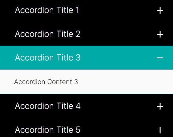
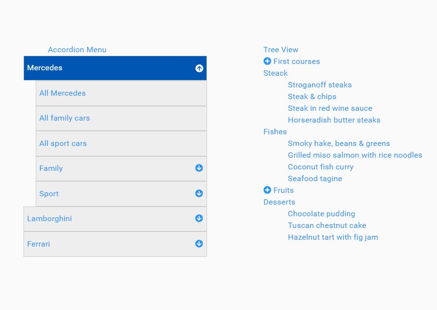
Multilevel Accordion Menu Plugin For jQuery
| File Size: | 4.66 KB |
|---|---|
| Views Total: | 11551 |
| Last Update: | |
| Publish Date: | |
| Official Website: | Go to website |
| License: | MIT |
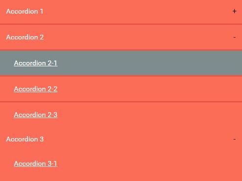
A nice, modern jQuery accordion plugin which gives you the ability to create a touch-enabled multilevel accordion menu with CSS3 powered expand / collapse animations.
How to use it:
1. Load the latest version of jQuery library and the core Javascript file in the document.
<script src="//code.jquery.com/jquery-2.1.4.min.js"></script>
<script src="js/script.js"></script>
2. Load the Font Awesome 4 for menu icons (OPTIONAL).
<link rel="stylesheet" href="font-awesome.min.css">
3. The markup structure for the accordion menu.
<nav>
<div id="menu" class="menu">
<div class="menu-header"> ACCORDION MENU </div>
<ul>
<li class="active"><a href="#"><i class="fa fa-home"></i>Home</a></li>
<li><a href="#"><i class="fa fa-file-image-o"> </i>Gallery</a>
<ul class="submenu">
<li><a href="#"> Graphics</a></li>
<li><a href="#"> Photoshop</a></li>
</ul>
</li>
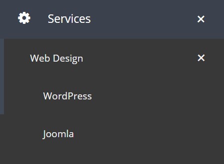
<li><a href="#"><i class="fa fa-cog"> </i>Services</a>
<ul class="submenu">
<li><a href="#"> Web Design </a>
<ul class="submenu">
<li><a href="#"> WordPress</a></li>
<li><a href="#"> Joomla</a></li>
</ul>
</li>
<li><a href="#"> Hosting</a></li>
<li><a href="#"> Design </a></li>
</ul>
</li>
<li><a href="#"><i class="fa fa-newspaper-o"> </i>News<span class="menu-label"> 8 </span></a></li>
<li><a href="#"><i class="fa fa-user"> </i>About</a></li>
<li><a href="#"><i class="fa fa-envelope"> </i> Contact</a></li>
</ul>
<div class="menu-footer"> @ Test</div>
</div>
</nav>
4. The core CSS / CSS3 styles.
.menu {
  box-shadow: 0 20px 50px #333333;
  float: left;
  min-width: 260px;
  outline: 0;
  position: relative;
}

.menu * {
  -moz-box-sizing: border-box;
  -webkit-box-sizing: border-box;
  box-sizing: border-box;
  outline: 0;
}

.menu .menu-footer {
  background: #414956;
  color: #f0f0f0;
  float: left;
  font-weight: normal;
  height: 50px;
  line-height: 50px;
  font-size: 6px;
  width: 100%;
  text-align: center;
}

.menu .menu-header {
  background: #414956;
  color: #f0f0f0;
  font-weight: bold;
  height: 50px;
  line-height: 50px;
  text-align: center;
  width: 100%;
}

.menu ul {
  list-style: none;
  margin: 0;
  padding: 0;
}

.menu ul li {
  display: block;
  float: left;
  position: relative;
  width: 100%;
}

.menu ul li a {
  background: #414956;
  color: #f0f0f0;
  float: left;
  font-size: 13px;
  overflow: hidden;
  padding: 14px 22px;
  position: relative;
  text-decoration: none;
  white-space: nowrap;
  width: 100%;
}

.menu ul li a i {
  float: left;
  font-size: 16px;
  line-height: 18px;
  text-align: left;
  width: 34px;
}

.menu ul li .menu-label {
  background: #f0f0f0;
  border-radius: 100%;
  color: #555555;
  font-size: 11px;
  font-weight: 800;
  line-height: 18px;
  min-width: 20px;
  padding: 1px 2px 1px 1px;
  position: absolute;
  right: 18px;
  text-align: center;
  top: 14px;
}

.menu ul .submenu {
  display: none;
  position: static;
  width: 100%;
}

.menu ul .submenu .submenu-indicator { line-height: 16px; }

.menu ul .submenu li {
  clear: both;
  width: 100%;
}

.menu ul .submenu li ul.submenu {
  display: none;
  position: static;
  width: 100%;
  overflow: hidden;
}

.menu ul .submenu li a {
  background: #383838;
  border-left: solid 6px transparent;
  border-top: none;
  float: left;
  font-size: 11px;
  position: relative;
  width: 100%;
}

.menu ul .submenu li:hover > a { border-left-color: #414956; }

.menu ul .submenu li .menu-label {
  background: #f0f0f0;
  border-radius: 100%;
  color: #555555;
  font-size: 11px;
  font-weight: 800;
  line-height: 18px;
  min-width: 20px;
  padding: 1px 2px 1px 1px;
  position: absolute;
  right: 18px;
  text-align: center;
  top: 12px;
  top: 14px;
}

.menu ul .submenu > li > a { padding-left: 30px; }

.menu ul .submenu > li > ul.submenu > li > a { padding-left: 45px; }

.menu ul .submenu > li > ul.submenu > li > ul.submenu > li > a { padding-left: 60px; }

.menu .submenu-indicator {
  -moz-transition: "transform .3s linear";
  -o-transition: "transform .3s linear";
  -webkit-transition: "transform .3s linear";
  transition: "transform .3s linear";
  float: right;
  font-size: 20px;
  line-height: 19px;
  position: absolute;
  right: 22px;
}

.menu .submenu-indicator-minus > .submenu-indicator {
  -moz-transform: rotate(45deg);
  -ms-transform: rotate(45deg);
  -o-transform: rotate(45deg);
  -webkit-transform: rotate(45deg);
  transform: rotate(45deg);
}

.menu > ul > li.active > a {
  background: #3b424d;
  color: #ffffff;
}

.menu > ul > li:hover > a {
  background: #3b424d;
  color: #ffffff;
}

.menu > ul > li > a { border-bottom: solid 1px #3b424d; }
5. The Material Design inspired click ripple effect.
.ink {
  -moz-transform: scale(0);
  -ms-transform: scale(0);
  -o-transform: scale(0);
  -webkit-transform: scale(0);
  background: rgba(255, 255, 255, 0.3);
  border-radius: 100%;
  display: block;
  position: absolute;
  transform: scale(0);
}

.animate-ink {
  -moz-animation: ripple .3s linear;
  -ms-animation: ripple .3s linear;
  -o-animation: ripple .3s linear;
  -webkit-animation: ripple .3s linear;
  animation: ripple .3s linear;
}

@-moz-keyframes 'ripple' {
 100% {
 opacity: 0;
 transform: scale(2.5);
}
}

@-webkit-keyframes 'ripple' {
 100% {
 opacity: 0;
 transform: scale(2.5);
}
}

@keyframes 'ripple' {
 100% {
 opacity: 0;
 transform: scale(2.5);
}
}
6. Initialize the accordion menu.
$("#menu").accordion();
7. All default options.
// animation speed
speed: 200,

// transition delay time
showDelay: 0,
hideDelay: 0,

// open one sub menu at a time
singleOpen: true,

// enable ripple click effect
clickEffect: true,

// sub menu indicator
indicator: 'submenu-indicator-minus',

// CSS class for sub menus
subMenu: 'submenu',

// click, touchstart
event: 'click touchstart'
This awesome jQuery plugin is developed by thanhnhan2tn. For more Advanced Usages, please check the demo page or visit the official website.