Animated Text Input With jQuery and CSS3 Transforms
| File Size: | 4.82 KB |
|---|---|
| Views Total: | 5524 |
| Last Update: | |
| Publish Date: | |
| Official Website: | Go to website |
| License: | MIT |
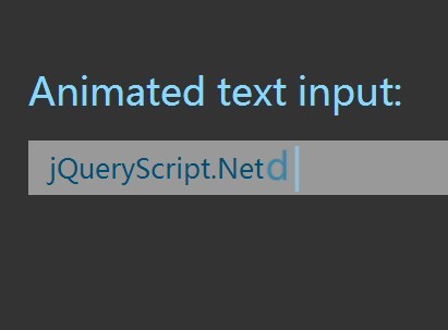
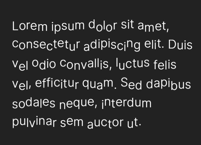
Makes use of jQuery and CSS3 transforms to animate each letter/number while typing something into an input field.
See also:
How to use it:
1. Include the prefix.min.js in the head section of the web page. Prefix.js is a small JS library lets you use only unprefixed CSS properties everywhere.
<script src="prefixfree.min.js"></script>
2. Create an input field in your web page.
<form>
  <div class="bloop" id="blooper">
    <input type="text"/>
    <div> <i class="carrat">|</i> </div>
  </div>
</form>
3. The required CSS3 rules to animate letters/numbers.
@keyframes
blink {  0% {
 opacity: 0.0;
}
 50% {
 opacity: 1.0;
}
 100% {
 opacity: 0.0;
}
}
@keyframes
letter {  0% {
 color: #87d8ff;
 transform: scale(2, 2) translateX(7px);
}
 100% {
 color: #004f75;
 transform: scale(1, 1) translateX(0px);
}
}

form {
  width: 400px;
  margin: 120px auto;
}

form span {
  color: #87d8ff;
  font-weight: 100;
  padding-bottom: 10px;
  display: inline-block;
}

.bloop {
  width: 400px;
  height: 40px;
  margin: 0px auto;
  position: relative;
}

.bloop input {
  width: 100%;
  height: 100%;
  border: none;
  font-size: 20px;
  color: transparent;
  background: transparent;
  position: absolute;
  z-index: 2;
  padding-left: 15px;
}

.bloop input:focus {
  outline-color: transparent;
  outline-style: none;
  outline: none;
}

.bloop input:focus + div { background: #999; }

.bloop input:focus + div .carrat { display: inline-block; }

.bloop div {
  position: absolute;
  top: 0px;
  left: 0px;
  width: 100%;
  height: 100%;
  line-height: 40px;
  background: #777;
  font-family: sans-serif;
  font-size: 20px;
  padding: 0px 15px;
}

.bloop div .carrat {
  display: none;
  color: #87d8ff;
  font-size: 35px;
  opacity: 1.0;
  font-style: normal;
  animation: blink 0.8s linear infinite;
  font-size: 31px;
  font-weight: 100;
  position: relative;
  top: -3px;
  right: -7px;
}

.bloop div span {
  position: relative;
  top: -4px;
  transition: 200ms cubic-bezier(0.08, 0.6, 0.56, 1.4);
  animation: letter 0.5s cubic-bezier(0.08, 0.6, 0.56, 1.4);
  display: inline-block;
  color: #004f75;
  font-size: 20px;
  font-weight: 100;
}
4. Include the necessary jQuery library at the end of the web page.
<script src="//ajax.googleapis.com/ajax/libs/jquery/1.11.1/jquery.min.js"></script>
5. The javascript to active the text input animation.
var $input = $('.bloop input');
var $div = $('.bloop div');
var $carrat = $('.bloop div .carrat');

var current = '';

function addLetters(letters) {
  var delay = 200;
  var base = 0;
  letters.split('').forEach(function(letter, i) {
    console.log('delaying %d on letter %s', i*delay, letter);
    setTimeout(function() {
      if (letter === ' ') { letter = ' '; }
      var span = '<span>' + letter + '</span>';
      $carrat.before(span);
    }, delay * i);
  });
}

function deleteLastLetter() {
  $div.find('span:last').remove();
}

function indexOfChange(a, b) {
  var i = 0;
  while (a.charAt(i) === b.charAt(i)) { i++; }
  return i;
}

// keypress only fires for 'readable' content
$input.on('input', function(e){
  var val = this.value;
  var idx = indexOfChange(current, val);
  var base = current.slice(0, idx);

  // shrink current and displayed down to base size
  while(current.length > base.length) {
    deleteLastLetter();
    current = current.slice(0, current.length - 1);
  }

  // adding
  if (val.length > base.length) {
    var letters = val.slice(idx);
    addLetters(letters);
    current = val;
  }

});
This awesome jQuery plugin is developed by themitchy. For more Advanced Usages, please check the demo page or visit the official website.