Elastic Hover Effect With jQuery And GSAP
| File Size: | 4.26 KB |
|---|---|
| Views Total: | 3114 |
| Last Update: | |
| Publish Date: | |
| Official Website: | Go to website |
| License: | MIT |

A fancy elastic hover effect with an interactive cursor and a ripple click animation, built on top of jQuery and GSAP libraries.
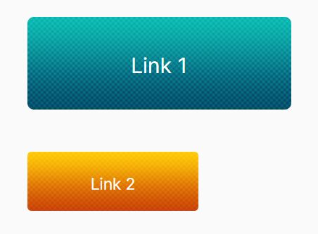
Suitable for creating an interactive action button to increase conversation rates.
How to use it:
1. Create an action button on the page.
<button type="button" class="button btn-primary">
  Hover Me
  <div class="btn-secondary"></div>
</button>
2. Create an element to hold the custom cursor.
<div class="cursor"></div>
3. The necessary CSS styles for the action button.
.button {
  transition: transform .3s cubic-bezier(.175,.885,.32,1.275), bottom .3s cubic-bezier(.175,.885,.32,1.275), background-position 3s cubic-bezier(.455,.03,.515,.955), -webkit-transform .3s cubic-bezier(.175,.885,.32,1.275);
}

.button, .button .btn-secondary {
  background-position: 0 50%;
  bottom: 0;
}

.button .btn-secondary {
  left: 0;
  width: 100%;
  position: absolute;
  filter: blur(1rem);
  opacity: .65;
  z-index: -1;
  transform: scale3d(.85, .85, 1);
  transition: transform .3s cubic-bezier(.175,.885,.32,1.275), filter .3s cubic-bezier(.175,.885,.32,1.275), bottom .3s cubic-bezier(.175,.885,.32,1.275), background-position 3s cubic-bezier(.455,.03,.515,.955), -webkit-transform .3s cubic-bezier(.175,.885,.32,1.275), -webkit-filter .3s cubic-bezier(.175,.885,.32,1.275);
}

.button:focus {
  outline: none;
}

.button:hover {
  transform: scale3d(1.1, 1.1, 1);
  background-position: 100% 50%;
  outline: none;
  bottom: 2px;
}

.btn-secondary, .button:hover .btn-secondary {
  background-position: 100% 50%;
  filter: blur(1.6rem);
  bottom: -5px;
}
4. The CSS styles for the custom cursor.
.cursor {
  position: fixed;
  width: 20px;
  height: 20px;
  border-radius: 50%;
  background-color: #f5f5f5;
  pointer-events: none;
  mix-blend-mode: difference;
  transition: transform .3s cubic-bezier(.175, .885, .32, 1.175);
  z-index: 999;
}
5. The CSS styles for the ripple click effect.
span.ripple {
  position: absolute;
  border-radius: 50%;
  transform: scale(0);
  animation: ripple 600ms linear;
  background-color: rgba(255, 255, 255, .85);
}

@keyframes ripple {
  to {
    transform: scale(.65);
    opacity: 0;
  }
}
6. Load the necessary jQuery and GSAP libraries in the document.
<script src="/path/to/cdn/jquery.min.js"></script>
<script src="/path/to/cdn/gsap.min.js"></script>
7. The core JavaScript (jQuery script) to enable the Elastic Hover Effect.
$(document).ready(function() {

  var cursor = $(".cursor");

  $(window).mousemove(function(e) {
    cursor.css({
      top: e.clientY - cursor.height() / 2,
      left: e.clientX - cursor.width() / 2
    });
  });

  $(window)
    .mouseleave(function() {
      cursor.css({
        opacity: "0"
      });
    })
    .mouseenter(function() {
      cursor.css({
        opacity: "1"
      });
    });

  $(".link")
    .mouseenter(function() {
      cursor.css({
        transform: "scale(3.2)"
      });
    })
    .mouseleave(function() {
      cursor.css({
        transform: "scale(1)"
      });
    });

  $(window)
    .mousedown(function() {
      cursor.css({
        transform: "scale(.2)"
      });
    })
    .mouseup(function() {
      cursor.css({
        transform: "scale(1)"
      });
    });
});

let updateScrollPos = function(e) {
  $(window).scrollTop($(window).scrollTop() + (clickY - e.pageY));
}

class Button {
  constructor(HTMLButtonElement) {
    this.button = HTMLButtonElement;
    this.width = this.button.offsetWidth;
    this.height = this.button.offsetHeight;
    this.left = this.button.offsetLeft;
    this.top = this.button.offsetTop;
    this.x = 0;
    this.y = 0;
    this.cursorX = 0;
    this.cursorY = 0;
    this.magneticPullX = 0.4;
    this.magneticPullY = 0.9;
    this.isHovering = false;
    this.magnetise();
    this.createRipple();
  }

  onEnter = () => {
    gsap.to(this.button, 0.4, {
      x: this.x * this.magneticPullX,
      y: this.y * this.magneticPullY,
      ease: Power4.easeOut
    });
  };

  onLeave = () => {
    gsap.to(this.button, 0.7, {
      x: 0,
      y: 0,
      ease: Elastic.easeOut.config(1.1, 0.5)
    });
  };

  magnetise = () => {
    document.querySelector("body").addEventListener("mousemove", (e) => {
      this.cursorX = e.clientX;
      this.cursorY = e.clientY;

      const center = {
        x: this.left + this.width / 2,
        y: this.top + this.height / 2
      };

      this.x = this.cursorX - center.x;
      this.y = this.cursorY - center.y;

      const distance = Math.sqrt(this.x * this.x + this.y * this.y);
      const hoverArea = this.isHovering ? 0.6 : 0.5;

      if (distance < this.width * hoverArea) {
        if (!this.isHovering) {
          this.isHovering = true;
        }
        this.onEnter();
      } else {
        if (this.isHovering) {
          this.onLeave();
          this.isHovering = false;
        }
      }
    });
  };

  createRipple = () => {
    this.button.addEventListener("click", () => {
      const circle = document.createElement("span");
      const diameter = Math.max(
        this.button.clientWidth,
        this.button.clientHeight
      );
      const radius = diameter / 2;

      const offsetLeft = this.left + this.x * this.magneticPullX;
      const offsetTop = this.top + this.y * this.magneticPullY;

      circle.style.width = circle.style.height = `${diameter}px`;
      circle.style.left = `${this.cursorX - offsetLeft - radius}px`;
      circle.style.top = `${this.cursorY - offsetTop - radius}px`;
      circle.classList.add("ripple");

      const ripple = this.button.getElementsByClassName("ripple")[0];

      if (ripple) {
        ripple.remove();
      }

      this.button.appendChild(circle);
    });
  };
}

const buttons = document.getElementsByTagName("button");
for (const button of buttons) {
  new Button(button);
}
This awesome jQuery plugin is developed by dlirA01. For more Advanced Usages, please check the demo page or visit the official website.