Minimalist jQuery Based Responsive iFrame Solution - Responsinatr
| File Size: | 17 KB |
|---|---|
| Views Total: | 703 |
| Last Update: | |
| Publish Date: | |
| Official Website: | Go to website |
| License: | MIT |

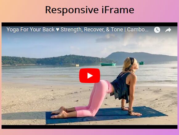
Responsinatr is a tiny and cross-browser jQuery plugin makes your iFrame content fully responsive while preserving the original aspect radio. Great for iframe embedded Youtube/Vimeo videos and Google Maps that auto resize depending on the current screen size.
How to use it:
1. Make sure to load the jQuery Responsinatr plugin after jQuery library but before we close the body tag.
<script src="//code.jquery.com/jquery.min.js"></script>
<script src="jquery.responsinatr.min.js"></script>
2. Let's say you have some Youtube/Vimeo videos and Google Maps embedded in the container '#container'.
<div id="container">

  <h2>YouTube</h2>
  <iframe width="560" height="315" src="https://www.youtube.com/embed/L7r2BSRYIWY" frameborder="0" allowfullscreen></iframe>

  <h2>Vimeo</h2>
  <iframe src="https://player.vimeo.com/video/1084537" width="640" height="360" frameborder="0" webkitallowfullscreen mozallowfullscreen allowfullscreen></iframe>

  <h2>Google Maps</h2>
  <iframe src="https://www.google.com/maps/embed?pb=!1m18!1m12!1m3!1d207433.7208676158!2d139.5703036759639!3d35.67326187350749!2m3!1f0!2f0!3f0!3m2!1i1024!2i768!4f13.1!3m3!1m2!1s0x605d1b87f02e57e7%3A0x2e01618b22571b89!2zVG9raW8sIEphcMOzbg!5e0!3m2!1ses-419!2s!4v1470093855442" width="600" height="450" frameborder="0" style="border:0" allowfullscreen></iframe>

</div>
3. Just call the function on the container and the plugin will do the rest.
$('#container').responsinatr();
This awesome jQuery plugin is developed by htmgarcia. For more Advanced Usages, please check the demo page or visit the official website.