AJAX-Enabled Dialog & Modal Plugin With jQuery - dialog.jQuery.js
| File Size: | 13 KB |
|---|---|
| Views Total: | 1841 |
| Last Update: | |
| Publish Date: | |
| Official Website: | Go to website |
| License: | MIT |
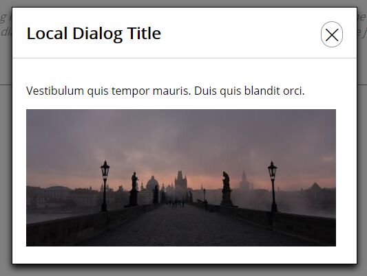
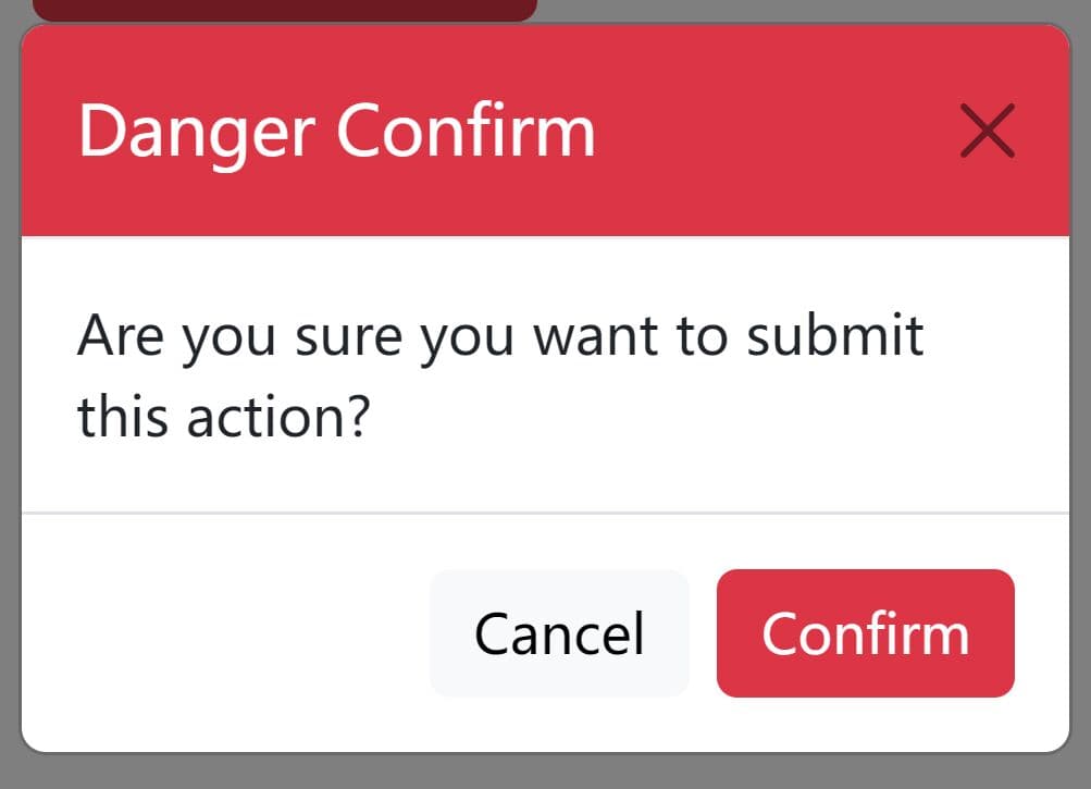
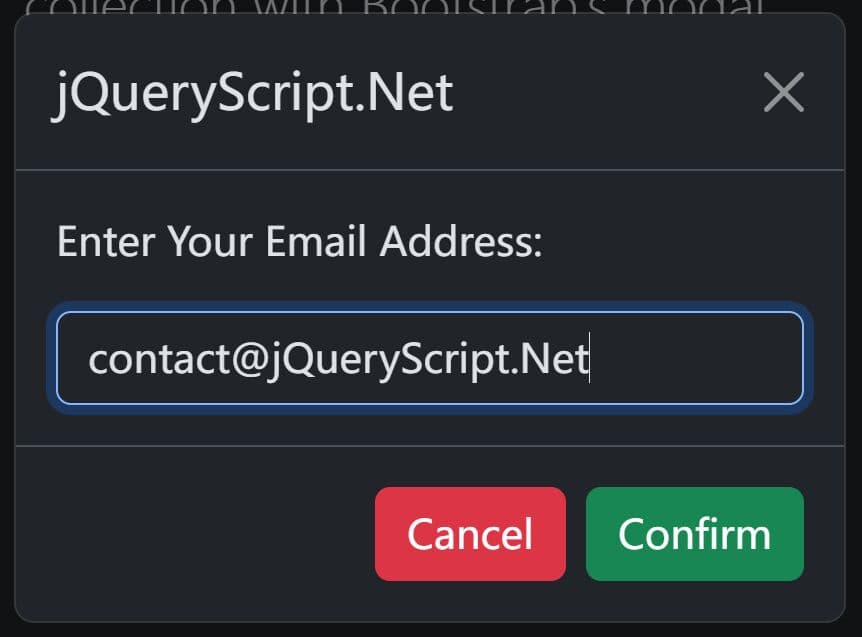
The dialog.jQuery.js jQuery plugin adds customizable, animated, and AJAX-enabled dialog boxes and modal windows to the web page. Dialog is a feature that displays a box "floating" above everything else on the page, with a dark semi-transparent "modal" background, to draw focus to the dialog box in the center. The style and settings can be modified via the jQuery plugin parameters.
How to use it:
1. Include jQuery library and the dialog.jQuery.js script on the web page.
<script src="https://code.jquery.com/jquery-3.2.1.min.js"
        integrity="sha256-hwg4gsxgFZhOsEEamdOYGBf13FyQuiTwlAQgxVSNgt4="
        crossorigin="anonymous">
</script>
<script src="dialog.jquery.js"></script>
2. Wrap the dialog/modal content into a container with a unique ID.
<div id="myID" style="display: none;">
  This is some text from a local div element on the page.
</div>
3. Create a trigger element with the following attributes to toggle the dialog/modal.
<a href="javascript:void(0)" class="trigger"
   data-dialog-title="Dialog Title"
   data-dialog-body-source="#myID">
   Launch
</a>
4. Initialize the plugin and we're done.
$(".trigger").dialog();
5. To load an external page into the dialog/modal via AJAX requests:
<a href="javascript:void(0)" class="trigger"
   data-dialog-title="Ajax Dialog Title"
   data-dialog-url="dialog.html">
   Open ajax dialog box
</a>
6. Default options to customize the dialog/modal.
$(".trigger").dialog({

  // Whether or not to use animation when showing/hiding the dialog box
  useAnimation     : true,

  // Type of animation to use if userAnimation is enabled (accepts: slide, fade)
  animationType     : "slide",

  // Duration of the animation (in milliseconds)
  animationDuration : 300,

  // Whether or not a modal backdrop should be used when the dialog box is visible
  useModal          : true,

  // Transparency/opacity of the modal backdrop, if enabled
  modalTransparency : 0.5, // 50% transparent

  // Whether or not to style the dialog box with jQuery or to have the user style it with CSS
  styleWithCSS      : false,

  // Any custom CSS styles for the dialog container element
  customCSS         : {},

  // Width of the dialog box (in pixels), if styleWithCSS is disabled
  width             : 500,

  // Distance the dialog box will end at (if animating)/where the dialog box will be positioned on the Y axis (in pixels)
  distanceFromTop   : 100,

  // Whether or not the user can close the dialog box by pressing the escape key
  closeWithEsc      : true,

  // Whether or not the user can close the dialog box by clicking/tapping the modal backdrop
  closeWithModal    : true,


  // Class for the modal, used to style the modal with CSS
  modalClass        : "jQueryDialogModal",

  // Class for the dialog container, used to style the dialog box with CSS
  dialogClass       : "jQueryDialogContainer",

  // Class for the title element within the dialog container
  titleClass        : "jQueryDialogTitle",

  // Class for the body element within the dialog container
  bodyClass        : "jQueryDialogBody",

  // Class for the close button in the upper right corner of the title
  closeButtonClass : "jQueryDialogCloseButton"

});
Change log:
2017-12-10
- v1.0.2
This awesome jQuery plugin is developed by rootr. For more Advanced Usages, please check the demo page or visit the official website.