Create Custom Alert/Confirm/Modal Popups With jQuery UI - Dialogs Manager
| File Size: | 119 KB |
|---|---|
| Views Total: | 7252 |
| Last Update: | |
| Publish Date: | |
| Official Website: | Go to website |
| License: | MIT |
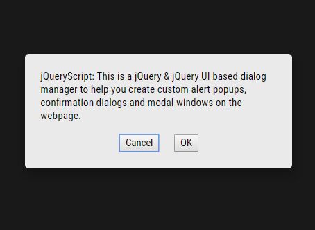
This is a jQuery & jQuery UI Position based dialog manager to help you create custom alert popups, confirmation dialogs and modal windows on the webpage.
How to use it:
1. Make sure you have the latest jQuery and jQuery UI Position (Choose only the position feature and download the custom build here) are included on the webpage.
<script src="jquery.min.js"></script>
<script src="jquery-ui.min.js"></script>
2. Load the Dialogs Manager's JavaScript right before the closing body tag.
<script src="dist/js/dialogs-manager.min.js"></script>
3. Create a new Dialogs Manager instance and we're ready to go.
var myDialog = new DialogsManager.Instance();
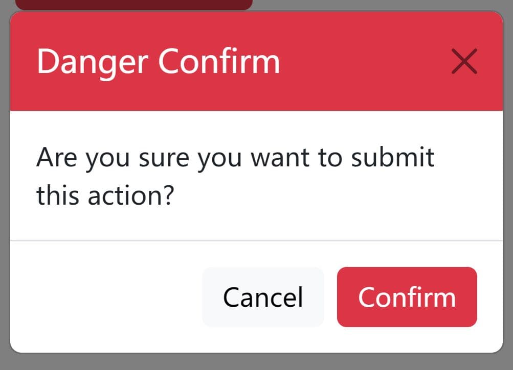
4. Create a custom confirmation dialog with Confirm/Cancel actions.
var confirmWidget = dialogManager.createWidget('confirm', {
    headerMessage: 'Dialog Title',
    message: 'Are You Sure?',
    onConfirm: function () {
      console.log('I Confirmed!');
    },
    onCancel: function () {
      console.log('I Canceled!');
    }
});
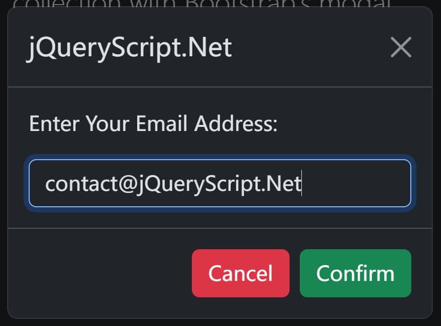
5. Create a normal modal window on the page.
var lightboxWidget = dialogManager.createWidget('lightbox', {
    headerMessage: 'Modal Title',
    message: 'Modal Content'
});
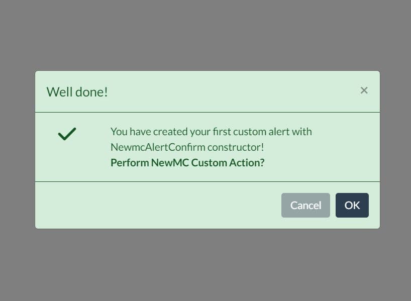
6. Create an alert dialog with a confirm action.
var alertWidget = dialogManager.createWidget('alert', {
    headerMessage: 'Dialog Title',
    message: 'Are You Sure?',
    onConfirm: function () {
      console.log('I Confirmed!');
    }
});
7. Customize the styles of the popups.
.dialog-widget {
  position: fixed;
  height: 100%;
  width: 100%;
  top: 0;
  left: 0;
  -webkit-user-select: none;
  -moz-user-select: none;
  background-color: rgba(0, 0, 0, 0.5);
}

.dialog-widget * { box-sizing: border-box; }

.dialog-widget-content {
  background-color: #EAEAEA;
  position: absolute;
  width: 350px;
  height: 150px;
  margin: auto;
  border-radius: 5px;
  box-shadow: 2px 8px 23px 3px rgba(0, 0, 0, 0.2);
}

.dialog-widget-header {
  height: 20px;
  background-image: linear-gradient(to top, #A0A09D, #D9D9D9);
  font-size: 14px;
  text-align: center;
}

.dialog-message {
  height: 70%;
  padding: 10px;
  font-family: sans-serif;
  font-size: 14px;
}

.dialog-buttons-wrapper { text-align: center; }

.dialog-buttons-wrapper > button {
  margin: 0 10px;
  cursor: pointer;
}
Changelog:
v4.9.1 (2023-01-12)
- Update
v4.8.1 (2020-08-18)
- Update
v4.8.0 (2020-08-14)
- Update
v4.7.7 (2020-08-10)
- Update
v4.7.6 (2020-02-12)
- Update
v4.7.5 (2020-02-10)
- Update
v4.7.4 (2020-01-19)
- Update
v4.7.3 (2019-07-16)
- Update
v4.7.2 (2019-06-26)
- Update
v4.7.1 (2019-01-14)
- Update
v4.7.0 (2019-01-10)
- Update
v4.6.1 (2019-01-04)
- Update
v4.6.0 (2018-12-26)
- Update
v4.5.1 (2018-10-28)
- Update
This awesome jQuery plugin is developed by kobizz. For more Advanced Usages, please check the demo page or visit the official website.