Minimal jQuery Modal Window with CSS3 Animations - Moedal
| File Size: | 95.5 KB |
|---|---|
| Views Total: | 875 |
| Last Update: | |
| Publish Date: | |
| Official Website: | Go to website |
| License: | MIT |
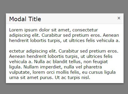
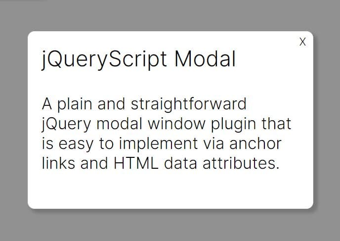
Moedal is a minimalist jQuery plugin that helps you create a responsive, CSS styleable and always-centered modal window with CSS3 powered animations.
How to use it:
1. Load jQuery JavaScript library and the jQuery moedal plugin in the document.
<script src="//code.jquery.com/jquery-1.11.2.min.js"></script>
<script src="js/jquery.moedal.min.js"></script>
2. Show a basic modal window with custom title & body content.
$.moedal.alert('Title', 'Modal Content').show();
3. Modify the template of the modal by editing the modalTemplate variable in the jquery.moedal.min.js.
<div id="@attrBackdropId@" class="@attrBackdropClass@" style="display: none;"></div>
<div id="@attrModalId@" class="@attrModalClass@" style="display: none;">
  <div class="wrapper">
    <div class="caption">
      <h1>@dataModalTitle@</h1>
      <button type="button" id="closeMoedal" class="close"></button>
    </div>
    <div class="content">@dataModalContent@</div>
  </div>
</div>
4. Modify the theme & CSS animation of the modal by editing the modalStyles variable in the jquery.moedal.min.js.
/**
 * NOTICE: This is the foundation styles of the modal. It is better to not modify it.
 */

#moedalBackdrop {
  width: 100%;
  height: 100%;
  position: fixed;
  top: 0;
  right: 0;
  z-index: 2000;
}

#moedal {
  width: auto;
  height: auto;
  min-width: 450px;
  min-height: 80px;
  position: fixed;
  top: 50%;
  right: 50%;
  transform: translate(50%, -50%);
  z-index: 2010;
}

#closeMoedal {
  width: 20px;
  height: 20px;
  line-height: 20px;
  padding: 0;
  position: absolute;
  top: 5px;
  right: 5px;
  font-size: 16pt;
  font-weight: normal;
  border: none;
  outline: none;
  cursor: pointer;
}

/**
 * NOTICE: If you want to modify the theme of the modal, do it by editing the styles below.
 */

.moedalBackdrop { background-color: rgba(0, 0, 0, 0.5); }

.moedal {
  font-family: Verdana, Geneva, Tahoma, Arial, Helvetica, sans-serif;
  font-size: 15px;
  background-color: #fff;
  color: #000;
  border: #e9e9e9 1px solid;
  box-shadow: 0 2px 6px rgba(0, 0, 0, 0.3), 0 3px 8px rgba(0, 0, 0, 0.2);
  -moz-box-shadow: 0 2px 6px rgba(0, 0, 0, 0.3), 0 3px 8px rgba(0, 0, 0, 0.2);
  -webkit-box-shadow: 0 2px 6px rgba(0, 0, 0, 0.3), 0 3px 8px rgba(0, 0, 0, 0.2);
}

.moedal .caption {
  max-height: 30px;
  padding: 5px 10px;
  background-color: #f6f6f6;
  border-bottom: #e6e6e6 1px solid;
}

.moedal .caption h1 {
  margin: 0;
  padding: 0;
  font-size: 20px;
  font-weight: normal;
}

.moedal .caption .close {
  color: #575757;
  background-color: #f6f6f6;
}

.moedal .caption .close:hover {
  color: #000;
  background-color: #ddd;
}

.moedal .caption .close:before { content: "\D7"; }

.moedal .content { padding: 10px; }

/**
 * Animations.
 */

.animated {
  animation-duration: 1s;
  -webkit-animation-duration: 1s;
  animation-fill-mode: both;
  -webkit-animation-fill-mode: both;
}

@-webkit-keyframes
shake {  0%, 100% {
-webkit-transform: translate(50%, -50%);
}
 10%, 30%, 50%, 70%, 90% {
-webkit-transform: translate(48%, -50%);
}
 20%, 40%, 60%, 80% {
-webkit-transform: translate(52%, -50%);
}
}

@keyframes
shake {  0%, 100% {
transform: translate(50%, -50%);
}
 10%, 30%, 50%, 70%, 90% {
transform: translate(48%, -50%);
}
 20%, 40%, 60%, 80% {
transform: translate(52%, -50%);
}
}

.shake {
  animation-name: shake;
  -webkit-animation-name: shake;
}
5. Default options for the modal window.
backdropClass: 'moedalBackdrop',
modalClass: 'moedal',
additionalModalClass: null,
closable: true,
backdropClose: true,
cssIndependent: true
Change logs:
2015-06-02
- js update.
2015-05-25
- v1.1
2015-04-25
- add new features
This awesome jQuery plugin is developed by KazeFlame. For more Advanced Usages, please check the demo page or visit the official website.