Responsive Fullscreen Modal Plugin For Bootstrap 3 And 4
| File Size: | 8.21 KB |
|---|---|
| Views Total: | 15105 |
| Last Update: | |
| Publish Date: | |
| Official Website: | Go to website |
| License: | MIT |
bs-modal-fullscreen.js is a jQuery plugin that makes your Bootstrap 3 / 4 modal component responsive and fullscreen to fit any screen size.
How to use it:
1. Insert the bs-modal-fullscreen.js script to your Bootstrap 3 or 4 project.
<link rel="stylesheet" href="/path/to/bootstrap.min.css">
<script src="/path/to/jquery.min.js"></script>
<script src="/path/to/bootstrap.min.js"></script>
<script src="dist/bs-modal-fullscreen.js"></script>
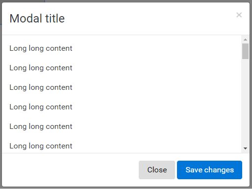
2. Add the CSS class 'modal-fullscreen' to your Bootstrap modal component.
<div class="modal fade modal-fullscreen" id="myModal"> <div class="modal-dialog" role="document"> <div class="modal-content"> <div class="modal-header"> <button type="button" class="close" data-dismiss="modal" aria-label="Close"> <span aria-hidden="true">×</span> </button> <h4 class="modal-title">Modal title</h4> </div> <div class="modal-body"> <p>One fine body…</p> </div> <div class="modal-footer"> <button type="button" class="btn btn-secondary" data-dismiss="modal">Close</button> <button type="button" class="btn btn-primary">Save changes</button> </div> </div><!-- /.modal-content --> </div><!-- /.modal-dialog --> </div><!-- /.modal -->
3. Create a trigger button to launch the modal window.
<button type="button" class="btn btn-lg" data-toggle="modal" data-target="#myModal" id="trigger-btn">Launch</button>
4. Make your modal window fullscreen manually.
$('#myModal').fullscreen();
Change log:
2017-01-04
- JS update
This awesome jQuery plugin is developed by benallfree. For more Advanced Usages, please check the demo page or visit the official website.