Stylish Animated Modal Window with jQuery and CSS3
| File Size: | 3.07 KB |
|---|---|
| Views Total: | 1144 |
| Last Update: | |
| Publish Date: | |
| Official Website: | Go to website |
| License: | MIT |
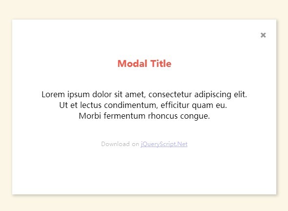
A stylish and responsive modal script which allows you to create a popup window with fancy physics close/open animations. Based on CSS3 transitions, transforms, animations and keyframes. Works nicely on modern browsers that have full CSS3 support.
How to use it:
1. Create the Html for the modal window with custom content. Font Awesome 4 iconic font and CSS toolkit is required for the modal close button.
<div class="modal-frame">
  <div class="modal">
    <div class="modal-inset">
      <div class="button close"><i class="fa fa-close"></i></div>
      <div class="modal-body">
        <h3>Title</h3>
        <p>Content goes here</p>
      </div>
    </div>
  </div>
</div>
2. The core CSS/CSS3 styles for the modal window.
.modal-frame {
  position: absolute;
  top: 0;
  left: 0;
  right: 0;
  bottom: 0;
  margin: auto;
  z-index: 50;
  display: -webkit-flex;
  display: flex;
  -webkit-align-items: center;
  align-items: center;
  -moz-box-align: center;
  -webkit-box-pack: center;
  -webkit-justify-content: center;
  justify-content: center;
  -moz-box-pack: center;
  -ms-flex-pack: center;
  width: 100%;
  text-align: center;
  visibility: hidden;
}

.modal-frame.state-appear { visibility: visible; }

.modal-frame.state-appear .modal-inset {
  -moz-animation: modalComeIn 0.25s ease;
  -webkit-animation: modalComeIn 0.25s ease;
  animation: modalComeIn 0.25s ease;
  visibility: visible;/* to keep @ final state */
}

.modal-frame.state-appear .modal-body {
  opacity: 1;
  -moz-transform: translateY(0) scale(1, 1);
  -ms-transform: translateY(0) scale(1, 1);
  -webkit-transform: translateY(0) scale(1, 1);
  transform: translateY(0) scale(1, 1);
}

.modal-frame.state-leave { visibility: visible; }

.modal-frame.state-leave .modal-inset {
  -moz-animation: modalHeadOut 0.35s ease 0.1s;
  -webkit-animation: modalHeadOut 0.35s ease 0.1s;
  animation: modalHeadOut 0.35s ease 0.1s;
  visibility: visible;
}

.modal-frame.state-leave .modal-body {
  opacity: 0;
  -moz-transition-delay: 0s;
  -o-transition-delay: 0s;
  -webkit-transition-delay: 0s;
  transition-delay: 0s;
  -moz-transition-duration: 0.35s;
  -o-transition-duration: 0.35s;
  -webkit-transition-duration: 0.35s;
  transition-duration: 0.35s;
  -moz-transition-timing-function: ease;
  -o-transition-timing-function: ease;
  -webkit-transition-timing-function: ease;
  transition-timing-function: ease;
  -moz-transform: translateY(25px);
  -ms-transform: translateY(25px);
  -webkit-transform: translateY(25px);
  transform: translateY(25px);
}
 @-moz-document url-prefix() {
 .modal-frame {
 height: calc(100% - 55px);
}
}

.modal {
  display: block;
  vertical-align: middle;
  text-align: center;
}

.modal-inset {
  position: relative;
  padding: 60px;
  background-color: white;
  min-width: 320px;
  min-height: 126px;
  margin: auto;
  visibility: hidden;
  -moz-box-shadow: 2px 2px 8px 1px rgba(0, 0, 0, 0.2);
  -webkit-box-shadow: 2px 2px 8px 1px rgba(0, 0, 0, 0.2);
  box-shadow: 2px 2px 8px 1px rgba(0, 0, 0, 0.2);
  -moz-backface-visibility: hidden;
  -webkit-backface-visibility: hidden;
  backface-visibility: hidden;
  -moz-transform: translate3d(0, 0, 0);
  -ms-transform: translate3d(0, 0, 0);
  -webkit-transform: translate3d(0, 0, 0);
  transform: translate3d(0, 0, 0);
  -moz-transform-style: preserve-3d;
  -webkit-transform-style: preserve-3d;
  transform-style: preserve-3d;
}

.modal-inset .close {
  display: block;
  cursor: pointer;
  position: absolute;
  top: 10px;
  right: 10px;
  padding: 10px;
  opacity: .4;
}

.modal-inset .close:hover { opacity: 1; }

.modal-body {
  margin: auto;
  opacity: 0;
  -moz-transform: translateY(0) scale(0.8, 0.8);
  -ms-transform: translateY(0) scale(0.8, 0.8);
  -webkit-transform: translateY(0) scale(0.8, 0.8);
  transform: translateY(0) scale(0.8, 0.8);
  -moz-transition-property: opacity, -moz-transform;
  -o-transition-property: opacity, -o-transform;
  -webkit-transition-property: opacity, -webkit-transform;
  transition-property: opacity, transform;
  -moz-transition-duration: 0.25s;
  -o-transition-duration: 0.25s;
  -webkit-transition-duration: 0.25s;
  transition-duration: 0.25s;
  -moz-transition-delay: 0.1s;
  -o-transition-delay: 0.1s;
  -webkit-transition-delay: 0.1s;
  transition-delay: 0.1s;
}

.modal-body h3 {
  font-weight: 700;
  padding-bottom: 22px;
  display: block;
  color: #F2594B;
  text-align: center;
}

.modal-body p { padding-bottom: 20px; }

.modal-body .ps {
  font-size: 12px;
  opacity: .3;
}
3. Create an overlay that will cover the entire page when the modal window is opened.
<div class="modal-overlay"></div>
4. The required CSS/CSS3 styles for the full page overlay.
.modal-overlay {
  position: absolute;
  top: 0;
  left: 0;
  right: 0;
  bottom: 0;
  margin: auto;
  background-color: #fff;
  opacity: 0;
  visibility: hidden;
  z-index: 40;
  -moz-transition: opacity 0.25s ease 0s, visibility linear 0.35s;
  -o-transition: opacity 0.25s ease 0s, visibility linear 0.35s;
  -webkit-transition: opacity 0.25s ease, visibility linear;
  -webkit-transition-delay: 0s, 0.35s;
  transition: opacity 0.25s ease 0s, visibility linear 0.35s;
}

.modal-overlay.state-show {
  opacity: .7;
  visibility: visible;
  -moz-transition-delay: 0s;
  -o-transition-delay: 0s;
  -webkit-transition-delay: 0s;
  transition-delay: 0s;
  -moz-transition-duration: 0.2s, 0s;
  -o-transition-duration: 0.2s, 0s;
  -webkit-transition-duration: 0.2s, 0s;
  transition-duration: 0.2s, 0s;
}
5. Create a button to toggle the modal window.
<button class="open">Open a modal</button>
6. Include the latest version of jQuery library at the bottom of the web page.
<script src="http://code.jquery.com/jquery-2.1.1.min.js"></script>
7. The required CSS/CSS3 styles to create the physics open/close animations.
@-webkit-keyframes
modalComeIn {  0% {
 visibility: hidden;
 opacity: 0;
 -moz-transform: scale(0.8, 0.8);
 -ms-transform: scale(0.8, 0.8);
 -webkit-transform: scale(0.8, 0.8);
 transform: scale(0.8, 0.8);
}
 65.5% {
 -moz-transform: scale(1.03, 1.03);
 -ms-transform: scale(1.03, 1.03);
 -webkit-transform: scale(1.03, 1.03);
 transform: scale(1.03, 1.03);
}
 100% {
 visibility: visible;
 opacity: 1;
 -moz-transform: scale(1, 1);
 -ms-transform: scale(1, 1);
 -webkit-transform: scale(1, 1);
 transform: scale(1, 1);
}
}

@-moz-keyframes
modalComeIn {  0% {
 visibility: hidden;
 opacity: 0;
 -moz-transform: scale(0.8, 0.8);
 -ms-transform: scale(0.8, 0.8);
 -webkit-transform: scale(0.8, 0.8);
 transform: scale(0.8, 0.8);
}
 65.5% {
 -moz-transform: scale(1.03, 1.03);
 -ms-transform: scale(1.03, 1.03);
 -webkit-transform: scale(1.03, 1.03);
 transform: scale(1.03, 1.03);
}
 100% {
 visibility: visible;
 opacity: 1;
 -moz-transform: scale(1, 1);
 -ms-transform: scale(1, 1);
 -webkit-transform: scale(1, 1);
 transform: scale(1, 1);
}
}

@keyframes
modalComeIn {  0% {
 visibility: hidden;
 opacity: 0;
 -moz-transform: scale(0.8, 0.8);
 -ms-transform: scale(0.8, 0.8);
 -webkit-transform: scale(0.8, 0.8);
 transform: scale(0.8, 0.8);
}
 65.5% {
 -moz-transform: scale(1.03, 1.03);
 -ms-transform: scale(1.03, 1.03);
 -webkit-transform: scale(1.03, 1.03);
 transform: scale(1.03, 1.03);
}
 100% {
 visibility: visible;
 opacity: 1;
 -moz-transform: scale(1, 1);
 -ms-transform: scale(1, 1);
 -webkit-transform: scale(1, 1);
 transform: scale(1, 1);
}
}

@-webkit-keyframes
modalHeadOut {  0% {
 visibility: visible;
 opacity: 1;
 -moz-transform: translateY(0) scale(1, 1);
 -ms-transform: translateY(0) scale(1, 1);
 -webkit-transform: translateY(0) scale(1, 1);
 transform: translateY(0) scale(1, 1);
}
 100% {
 visibility: hidden;
 opacity: 0;
 -moz-transform: translateY(35px) scale(0.97, 0.97);
 -ms-transform: translateY(35px) scale(0.97, 0.97);
 -webkit-transform: translateY(35px) scale(0.97, 0.97);
 transform: translateY(35px) scale(0.97, 0.97);
}
}

@-moz-keyframes
modalHeadOut {  0% {
 visibility: visible;
 opacity: 1;
 -moz-transform: translateY(0) scale(1, 1);
 -ms-transform: translateY(0) scale(1, 1);
 -webkit-transform: translateY(0) scale(1, 1);
 transform: translateY(0) scale(1, 1);
}
 100% {
 visibility: hidden;
 opacity: 0;
 -moz-transform: translateY(35px) scale(0.97, 0.97);
 -ms-transform: translateY(35px) scale(0.97, 0.97);
 -webkit-transform: translateY(35px) scale(0.97, 0.97);
 transform: translateY(35px) scale(0.97, 0.97);
}
}

@keyframes
modalHeadOut {  0% {
 visibility: visible;
 opacity: 1;
 -moz-transform: translateY(0) scale(1, 1);
 -ms-transform: translateY(0) scale(1, 1);
 -webkit-transform: translateY(0) scale(1, 1);
 transform: translateY(0) scale(1, 1);
}
 100% {
 visibility: hidden;
 opacity: 0;
 -moz-transform: translateY(35px) scale(0.97, 0.97);
 -ms-transform: translateY(35px) scale(0.97, 0.97);
 -webkit-transform: translateY(35px) scale(0.97, 0.97);
 transform: translateY(35px) scale(0.97, 0.97);
}
}
8. Enable the modal window.
$(document).on('ready', function(){
  $modal = $('.modal-frame');
  $overlay = $('.modal-overlay');

  $modal.bind('webkitAnimationEnd oanimationend msAnimationEnd animationend', function(e){
    if($modal.hasClass('state-leave')) {
    $modal.removeClass('state-leave');
    }
  });

  $('.close').on('click', function(){
    $overlay.removeClass('state-show');
    $modal.removeClass('state-appear').addClass('state-leave');
  });

  $('.open').on('click', function(){
    $overlay.addClass('state-show');
    $modal.removeClass('state-leave').addClass('state-appear');
  });

});
This awesome jQuery plugin is developed by koolhaus. For more Advanced Usages, please check the demo page or visit the official website.