eModal 2: Bootstrap 5 Alert, Confirm & Prompt Dialogs
| File Size: | 100 KB |
|---|---|
| Views Total: | 12135 |
| Last Update: | |
| Publish Date: | |
| Official Website: | Go to website |
| License: | MIT |
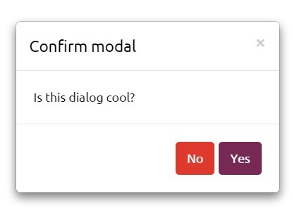
eModal is a Bootstrap 5 modal management pluginb that creates alert, confirm, prompt, Ajax, iframe, and custom dialogs with native promises. It replaces the ceremony of manually constructing Bootstrap modals with a compact, async-friendly API.
If you're works with the legacy Bootstrap 4 & 3 frameworks, download the eModal v1 here.
Features:
- Creates alert, confirmation, prompt, Ajax, iframe, and custom Bootstrap dialogs.
- Returns native promises for every dialog flow.
- Accepts HTML strings or DOM nodes as modal content.
- Supports custom buttons with Bootstrap variants and async click handlers.
- Ssmall, large, extra-large, and fullscreen dialog sizes.
- TypeScript declarations and React hook.
- Removes generated dialog markup after Bootstrap closes the modal.
How To Use It (v2):
Install eModal
Install eModal and its Bootstrap peer dependency from npm. The package includes ESM, CommonJS, UMD, and TypeScript declaration files. React 18 or newer serves as an optional peer dependency for the React adapter.
npm install emodal bootstrap
Basic Usage With CDN Files
The UMD build works in a normal browser page. Load Bootstrap CSS first, Bootstrap JavaScript second, and eModal last. jQuery is not required.
<!doctype html>
<html lang="en">
<head>
  <meta charset="utf-8">
  <meta name="viewport" content="width=device-width, initial-scale=1">
  <title>eModal Basic Example</title>

  <!-- Bootstrap controls the modal layout and theme. -->
  <link
    rel="stylesheet"
    href="https://cdn.jsdelivr.net/npm/[email protected]/dist/css/bootstrap.min.css"
  >
</head>
<body class="p-4">

  <button id="open-account-notice" class="btn btn-primary" type="button">
    Open Account Notice
  </button>

  <!-- Bootstrap must load before the eModal UMD bundle. -->
  <script src="https://cdn.jsdelivr.net/npm/[email protected]/dist/js/bootstrap.bundle.min.js"></script>
  <script src="https://unpkg.com/[email protected]/dist/eModal.min.js"></script>

  <script>
    document
      .querySelector('#open-account-notice')
      .addEventListener('click', function () {
        eModal.alert({
          title: 'Account updated',
          message: '<p class="mb-0">Your notification settings are saved.</p>',
          centered: true
        });
      });
  </script>
</body>
</html>
npm And Module Usage
Import Bootstrap CSS and the default eModal object in an ESM project:
import 'bootstrap/dist/css/bootstrap.min.css';
import eModal from 'emodal';

async function showSaveNotice() {
  await eModal.alert({
    title: 'Profile saved',
    message: '<p class="mb-0">The profile changes are now active.</p>'
  });
}

showSaveNotice();
eModal imports Bootstrap's modal JavaScript in the module build. Your application must load Bootstrap CSS.
Configuration Options
Dialog Options
title(String): Sets the modal heading. The shared default isAttention.subtitle(String): Adds secondary text below the main heading.message(String | Node): Sets the modal body content. String values enter the DOM throughinnerHTML. Pass trusted HTML.bodyClassName(String): Adds custom classes to the generated.modal-bodyelement.className(String): Adds custom classes to the outer.modalelement.size(String): Accepts'',sm,lg,xl, orfullscreen.fullscreen(Boolean): Adds Bootstrap's fullscreen dialog class.buttons(Array | false): Replaces the footer buttons. Set it tofalseto remove the footer.backdrop(Boolean |static): Controls backdrop behavior through Bootstrap's modal API.keyboard(Boolean): Controls Escape key dismissal.focus(Boolean): Controls Bootstrap's focus management.centered(Boolean): Vertically centers the dialog.scrollable(Boolean): Keeps long modal content inside a scrollable dialog body.closeButton(Boolean): Shows or hides the header close button.
Button Options
text(String): Sets the button label.variant(String): Uses a Bootstrap button variant such asprimary,danger,warning,info,light,dark, orlink.value(Any): Sets the value that resolves or rejects the dialog promise.reject(Boolean): Rejects the dialog promise when the button runs.dismiss(Boolean): Controls the generateddata-bs-dismiss="modal"attribute. The default behavior dismisses the modal.autofocus(Boolean): Adds the native autofocus property to the button.attributes(Object): Adds custom HTML attributes to the generated button.onClick(Function): Runs custom button logic. The function receives the dialog context and returns a value, a promise, or no value.
Prompt Options
label(String): Sets the text label above the generated input.placeholder(String): Sets the input placeholder.defaultValue(String): Sets the initial input value.required(Boolean): Adds native required-field validation.
Ajax Options
url(String): Sets the URL thatfetch()requests.request(RequestInit): Passes headers, credentials, method, body, and otherfetch()settings.loadingHtml(String): Replaces the loading indicator shown before the response arrives.errorTitle(String): Replaces the heading inside the Ajax error message.
iFrame Options
url(String): Sets the iframe source URL.
setEModalOptions() accepts these shared default keys: title, closeButton, centered, scrollable, focus, keyboard, backdrop, and loadingHtml.
API Methods
// Open a custom modal and resolve it with a typed button value.
const customDialog = eModal.modal({
  title: 'Choose export format',
  message: '<p class="mb-0">Select the file type for this report.</p>',
  buttons: [
    { text: 'CSV', variant: 'primary', value: 'csv' },
    { text: 'JSON', variant: 'secondary', value: 'json' }
  ]
});

// Open an informational alert.
await eModal.alert('The report is ready.', 'Export complete');

// Open a confirmation dialog.
try {
  const confirmed = await eModal.confirm(
    'Archive this project?',
    'Confirm archive'
  );
} catch (error) {
  // The Cancel button rejects the promise.
}

// Request a text value through a generated input form.
try {
  const label = await eModal.prompt({
    title: 'Rename project',
    label: 'Project name',
    required: true
  });
} catch (error) {
  // The Cancel button rejects the promise.
}

// Load an HTML response through fetch().
const html = await eModal.ajax({
  url: '/account/billing-summary',
  title: 'Billing summary'
});

// Open a page in an iframe modal.
await eModal.iframe({
  url: '/help/keyboard-shortcuts',
  title: 'Keyboard shortcuts',
  size: eModal.size.xl
});

// Close the most recently opened active dialog.
const closedElement = eModal.close();

// Change defaults for later dialogs.
eModal.setEModalOptions({
  centered: true,
  scrollable: true,
  backdrop: 'static'
});

// Use the compatibility alias for setEModalOptions().
eModal.setModalOptions({
  closeButton: true
});

// addLabel() exists as a migration guard and throws an error in v2.
// eModal.addLabel();

// Read size constants.
const largeSize = eModal.size.lg;
const fullscreenSize = eModal.size.fullscreen;

// Read the package version.
const currentVersion = eModal.version;
Each dialog method returns a native promise with three attached properties: element, modal, and close. The element property references the generated modal root. The modal property exposes the Bootstrap Modal instance. The close property hides that dialog instance.
Advanced Examples
Confirm A Destructive Form Submission
<form id="delete-project-form" action="/projects/42/delete" method="post">
  <button class="btn btn-danger" type="submit">Delete Project</button>
</form>
Add the confirmation logic to a bundled JavaScript or TypeScript entry file:
import 'bootstrap/dist/css/bootstrap.min.css';
import eModal from 'emodal';

const form = document.querySelector<HTMLFormElement>(
  '#delete-project-form'
);

form?.addEventListener('submit', async function (event) {
  event.preventDefault();

  try {
    const confirmed = await eModal.confirm({
      title: 'Delete project',
      message: '<p class="mb-0">This action removes the project and its saved reports.</p>',
      backdrop: 'static',
      keyboard: false
    });

    // A header close or other generic dismissal resolves as undefined.
    if (confirmed !== true) {
      return;
    }

    form.submit();
  } catch (error) {
    // The generated Cancel button rejects the promise.
  }
});
The strict confirmed !== true check protects the form from every generic dismissal path.
Collect A Required Workspace Name
Use a prompt when an interface needs one short text value before it continues.
async function requestWorkspaceName() {
  try {
    const workspaceName = await eModal.prompt({
      title: 'Create workspace',
      label: 'Workspace name',
      placeholder: 'Marketing Operations',
      defaultValue: 'New Workspace',
      required: true,
      size: eModal.size.sm
    });

    // Native required validation accepts whitespace characters.
    if (typeof workspaceName !== 'string' || !workspaceName.trim()) {
      return;
    }

    document.querySelector('#workspace-name').textContent =
      workspaceName.trim();
  } catch (error) {
    console.log('Workspace creation canceled');
  }
}
Trim the result in application code when whitespace-only names are invalid.
Load Account Settings Through Ajax
Use ajax() for trusted server-rendered partials from the same application.
const settingsDialog = eModal.ajax({
  url: '/account/notification-settings',
  title: 'Notification settings',
  size: eModal.size.lg,
  request: {
    headers: {
      'X-Requested-With': 'XMLHttpRequest'
    },
    credentials: 'same-origin'
  },
  loadingHtml: `
    <div class="d-flex align-items-center gap-2">
      <span class="spinner-border spinner-border-sm" aria-hidden="true"></span>
      <span>Loading settings...</span>
    </div>
  `,
  errorTitle: 'Settings request failed'
});

settingsDialog
  .then(function (html) {
    console.log('Loaded HTML length:', html.length);
  })
  .catch(function (error) {
    console.error(error);
  });
The method inserts the response with innerHTML. Load trusted HTML and follow normal fetch() CORS rules.
Run Async Work From A Custom Button
Set dismiss: false when a button must finish an async task before the modal closes.
async function openPublishDialog(articleId) {
  try {
    const result = await eModal.modal({
      title: 'Publish article',
      subtitle: 'The public page updates after the request succeeds.',
      message: '<p class="mb-0">Publish the current draft now?</p>',
      backdrop: 'static',
      buttons: [
        {
          text: 'Cancel',
          variant: 'secondary',
          reject: true
        },
        {
          text: 'Publish',
          variant: 'primary',
          dismiss: false,
          autofocus: true,
          attributes: {
            'data-action': 'publish'
          },
          onClick: async function (context) {
            const response = await fetch(
              `/articles/${articleId}/publish`,
              {
                method: 'POST',
                headers: {
                  'Content-Type': 'application/json'
                }
              }
            );

            if (!response.ok) {
              throw new Error(
                `Publish request failed with ${response.status}`
              );
            }

            context.resolve('published');
            context.close();
          }
        }
      ]
    });

    if (result === 'published') {
      console.log('Article published');
    }
  } catch (error) {
    console.error(error);
  }
}
A rejected async handler rejects the modal promise. The dialog stays open until your handler calls context.close() or another action dismisses it.
Use eModal In React
Import the React adapter from emodal/react inside a client-side React component.
import 'bootstrap/dist/css/bootstrap.min.css';
import { useEModal } from 'emodal/react';

export function PublishButton() {
  const modal = useEModal({
    defaults: {
      centered: true,
      backdrop: 'static'
    }
  });

  async function confirmPublish() {
    try {
      const confirmed = await modal.confirm({
        title: 'Publish release notes',
        message: '<p class="mb-0">The public changelog will update immediately.</p>'
      });

      if (confirmed !== true) {
        return;
      }

      console.log('Continue with the publish request');
    } catch (error) {
      console.log('Publish canceled');
    }
  }

  return (
    <button className="btn btn-primary" onClick={confirmPublish}>
      Publish Notes
    </button>
  );
}
The hook exposes alert, confirm, prompt, ajax, iframe, modal, and close. Call these methods in browser-side event handlers or effects.
How to use it (v1, jQuery Version):
1. Load the necessary jQuery library and Bootstrap framework in the document.
<link rel="stylesheet" href="/path/to/cdn/bootstrap.min.css" />
<script src="/path/to/cdn/jquery.min.js"></script>
<script src="/path/to/cdn/bootstrap.min.js"></script>
2. Load the jQuery eModal plugin after jQuery library.
<script src="dist/eModal.js"></script>
3. Create dialog boxes as follows:
var message = "Custom message here";
var title = "Hello World!";

// alert dialog
eModal
.alert(message, title)
.then(function () {
  // do something
});

// confirm dialog
eModal
.confirm(message, title)
.then(
  function (/* DOM */) {
    // Confirm
  },
  function (/*null*/) {
    // Cancel
  }
);

// prompt dialog
eModal
.prompt({
  size: eModal.size.sm,
  message: 'What\'s your name?',
  title: title
})
.then(
  function (input) {
    // message: 'Hi ' + input + '!', title: title, imgURI: 'https://avatars0.githubusercontent.com/u/4276775?v=3&s=89'
  },
  function () {
    // error
});

// ajax popup
var params = {
    buttons: [
     { text: 'Close', close: true, style: 'danger' },
     { text: 'New content', close: false, style: 'success', click: ajaxDemo }
    ],
    size: eModal.size.lg,
    title: title,
    url: 'https://example.com/api/'
};
eModal
.ajax(params)
.then(function () {
  // do something
});

// embed popup
// ideal for Google Maps, Youtube Videos, etc
params = {
  async: true,
  iframe: {
    url: 'https://www.youtube.com/embed/s8Iar_t7CW4',
    attributes: {
      'id': 'youtube',
      'allow': 'autoplay; encrypted-media',
      'allowfullscreen': true
    }
  },
  buttons: [
    {
      close: true,
      text: 'Close'
    }
  ],
  onHide: hiddenModal,
  useBin: true,
  binId: 'youtube-demo'
};
$.eModal
.embed(params, title)
.then(function(html){
  console.info('Video is visible.');
});
4. Full plugin options.
var options = {
// animation type
animation: 'fade',
// returns a Promise, that is resolved when the modal is closed
async: false,
// ajax options
ajax: {
'dataType': false, // string
'error': false, // function
'loading': false, // boolean
'loadingHtml': LOADING, // string
'success': false, // function
'url': false, // string
'xhr': {} // object
},
// unique identifier of the content saved in the recycle bin
binId: false,
// inline CSS styles
bodyStyles: false,
// custom buttons
// Array, String, false, null
buttons: [
{text: 'Ok', style: 'info', close: true, click: eventA },
{text: 'KO', style: 'danger', close: true, click: eventB }
],
// confirm options
confirm: {
'label': Object.keys(LABELS)[0],
'style': []
},
// additional CSS classes
cssClass: false,
// shows footer
footer: true,
// shows header
header: true,
// shows close button in the header
headerClose: true,
headerCloseHtml: '<button type="button" class="x close" data-dismiss="modal" aria-label="Close">' +
'<span aria-hidden="true">×</span>' +
'</button>', // string
// height
height: false,
id: false,
// unique ID
iframe: {
'attributes': {},
'loadingHtml': LOADING,
'url': false
},
// message
message: false,
// Bootstrap modal options
modalOptions: {},
// close by clicking the overlay
overlayClose: true,
// onHide function
onHide: false,
// position
position: ['top', 'center'],
// prompt options
prompt: {
'autocomplete': false, // boolean
'autofocus': false, // boolean
'checkValidity': false, // boolean
'label': Object.keys(LABELS)[0], // string
'pattern': false, // string
'placeholder': false, // string
'required': true, // boolean
'style': [], // array
'type': 'text', // string
'value': false // string
},
// small (sm), large (lg) and extra large (xl)
size: EMPTY,
// subtitle
subtitle: false,
// title
title: 'Attention',
// If set to true, $.eModal keeps the content uploaded in the body element of the modal in a recycle bin can
// So that it can be recalled without a new upload from the web
useBin: false,
// width
width: false,
// custom wrapper element
wrapSubtitle: '<small>',
wrapTitle': '<h5>',
};
5. API methods.
// close
$.eModal.close

// add new labels
// it takes two arguments: confirm button label and reject button label
$.eModal.label

// return the jQuery object of the modal dialog
$.eModal.modal

// return the Promise to be able to perform a resolve or reject.
$.eModal.defer

// add a size to those provided by Bootstrap (sm, lg, xl)
$.eModal.size

// empty the recycle bin
$.eModal.emptyBin
Alternatives And Related Resources
- Async Modal Dialog That Replaces window.prompt - bsPrompt
- Create Dynamic Bootstrap 5 Modals with One JS Call
- Easy Confirmation Dialogs for Bootstrap 5/4/3
- Customizable Confirmation & Prompt Dialog Plugin For Bootstrap 5/4
- 10 Best Dialog Plugins To Replace The Native JS Popup Boxes
Changelog:
v2 (2026-07-23)
- Major update
v2.1.3 (2024-04-19)
- Bugfixes
v2.1.2 (2023-09-23)
- Update
v2.1.1 (2023-09-14)
- Update
v2.1.0 (2022-05-19)
- Update
v2.0.0 (2022-05-17)
- Completely reengineered
v1.2.69 (2020-04-15)
- Fixed for Bootstrap 4.
2018-12-21
- Update
2018-12-20
- fixed for jQuery 3+.
- fix default settings size
2016-11-03
- use ajax.done instead success
2016-11-02
- Add Scroller
2016-01-19
- Set Q as option to AMD modules
2015-11-13
- Fix $modal not defined issue on first load
2015-10-14
- eModal Deferred from jQuery
This awesome jQuery plugin is developed by Reload-Lab. For more Advanced Usages, please check the demo page or visit the official website.