Animated Circular Progress Bar with jQuery and Canvas - Circle Progress
| File Size: | 29.5 KB |
|---|---|
| Views Total: | 69715 |
| Last Update: | |
| Publish Date: | |
| Official Website: | Go to website |
| License: | MIT |
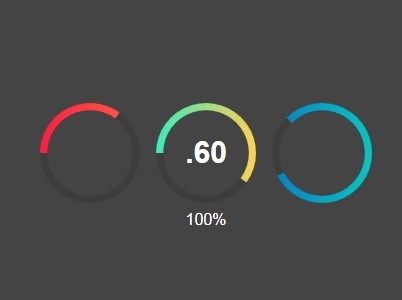
Circle Progress is a jQuery plugin that makes use of canvas element to draw an animated circular gradient progress bar in your web page/app.
See also:
- CProgress - jQuery Circular Progress Bar Plugin
- Circular Percentage Loader Plugin with jQuery and Canvas - ClassyLoader
- Percentage Loader - jQuery Progress Bar Plugin
Installation:
bower install --save jquery-circle-progress
npm install --save jquery-circle-progress
How to use it:
1. Load the jQuery library and the jQuery circle progress plugin at the end of the web page.
<script src="//ajax.googleapis.com/ajax/libs/jquery/1.11.1/jquery.min.js"></script>
<script src="circle-progress.js"></script>
2. Create an empty container where you want to place the progress bar.
<div class="first "></div>
3. The Javascript to generate a basic progress bar with customization options.
$('.demo').circleProgress({
value: 0.35,
fill: {
  gradient: ['#3aeabb', '#fdd250'] // or color: '#3aeabb', or image: 'http://i.imgur.com/pT0i89v.png'
},
});
4. All the default options.
$('.demo').circleProgress({
/**
 * This is the only required option. It should be from 0.0 to 1.0
 * @type {number}
 */
value: 0.0,

/**
 * Size of the circle / canvas in pixels
 * @type {number}
 */
size: 100.0,

/**
 * Initial angle for 0.0 value in radians
 * @type {number}
 */
startAngle: -Math.PI,

/**
 * Width of the arc. By default it's auto-calculated as 1/14 of size, but you may set it explicitly in pixels
 * @type {number|string}
 */
thickness: 'auto',

/**
 * Fill of the arc. You may set it to:
 *   - solid color:
 *   - { color: '#3aeabb' }
 *   - { color: 'rgba(255, 255, 255, .3)' }
 *   - linear gradient (left to right):
 *   - { gradient: ['#3aeabb', '#fdd250'], gradientAngle: Math.PI / 4 }
 *   - { gradient: ['red', 'green', 'blue'], gradientDirection: [x0, y0, x1, y1] }
 *   - image:
 *   - { image: 'http://i.imgur.com/pT0i89v.png' }
 *   - { image: imageObject }
 *   - { color: 'lime', image: 'http://i.imgur.com/pT0i89v.png' } - color displayed until the image is loaded
 */
fill: {
  gradient: ['#3aeabb', '#fdd250']
},

/**
 * Color of the "empty" arc. Only a color fill supported by now
 * @type {string}
 */
emptyFill: 'rgba(0, 0, 0, .1)',

/**
 * Animation config (see jQuery animations: http://api.jquery.com/animate/)
 */
animation: {
  duration: 1200,
  easing: 'circleProgressEasing'
},

/**
 * Default animation starts at 0.0 and ends at specified `value`. Let's call this direct animation.
 * If you want to make reversed animation then you should set `animationStartValue` to 1.0.
 * Also you may specify any other value from 0.0 to 1.0
 * @type {number}
 */
animationStartValue: 0.0,

/**
 * Reverse animation and arc draw
 * @type {boolean}
 */
reverse: false,

/**
 * Arc line cap ('butt' (default), 'round' and 'square')
 * Read more: https://developer.mozilla.org/en-US/docs/Web/API/CanvasRenderingContext2D.lineCap
 * @type {string}
 */
lineCap: 'butt',
});
Change logs:
v1,2,2 (2017-04-24)
- Update easing function declaration. Bump the next version.
v1,2,1 (2017-01-09)
- Fix UMD CommonJS export
v1,2,0 (2016-09-01)
- Feature: allow to append or prepend the <canvas> element
- AMD & CommonJS support implemented
2016-08-17
- Add a new event that is triggered when the circle progress bar is inited or re-inited.
v1.1.3 (2015-06-15)
- you can specify any config option as HTML data- attribute.
2014-12-31
- Version 1.1.2
2014-10-31
- Minor fixes
2014-10-19
- update.
2014-09-28
- v0.7
2014-08-27
- v0.6.1
- Added more options.
2014-08-26
- v0.6
- Examples updated.
2014-08-24
- Anti-aliasing provided for Chrome
This awesome jQuery plugin is developed by kottenator. For more Advanced Usages, please check the demo page or visit the official website.