Minimal CSS3 Animated Top Notification Bar with jQuery - Notifier-CSS3
| File Size: | 3.12 KB |
|---|---|
| Views Total: | 1989 |
| Last Update: | |
| Publish Date: | |
| Official Website: | Go to website |
| License: | MIT |
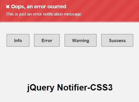
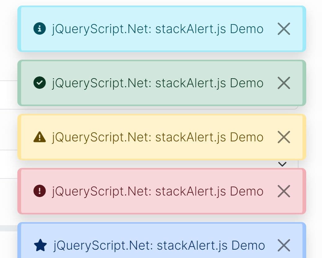
A minimalist notification system which uses jQuery and CSS3 animations to display info, error, warning, success notification bars at the top or bottom of your webpage.
How to use it:
1. Create a notification message to be displayed on page load as follow.
<div class="info message" id="notify_autopop">
   <h3>FYI, I only show up when the page loads!</h3>
   <p>This is just info notification message.</p>
</div>
2. Style the notification message.
.message {
  -webkit-background-size: 40px 40px;
  -moz-background-size: 40px 40px;
  background-size: 40px 40px;
  background-image: -webkit-gradient(linear, left top, right bottom,  color-stop(.25, rgba(255, 255, 255, .05)), color-stop(.25, transparent),  color-stop(.5, transparent), color-stop(.5, rgba(255, 255, 255, .05)),  color-stop(.75, rgba(255, 255, 255, .05)), color-stop(.75, transparent),  to(transparent));
  background-image: -webkit-linear-gradient(135deg, rgba(255, 255, 255, .05) 25%, transparent 25%,  transparent 50%, rgba(255, 255, 255, .05) 50%, rgba(255, 255, 255, .05) 75%,  transparent 75%, transparent);
  background-image: -moz-linear-gradient(135deg, rgba(255, 255, 255, .05) 25%, transparent 25%,  transparent 50%, rgba(255, 255, 255, .05) 50%, rgba(255, 255, 255, .05) 75%,  transparent 75%, transparent);
  background-image: -ms-linear-gradient(135deg, rgba(255, 255, 255, .05) 25%, transparent 25%,  transparent 50%, rgba(255, 255, 255, .05) 50%, rgba(255, 255, 255, .05) 75%,  transparent 75%, transparent);
  background-image: -o-linear-gradient(135deg, rgba(255, 255, 255, .05) 25%, transparent 25%,  transparent 50%, rgba(255, 255, 255, .05) 50%, rgba(255, 255, 255, .05) 75%,  transparent 75%, transparent);
  background-image: linear-gradient(135deg, rgba(255, 255, 255, .05) 25%, transparent 25%,  transparent 50%, rgba(255, 255, 255, .05) 50%, rgba(255, 255, 255, .05) 75%,  transparent 75%, transparent);
  -moz-box-shadow: inset 0 -1px 0 rgba(255,255,255,.4);
  -webkit-box-shadow: inset 0 -1px 0 rgba(255,255,255,.4);
  box-shadow: inset 0 -1px 0 rgba(255,255,255,.4);
  width: 100%;
  border: 1px solid;
  color: #fff;
  padding: 15px;
  position: fixed;
  _position: absolute;
  text-shadow: 0 1px 0 rgba(0,0,0,.5);
  -webkit-animation: animate-bg 5s linear infinite;
  -moz-animation: animate-bg 5s linear infinite;
}

.info {
  background-color: #4ea5cd;
  border-color: #3b8eb5;
}
3. Add an animated background to the notification message using CSS3 @keyframes.
@-webkit-keyframes
animate-bg {  from {
 background-position: 0 0;
}

to { background-position: -80px 0; }
}

@-moz-keyframes
animate-bg {  from {
 background-position: 0 0;
}

to { background-position: -80px 0; }
}
4. The main function. You must add the following JavaScript snippets after jQuery JavaScript library.
$.fn.notify = function(settings_overwrite){

  // options
  settings = {
      placement:"top", // top of bottom
      default_class: ".message",
      delay:0
  };
  $.extend(settings, settings_overwrite);

  $(settings.default_class).each(function(){$(this).hide();});

  $(this).show().css(settings.placement, -$(this).outerHeight());
  obj = $(this);

  if(settings.placement == "bottom"){
      setTimeout(function(){obj.animate({bottom:"0"}, 500)},settings.delay);
  }
  else{
      setTimeout(function(){obj.animate({top:"0"}, 500)},settings.delay);
  }
}
5. Display the notification message you just create once the webpage is loaded completely.
$("#notify_autopop").notify({
  // OPTIONS here
});
This awesome jQuery plugin is developed by SammyHerring. For more Advanced Usages, please check the demo page or visit the official website.