Mobile Friendly jQuery Stick Element Plugin - StickyComponent
| File Size: | 9.15 KB |
|---|---|
| Views Total: | 1040 |
| Last Update: | |
| Publish Date: | |
| Official Website: | Go to website |
| License: | MIT |
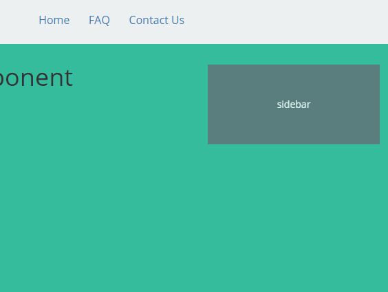
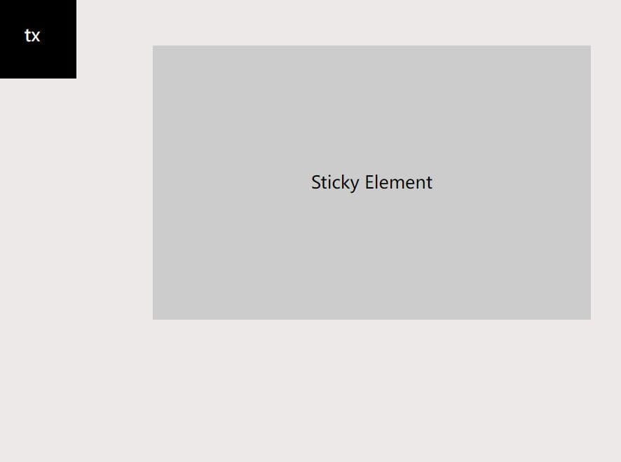
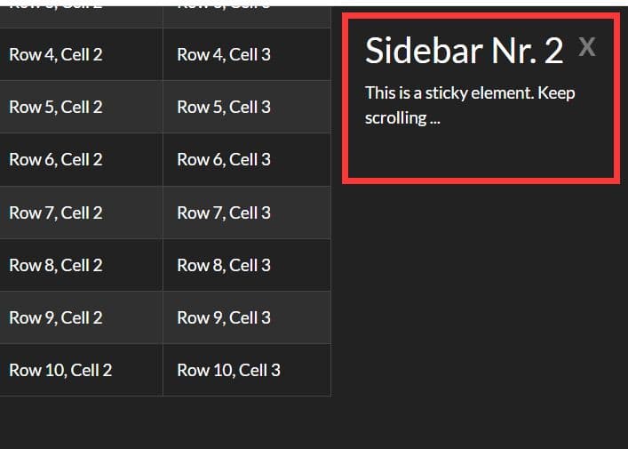
StickyComponent is a simple yet fully configurable jQuery plugin for making any elements sticky on page scroll that will be auto disabled on small screen devices.
More features:
- Custom top/bottom offset.
- Custom trigger position.
- Custom start/end point.
- Auto adds a custom CSS class when a specified element is stuck.
Basic usage:
1. Link to the latest version of jQuery library before the stickycomponent.js in your html markup.
<script src="//code.jquery.com/jquery.min.js"></script>
<script src="stickycomponent.js"></script>
2. Attach the plugin to target elements (navigation, sidebar, etc.) and we're done.
$('.sidebar').fgStickyComponent();
3. Customization options with default values.
$('.sidebar').fgStickyComponent({

  // top/bottom offset in pixels
  topoffset: 75,
  bottomoffset: 75,

  // top trigger in pixels
  triggertop: 150,

  // start/end point
  startselector: undefined,
  stopselector: 'footer',

  // active CSS class
  activeclass: 'fg-sticky-active',

  // disable the plugin when the screen size < 990px
  removesize: 990,

  // debug mode
  debug: false,

  // callback
  onInit: function() {}

});
4. API events.
$('.sidebarbox').on('fg.stickycomponent.active', function(e, global, wtop){
  // when active
})

$('.sidebarbox').on('fg.stickycomponent.normal', function(e, global, wtop){
  // when inactive
})

$('.sidebarbox').on('fg.stickycomponent.bottom', function(e, global, wtop){
  // when reaching the bottom
})
This awesome jQuery plugin is developed by sturple. For more Advanced Usages, please check the demo page or visit the official website.