Basic Responsive Math Calculator With jQuery
| File Size: | 4.16 KB |
|---|---|
| Views Total: | 3577 |
| Last Update: | |
| Publish Date: | |
| Official Website: | Go to website |
| License: | MIT |
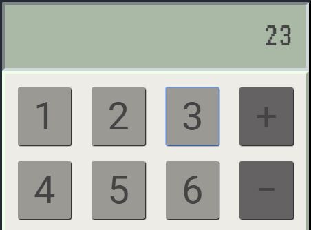
A small, basic, responsive math calculator app built using jQuery, HTML, CSS, and Bootstrap grid layout system.
How to use it:
1. Include the necessary jQuery JavaScript library and Bootstrap's stylesheet on the web page.
<script src="jquery.min.js"></script>
<link rel="stylesheet" href="bootstrap.min.css">
2. The HTML structure for the math calculator.
<div class="calc-main">
<div class="panel panel-default">
<div class="panel-heading" id="results-window">
<h1 id="result"></h1>
</div>
<div class="panel-body">
<div class="row">
<div class="col-xs-3">
<button id="button-1" class="btn number" value="1">
<h1>1</h1>
</button>
</div>
<div class="col-xs-3">
<button id="button-2" class="btn number" value="2">
<h1>2</h1>
</button>
</div>
<div class="col-xs-3">
<button id="button-3" class="btn number" value="3">
<h1>3</h1>
</button>
</div>
<div class="col-xs-3">
<button id="button-plus" class="btn operator" value="+">
<h1>+</h1>
</button>
</div>
</div>
<br>
<div class="row">
<div class="col-xs-3">
<button id="button-4" class="btn number" value="4">
<h1>4</h1>
</button>
</div>
<div class="col-xs-3">
<button id="button-5" class="btn number" value="5">
<h1>5</h1>
</button>
</div>
<div class="col-xs-3">
<button id="button-6" class="btn number" value="6">
<h1>6</h1>
</button>
</div>
<div class="col-xs-3">
<button id="button-minus" class="btn operator" value="-">
<h1>−</h1>
</button>
</div>
</div>
<br>
<div class="row">
<div class="col-xs-3">
<button id="button-7" class="btn number" value="7">
<h1>7</h1>
</button>
</div>
<div class="col-xs-3">
<button id="button-8" class="btn number" value="8">
<h1>8</h1>
</button>
</div>
<div class="col-xs-3">
<button id="button-9" class="btn number" value="9">
<h1>9</h1>
</button>
</div>
<div class="col-xs-3">
<button id="button-multiply" class="btn operator" value="*">
<h1>×</h1>
</button>
</div>
</div>
<br>
<div class="row">
<div class="col-xs-3">
<button id="button-0" class="btn number" value="0">
<h1>0</h1>
</button>
</div>
<div class="col-xs-3">
<button id="button-." class="btn number" value=".">
<h1>.</h1>
</button>
</div>
<div class="col-xs-3">
<button id="button-divide" class="btn operator" value="/">
<h1>÷</h1>
</button>
</div>
<div class="col-xs-3">
<button id="button-power" class="btn operator" value="^">
<h1>^</h1>
</button>
</div>
</div>
<br>
<div class="row">
<div class="col-xs-2"></div>
<div class=" col-xs-5">
<button id="button-clear" class="btn btn-default clear" value="clear">
<h1>clear</h1>
</button>
</div>
<div class="col-xs-5">
<button id="button-equal" class="btn equal" value="=">
<h1>=</h1>
</button>
</div>
</div>
</div>
</div>
</div>
3. Include the main JavaScript calc.js at the bottom of the web page.
<script src="calc.js"></script>
4. Style the math calculator.
#results-window {
  min-height: 100px;
  text-align: right;
  background-color: #aab9a6;
  border: .3em inset #cfd6dc;
}

.calc-main {
  width: 40%;
  min-width: 320px;
  margin: 4em auto;
}

.panel-default {
  border: .6em outset #242b35;
  border-radius: 2%;
}

.panel-body {
  background-color: #edece7;
  border: .3em outset #edffe7;
  padding: 1.5em;
}

#result {
  font-family: 'VT323', monospace;
  font-size: 4em;
  overflow: hidden;
  white-space: nowrap;
  text-overflow: "";
}

.btn {
  width: 100%;
  color: #fff;
  box-shadow: 1px 1px 1px black
}

.calc-main h1 { margin: .1em; }

.number { background-color: #9a9994; }

.operator { background-color: #646263; }

.equal { background-color: #5786a2; }

.clear { color: #cc0404; }

@media screen and (max-width: 920px) {

.btn h1 { font-size: 28px }

}

@media screen and (max-width: 880px) {

.btn h1 { font-size: 20px }

}
This awesome jQuery plugin is developed by mkdoh3. For more Advanced Usages, please check the demo page or visit the official website.