Responsive jQuery Frame Emulator For Mobile Development - rFrame
| File Size: | 89.3 KB |
|---|---|
| Views Total: | 5429 |
| Last Update: | |
| Publish Date: | |
| Official Website: | Go to website |
| License: | MIT |
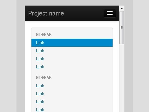
rFrame is an useful jQuery plugin that emulates the view port sizes of a handful (for now) of devices to give you a rough idea of how your web site/application might look on that device. It supports iPhone 5, iphone4, iPad, Kindle and Android for now, and only works in Chrome and Safari.
How to use it:
1. Include jQuery Library and jQuery rFrame on the web page
<script src="http://ajax.googleapis.com/ajax/libs/jquery/1.9.1/jquery.min.js"></script>
<script src="js/jquery.rframe.js"></script>
2. Create a selection menu to pick a device and orientation
3. Call the plugin
<script>
jQuery(function ($) {
    $.rFrame();
});
</script>
4. Options
$.rFrame({
    background : '#dedede',/* 'body' background color */
    color : '#dedede',/* toolbar text color */
    toolbar_bg: '#333',/* toolbar background color */
    btn_bg: '#3e8ec0',/* Portrait/Landscape button background color  */
    btn_color: '#fff',/* Portrait/Landscape button text color  */
    font: 'Verdana',/* toolbar font  */
    device:'iPhone5',/* default device */
    device_color : '#d0d0d0',/* device color */
    view : 0,/* default orientation, portrait = 0, landscape = 1 */
    forkme: true,/* show Github forkme banner */
});
Change log:
v0.0.3 (2013-08-07)
- Now rewriting DOM with iFrame content instead of appending it.
This awesome jQuery plugin is developed by seyDoggy. For more Advanced Usages, please check the demo page or visit the official website.

