Test Responsive And Device-specific Viewports Using jQuery - easyViewport
| File Size: | 4.55 KB |
|---|---|
| Views Total: | 901 |
| Last Update: | |
| Publish Date: | |
| Official Website: | Go to website |
| License: | MIT |
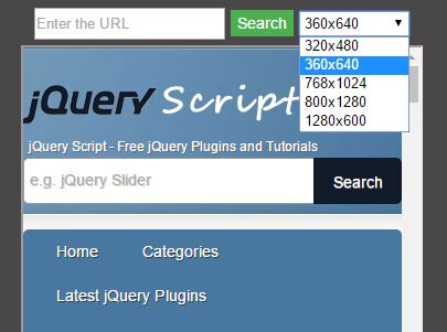
easyViewport is a jQuery plugin that simulates Mobile/Tablet/Desktop viewports to test how your webpage will look on a range of screen sizes/resolutions. Similar to the Google Chrome's Device Mode tool. A great online tool to help you create responsive and mobile friendly webpages.
Pre-defined screen sizes:
- 320x480
- 360x640
- 768x1240
- 800x1280
- 1280x600
See also:
- jQuery Plugin To Test Your Website In Multiple Types of Screen
- jQuery Plugin To Test Website On Different Screen Resolutions - Previewer
How to use it:
1. Create a container for the plugin where you can select a screen size from a dropdown menu.
<div id="myViewport" class="viewport"></div>
2. Load the jQuery easyViewport plugin after loading jQuery JavaScript library.
<script src="//code.jquery.com/jquery.min.js"></script>
<script src="easyViewport.js"></script>
3. Initialize the plugin.
$("#myViewport").easyViewport();
4. Modify or override the default plugin styles as displayed below.
.viewport {
  padding-top: 10px;
  text-align: center;
  background-color: #494747
}

.viewport iframe { margin-top: 5px; }

.viewport button {
  background-color: #4CAF50;
  border: none;
  color: white;
  text-align: center;
  margin-left: 5px;
  margin-right: 5px;
  text-decoration: none;
  display: inline-block;
  font-size: 14px;
  height: 24px;
}

.viewport select {
  width: 100px;
  height: 23px;
}

.viewport input { height: 23px; }
5. Default plugin options.
$("#myViewport").easyViewport({

  // default webpage
  url: "http://jqueryscript.net/",

  // default screen size
  width: 320,
  height: 480

});
This awesome jQuery plugin is developed by Gabrielr47. For more Advanced Usages, please check the demo page or visit the official website.