jQuery Plugin To Test Website On Different Screen Resolutions - Previewer
| File Size: | 382 KB |
|---|---|
| Views Total: | 2705 |
| Last Update: | |
| Publish Date: | |
| Official Website: | Go to website |
| License: | MIT |
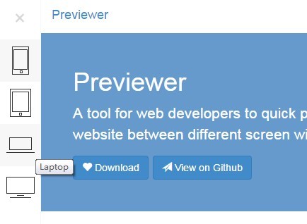
Previewer is a jQuery based responsive design tool that allows you to preview / test your website at different screen resolutions including desktop, mobile, tablet, and laptop.
See also:
How to use it:
1. Include jQuery library together with jQuery previewer plugin's stylesheet and JS files on the web page.
<script src="jquery.js"></script>
...
<link  href="previewer.css" rel="stylesheet">
<script src="previewer.js"></script>
2. Basic usage. Call the method previewer() with default parameters on body tag.
$("body").previewer()
3. Available parameters.
// Show the preview page directly
// Type: Boolean
show: false,

// Default preview type
// Type: String
type: 'phone',

// Screen widths
// Type: Number
phone: 480,
tablet: 768,
laptop: 992,
desktop: 1200
4. Public methods.
// Show the previewer.
$.previewer('show');

// Hide the previewer.
$.previewer('hide');

// Destroy the previewer.
$.previewer('destroy');
Change log:
v0.1.0 (2015-07-04)
- Supports six options: "show", "type", "phone", "tablet", "laptop", "desktop"
- Supports three methods: "show", "hide", "destroy"
This awesome jQuery plugin is developed by fengyuanchen. For more Advanced Usages, please check the demo page or visit the official website.