Minimal Themeable JavaScript Tabs Plugin - CardTabs
| File Size: | 12.6 KB |
|---|---|
| Views Total: | 2855 |
| Last Update: | |
| Publish Date: | |
| Official Website: | Go to website |
| License: | MIT |
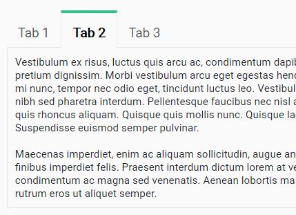
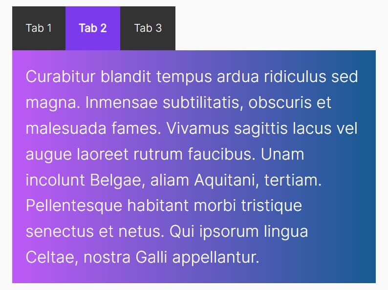
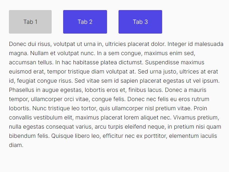
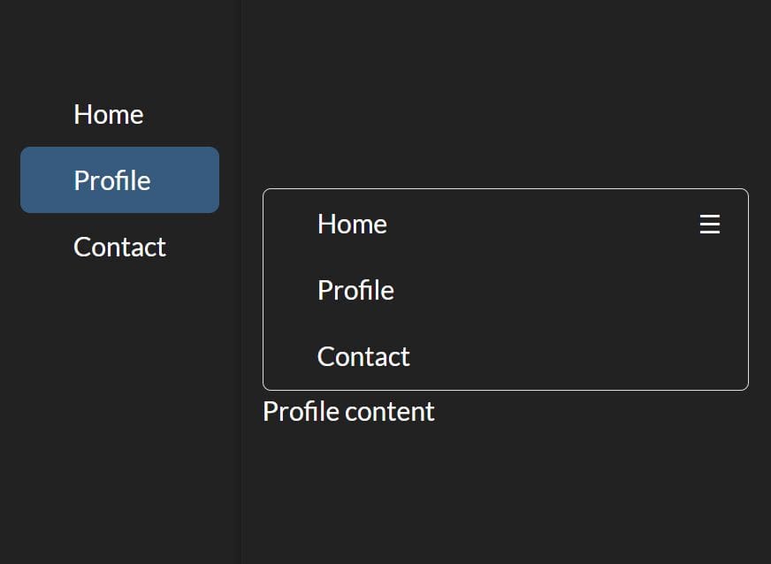
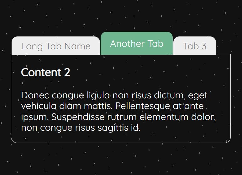
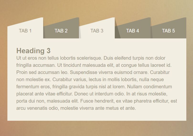
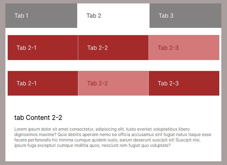
CardTabs is an ultra-light jQuery Vanilla JS tabs plugin that automatically creates tabs to switch between tabbed content on click.
How to use it:
1. Include the CardTabs JS plugin's files on the web page.
<link rel="stylesheet" href="cardtabs.css">
<script src="cardtabs.js"></script>
2. Create the tabbed content and define the tab names in the data-tab attribute:
<div class="demo">
  <div data-tab="tab 1">
    Tab 1 content
  </div>
  <div data-tab="tab 2">
    Tab 2 content
  </div>
  <div data-tab="tab 3">
    Tab 3 content
  </div>
  ...
</div>
3. Call the main function cardTabs on the top container and done.
cardTabs('.demo');
4. The plugin comes with 4 themes from which you can choose during init.
cardTabs('.demo', {
  theme: 'inset'
});
5. If you'd like to set the active tab on page load:
<div class="active" data-tab="tab 2">
  Tab 2 content
</div>
6. You're also allowed to create your own themes in the CSS as this:
/*  Green gray slate */
div.card-tabs-bar.graygreen {
  border-bottom: 1px solid #e5e5e5;
  border-radius: 3px;
}

div.card-tabs-bar.graygreen a {
  padding: 15px;
  border-radius: 0px;
  margin: 0;
  padding-bottom: 10px;
  margin-bottom: -2px;
  font-size: 17px;
}

div.card-tabs-bar.graygreen a.active {
  background-color: #fafafa;
  border-top: 4px solid #2CC185;
}

div.card-tabs-stack.graygreen div[data-tab] {
  padding: 10px;
  background-color: #fafafa;
  border: 1px solid #e5e5e5;
  border-top: none;
  border-radius: 3px;
}
Changelog:
2026-10-13
- removed jQuery dependency
2018-03-29
- Bugfixed
This awesome jQuery plugin is developed by blekerfeld. For more Advanced Usages, please check the demo page or visit the official website.