Custom Tabs UI Templates With jQuery And CSS
| File Size: | 17.7 KB |
|---|---|
| Views Total: | 1299 |
| Last Update: | |
| Publish Date: | |
| Official Website: | Go to website |
| License: | MIT |
Tabs are very useful in web development as they save a lot of space and look neat as well. I love using them and you will see them used in my projects very often. On this page, I have brought together a collection of seveal awesome tabs UI templates which can be very useful for your next project. Let's get started.
Table Of Contents:
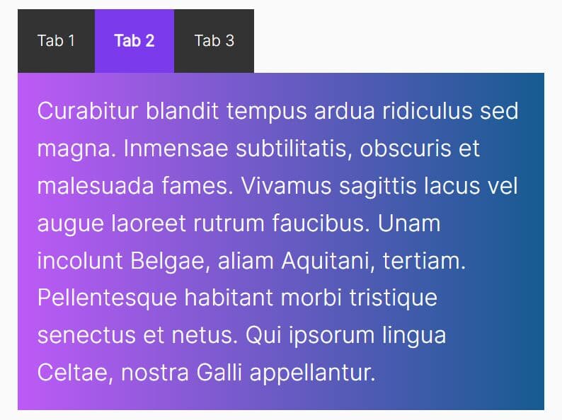
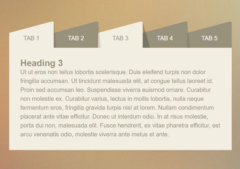
Simple Tabs
This example shows how to create a basic tabs UI that uses jQuery to toggle CSS classes when switch between tabs.
<!-- HTML -->
<div class="myTabs">
  <div class="tabsTitle">
    <a class="tabButton">Tab 1</a>
    <a class="tabButton">Tab 2</a>
    <a class="tabButton">Tab 3</a>
  </div>
  <div class="tabsContent">
    <div class="tabContent">
      <h2>tab Content 1</h2>
    </div>
    <div class="tabContent">
      <h2>tab Content 2</h2>
    </div>
    <div class="tabContent">
      <h2>tab Content 3</h2>
    </div>
  </div>
</div>
/* Required CSS */
.myTabs{
  margin:25px auto;
  max-width: 80%;
}
.myTabs .tabsContent{
  width: 100%;
}
.myTabs .tabsTitle{
  display: flex;
  flex-wrap: wrap;
}
.myTabs .tabsTitle .tabButton{
  padding:25px;
  background-color:#838181;
  color:#ffffff;
  font-size:16px;
  border-left:1px solid lightgray;
  flex:1;
  cursor: pointer;
}
.myTabs .tabsTitle .tabButton:hover{
  background-color:#5a5858;
}
.myTabs .tabsTitle .tabButton.active{
  background-color:#ffffff;
  color:#5a5858;
  font-weight: bold;
}
.myTabs .tabsTitle .tabButton:first-child{
  border-left:none;
}
.myTabs .tabsContent .tabContent{
  background-color:#ffffff;
  padding:25px;
  font-size:12px;
  display: none;
}
.myTabs .tabsContent .tabContent.active{
  display: block;
}
// jQuery Script
var tab = $('.tabsTitle .tabButton'),
    content= $('.tabsContent .tabContent');
tab.filter(':first').addClass("active");
content.filter(':first').addClass("active").show();
tab.click(function () {
  var indis = $(this).index();
  tab.removeClass('active').eq(indis).addClass("active");
  content.removeClass("active").hide().eq(indis).addClass("active").show();
  return false;
})
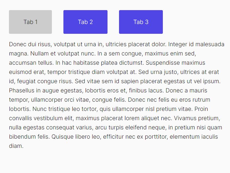
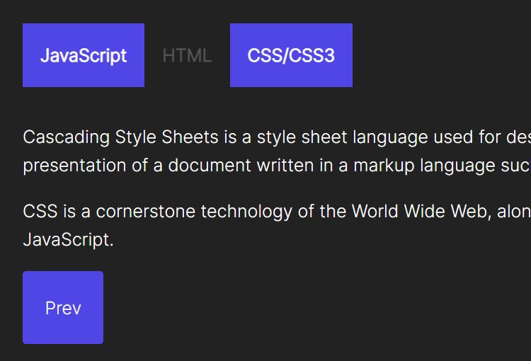
Simple Tabs UI With ID
This example shows how to create a basic tabs UI where each tab has an unique ID.
<!-- HTML -->
<div class="myTabs">
  <div class="tabsTitle">
    <a href="#tab1" class="tabButton">Tab 1</a>
    <a href="#tab2" class="tabButton">Tab 2</a>
    <a href="#tab3" class="tabButton">Tab 3</a>
  </div>
  <div class="tabsContent">
    <div id="tab3" class="tabContent">
      <h2>tab Content 3</h2>
    </div>
    <div id="tab1" class="tabContent">
      <h2>tab Content 1</h2>
    </div>
    <div id="tab2" class="tabContent">
      <h2>tab Content 2</h2>
    </div>
  </div>
</div>
/* Required CSS */
.myTabs{
  margin:25px auto;
  max-width: 80%;
}
.myTabs .tabsContent{
  width: 100%;
}
.myTabs .tabsTitle{
  display: flex;
  flex-wrap: wrap;
}
.myTabs .tabsTitle .tabButton{
  padding:25px;
  background-color:#838181;
  color:#ffffff;
  font-size:16px;
  border-left:1px solid lightgray;
  flex:1;
  cursor: pointer;
}
.myTabs .tabsTitle .tabButton:hover{
  background-color:#5a5858;
}
.myTabs .tabsTitle .tabButton.active{
  background-color:#ffffff;
  color:#5a5858;
  font-weight: bold;
}
.myTabs .tabsTitle .tabButton:first-child{
  border-left:none;
}
.myTabs .tabsContent .tabContent{
  background-color:#ffffff;
  padding:25px;
  font-size:12px;
  display: none;
}
.myTabs .tabsContent .tabContent.active{
  display: block;
}
// jQuery Script
var tab = $('.tabsTitle .tabButton'),
    content= $('.tabsContent .tabContent');

if(location.hash){
  tab.filter('[href="'+location.hash+'"]').addClass('active');
  content.removeClass('active').filter(location.hash).addClass('active');
} else{
  tab.filter(':first').addClass("active");
  content.filter(':first').addClass("active");
}

tab.click(function () {
  if(location.hash){
    var tabid = location.hash;
  } else {
    var tabid = $(this).attr("href");
  }
  tab.removeClass("active").filter('[href="'+tabid+'"]').addClass("active");
  content.removeClass("active").filter(tabid).addClass("active");
});

$(window).bind('hashchange',function(){
  tab.trigger("click");
});
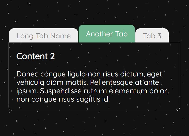
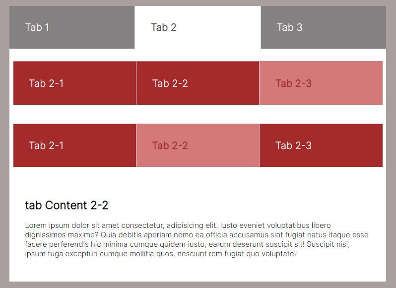
Nested Tabs UI
This example shows how to create a nested tabs UI.
<!-- HTML -->
<div class="myTabs">
  <div class="tabsTitle">
    <a class="tabButton active">Tab 1</a>
    <a class="tabButton">Tab 2</a>
    <a class="tabButton">Tab 3</a>
  </div>
  <div class="tabsContent">
    <div class="tabContent active">
      <h2>tab Content 1</h2>
    </div>
    <div class="tabContent">
      <div class="tabsTitle">
        <a class="tabButton">Tab 2-1</a>
        <a class="tabButton active">Tab 2-2</a>
        <a class="tabButton">Tab 2-3</a>
      </div>
      <div class="tabsContent">
        <div class="tabContent">
          <h2>tab Content 2-1</h2>
        </div>
        <div class="tabContent active">
          <h2>tab Content 2-2</h2>
        </div>
        <div class="tabContent">
          <div class="tabsTitle">
            <a class="tabButton">Tab 2-1</a>
            <a class="tabButton active">Tab 2-2</a>
            <a class="tabButton">Tab 2-3</a>
          </div>
          <div class="tabsContent">
            <div class="tabContent">
              <h2>tab Content 2-1</h2>
            </div>
            <div class="tabContent active">
              <h2>tab Content 2-2</h2>
            </div>
            <div class="tabContent">
              <h2>tab Content 2-3</h2>
            </div>
          </div>
        </div>
      </div>
    </div>
    <div class="tabContent">
      <h2>tab Content 3</h2>
    </div>
  </div>
</div>
/* Required CSS */
.myTabs{
  margin:25px auto;
  max-width: 80%;
}
.myTabs .tabsContent{
  width: 100%;
}
.myTabs .tabsTitle{
  display: flex;
  flex-wrap: wrap;
}
.myTabs .tabsTitle .tabButton{
  padding:25px;
  background-color:#838181;
  color:#ffffff;
  font-size:16px;
  border-left:1px solid lightgray;
  flex:1;
  cursor: pointer;
  transition: all .3s ease-in-out;
}
.myTabs .tabsTitle .tabButton:hover{
  background-color:#5a5858;
}
.myTabs .tabsTitle .tabButton.active{
  background-color:#ffffff;
  color:#5a5858;
  font-weight: bold;
}
.myTabs .tabsTitle .tabButton:first-child{
  border-left:none;
}
.myTabs .tabsContent .tabContent{
  background-color:#ffffff;
  padding:25px;
  font-size:12px;
  display: none;
}
.myTabs .tabsContent .tabContent.active{
  display: block;
}
.myTabs .tabsContent .tabContent.submain{
  padding:10px 0 0;
}
.myTabs .tabsContent .tabContent.submain .tabsTitle{
  width: 98%;
  margin:10px auto;
}
.myTabs .tabsContent .tabContent.submain .tabsTitle .tabButton{
  background-color:brown;
  border-top:1px solid #d47979;
}
.myTabs .tabsContent .tabContent.submain .tabsTitle .tabButton.active{
  background-color:#d47979;
  color:brown;
}
.myTabs .tabsContent .tabContent.submain .tabsTitle .tabButton:hover{
  background-color:#d47979;
}
// jQuery Script
var subcontentTab = $(".tabContent").children(".tabsContent");
    subcontentTab.parent().addClass("submain");

$(".tabsTitle > .tabButton").click(function () {
  var elemnt = $(this),
      indis = $(this).index(),
      parentelemnt = elemnt.parent(),
      elemntchild = parentelemnt.children();
      elemntmain = parentelemnt.parent(),
      content = elemntmain.children(".tabsContent"),
      contentelemnt = content.children(),
      submain = contentelemnt.parents(".tabContent"),
      subcontent = submain.children(".tabsContent"),
      subcontentelemnt = subcontent.children();
      elemntchild.removeClass("active");
      contentelemnt.removeClass("active");
      elemnt.addClass("active");
      if(elemntmain.hasClass("myTabs")){
        elemntmain.addClass("maintabs");
      }
      contentelemnt.eq(indis).addClass("active");
});
See Also:
This awesome jQuery plugin is developed by mervekabakci. For more Advanced Usages, please check the demo page or visit the official website.