Trigger A Function When A Screen Size Is Reached - jQuery applyOnScreen
| File Size: | 48.8 KB |
|---|---|
| Views Total: | 1287 |
| Last Update: | |
| Publish Date: | |
| Official Website: | Go to website |
| License: | MIT |
Apply on Screen is a jQuery plugin that monitors the window resize event and conditionally runs functions on the screen limit defined by min and max.
How to use it:
1. Load the minified version of the Apply On Screen plugin after loading jQuery JavaScript library.
<script src="https://code.jquery.com/jquery-3.2.1.slim.min.js"
        integrity="sha384-KJ3o2DKtIkvYIK3UENzmM7KCkRr/rE9/Qpg6aAZGJwFDMVNA/GpGFF93hXpG5KkN"
        crossorigin="anonymous"></script>
<script src="dist/applyonscreen.jquery.min.js"></script>
2. Specify the breakpoints for each screen resolution.
myOptions = {
  min: {
    mobile: 0,
    tablet: 768,
    desktop: 992,
    large: 1200
  },
  max: {
    mobile: 767,
    tablet: 991,
    desktop: 1199,
    large: 7680
  }
};
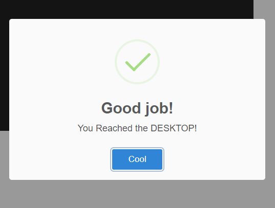
3. Fire a custom function when a specific screen size is reached.
$( window ).resize(function() {
  $('body').applyOnScreen(function() {
    alert('Large');
  }).max('large');
});

$( window ).resize(function() {
  $('body').applyOnScreen(function() {
    alert('Desktop');
  }).max('desktop');
});

$( window ).resize(function() {
  $('body').applyOnScreen(function() {
    alert('Tablet');
  }).max('Tablet');
});

$( window ).resize(function() {
  $('body').applyOnScreen(function() {
    alert('Mobile');
  }).max('Mobile');
});
This awesome jQuery plugin is developed by dipcode-software. For more Advanced Usages, please check the demo page or visit the official website.