jQuery Plugin To Generate Step Based Site Guides - uiGlide
| File Size: | 154 KB |
|---|---|
| Views Total: | 696 |
| Last Update: | |
| Publish Date: | |
| Official Website: | Go to website |
| License: | MIT |
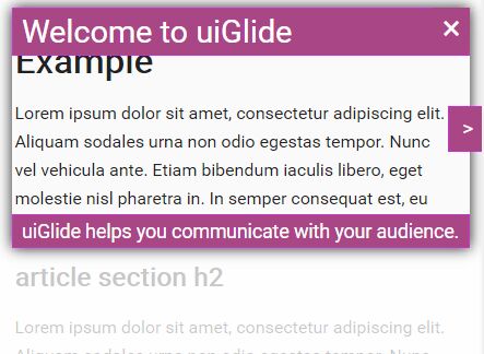
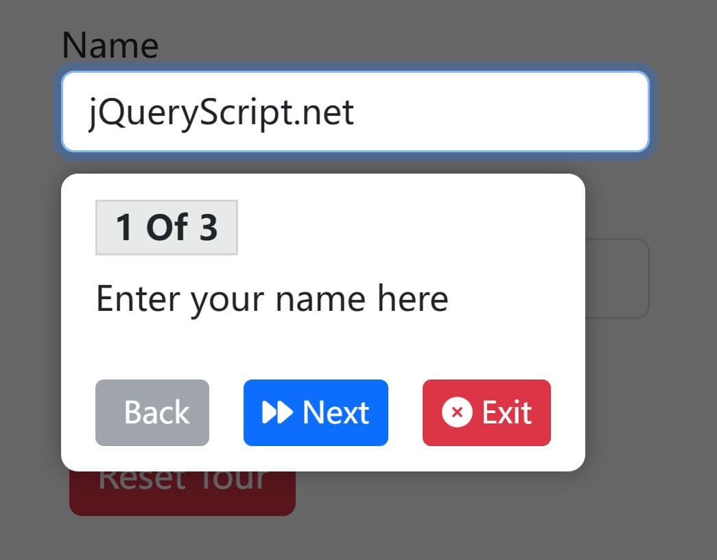
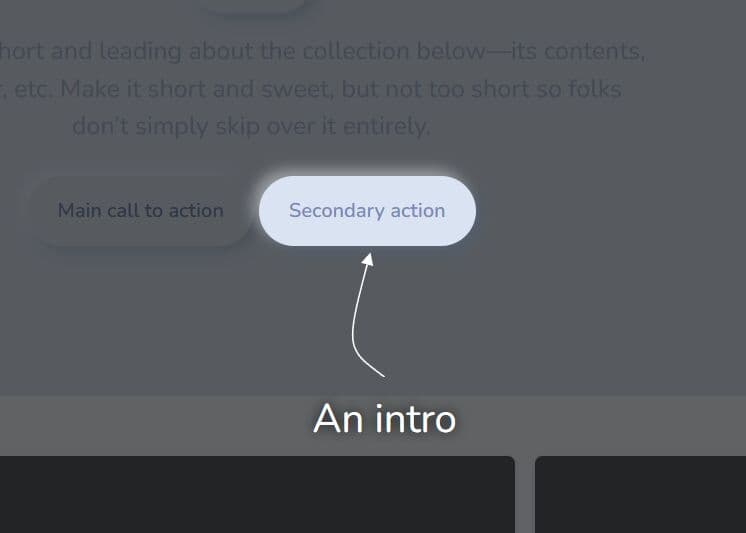
uiglance is a simple-to-use jQuery plugin that helps you create a step-by-step site tour/guide to make awesome navigatable introductions for your site's new features and components. Also provides a standalone version which allows you to implement the site guide in native JavaScript.
How to use it:
1. Load the jQuery uiglance plugin's JavaScript and default style sheet in the document. Make sure you first have jQuery library installed.
<script src="//code.jquery.com/jquery-3.1.0.min.js"></script>
<link href="css/uiglance.default.css" rel="stylesheet">
<script src="jquery.uiglance.min.js"></script>
<!-- themes -->
<link href="css/uiglance.uiglance.beehive.css" rel="stylesheet">
<link href="css/uiglance.ocean.css" rel="stylesheet">
2. Create the dynamic DOM elements and initialize the step sequence using html5 data-uigstep and data-uigset attributes as seen below:
<div data-uigstep="0" data-uigset="help">
  Step 1
</div>

<div data-uigstep="1" data-uigset="help">
  Step 2
</div>

<div data-uigstep="2" data-uigset="help">
  Step 3
</div>

...
3. Show the site guide on page load.
var uig = $("body").uiglance().open();
4. Default plugin settings.
- parent: document.body - This is the DOM Element that will contain all uiglance content. The default is <BODY>, but you can contain uiglance within a <DIV>
- steps: [] (empty array) - The "steps" array contains custom information relating to each "step" in the executing uiglance. Steps are configured through the "data-" attributes associated with DOM Elements or by adding values directly to the "steps" array
- defaultSet: "uiglance" - "Steps" are always grouped into "Sets" and each set is given a unique name. When uiglance is open, it will display steps in the order specifed by the active set.
- transition: 500 - The number of milliseconds used for tweening between steps.
- fadeIn: 1000 - The number of milliseconds used for fading-in the first step after uiSlide has opened.
- fadeOut: 500 - The number of milliseconds used for fading-out the current step when uiSlide is closed.
- minWidth: 220 - Each Step will be forced to maintain a minimum size when it is displayed.
- minHeight: 125 - Each Step will be forced to maintain a minimum size when it is displayed.
- padding: 10 - Creates negative space between the content and the uiglance step border.
- borderWidth: 2 - Creates creates a border around the uiglance step focus box. This is mostly for aesthetic reasons
- documentPadding: 20 - This will force each uiglance step to maintain a minimum distance from the borders of the parent element.
- passthrough: true - ALERT!!! This is experimental. Passthrough allows pointer events to penetrate the uiStep overlay. This is really helpful for highlighting forms... However, browser support is not great.
- dataUISet: "data-uigset" - The default data attribute used when defining a step.
- dataUIStep: "data-uigstep" - The default data attribute used when defining a step.
- dataUITitle: "data-uigtitle" - The default data attribute used when defining a step.
- dataUIDesc: "data-uigdesc" - The default data attribute used when defining a step.
- dataUIHtml: "data-uightml" - The default data attribute used when defining a step.
- dataUIPassthrough: "data-uigpassthrough" - The default data attribute used when defining a step.
- cssLeftBox: "uig-box uig-box-left" - The default css classes applied to uiglance's dynamic elements.
- cssRightBox: "uig-box uig-box-right" - The default css classes applied to uiglance's dynamic elements.
- cssTopBox: "uig-box uig-box-top" - The default css classes applied to uiglance's dynamic elements.
- cssBottomBox: "uig-box uig-box-bottom" - The default css classes applied to uiglance's dynamic elements.
- cssFocusBox: "uig-focusbox" - The default css classes applied to uiglance's dynamic elements.
- cssFocusBoxLeft: "uig-focusbox-left" - The default css classes applied to uiglance's dynamic elements.
- cssFocusBoxRight: "uig-focusbox-right" - The default css classes applied to uiglance's dynamic elements.
- cssFocusBoxTop: "uig-focusbox-top" - The default css classes applied to uiglance's dynamic elements.
- cssFocusBoxBottom: "uig-focusbox-bottom" - The default css classes applied to uiglance's dynamic elements.
- cssFocusContent: "uig-focus-content" - The default css classes applied to uiglance's dynamic elements.
- cssTitleBox: "uig-titlebox" - The default css classes applied to uiglance's dynamic elements.
- cssDescBox: "uig-descbox" - The default css classes applied to uiglance's dynamic elements.
- cssPrevBtn: "uig-btn uig-btn-prev" - The default css classes applied to uiglance's dynamic elements.
- cssNextBtn: "uig-btn uig-btn-next" - The default css classes applied to uiglance's dynamic elements.
- cssCloseBtn: "uig-btn uig-btn-close" - The default css classes applied to uiglance's dynamic elements.
- htmlPrevBtn: "<a href="javascript:void(0)"><</a>" - The default html content used to generate uiglance's dynamic elements.
- htmlNextBtn: "<a href="javascript:void(0)">></a>" - The default html content used to generate uiglance's dynamic elements.
- htmlCloseBtn: "<a href="javascript:void(0)">✖</a>" - The default html content used to generate uiglance's dynamic elements.
- htmlFocusContent: "<div></div>" - The default html content used to generate uiglance's dynamic elements.
- onBeforeOpen: null - Callback method that will be executed before the "Open" process begins.
- onAfterOpen: null - Callback method that will be executed when the "Open" process ends.
- onBeforeClose: null - Callback method that will be executed before the "Close" process begins.
- onAfterClose: null - Callback method that will be executed when the "Close" process ends.
- onBeforeGoto: null - Callback method that will be executed before the "Goto" process begins.
- onAfterGoto: null - Callback method that will be executed when the "Goto" process ends.
- onBeforeStep: null - Callback method that will be executed before the "Step" process begins. This callback can be overwritten on a per step basis.
- onAfterStep: null - Callback method that will be executed when the "Step" process ends. This callback can be overwritten on a per step basis.
- onStep: null - Callback method that will be executed when the "Step" has completed it's tween.. This callback can be overwritten on a per step basis.
var uig = $("body").uiglance({
    // options here
});
5. Public methods.
- open( stepNum, setName ): Create the dynamic DOM Elements and initialise the step sequence.
- close(): Complete the Step sequence and remove the dynamics DOM Elements.
- next(): Tween the display from the current step, through to the next step.
- prev(): Tween the display from the current step, back to the previous step.
- goto( stepNum ): Tween the display from the current step to another step in the currently loaded set.
- stop(): Instantly freeze the current tween. Stop can, and will, leave the focus box in whatever stage it was when the method was triggered.
- getFocusBox(): Retrieve the DOM Element used as the focus box.
- getSettings(): Retrieve the settings object.
- getSteps(): Retrieve an array of the currently loaded steps.
- getStep( idx ): Retrieve a step by it's position in the current set array.
- getCurrentSet(): Retrieve the currently loaded set array.
- getCurrentSetName(): Retrieve the currently loaded set's name.
- getCurrentStep(): Retrieve the currently loaded step.
- getCurrentStepIndex(): Retrieve the currently loaded step's index.
- getVersion(): A value that can be used to validate the uiSlide version identifier.
Change log:
2016-08-01
- Rename to uiGlance
- Themes update
2016-07-29
- Now optionally returns to initial scroll position. Fixed bug with default focusbox content.
2016-07-28
- New themes. Separated Focus Box from Controls Box
2016-07-27
- Ensure documentPadding is respected by the auto scroll
This awesome jQuery plugin is developed by WCPDigital. For more Advanced Usages, please check the demo page or visit the official website.