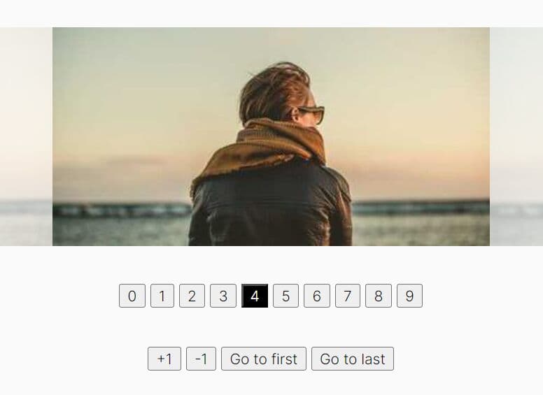
Customizable Thumbnail Slider With Lightbox Plugin - Thumbnail Scroller
| File Size: | 19.5 MB |
|---|---|
| Views Total: | 9497 |
| Last Update: | |
| Publish Date: | |
| Official Website: | Go to website |
| License: | MIT |
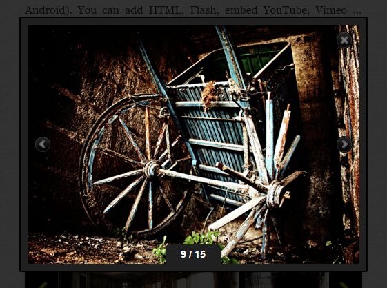
Thumbnail Scroller is a beautiful, responsive and highly configuration jQuery thumbnail slider plugin for presenting various media formats in a elegant way.
Key features:
- Tons of configuration options.
- Supports various media formats: Image, HTML, Flash, YouTube, Vimeo, etc.
- Image loader.
- Click on the thumbnail to present enlarged content in a navigatable lightbox gallery.
- Fully responsive and adapts to any screen size.
- Settings and content can be stored and edited in a HTML, JSON or XML file.
Basic usage:
1. Load jQuery library together with jQuery UI and the jQuery Thumbnail Scroller plugin's file into your document.
<link rel="stylesheet" href="/path/to/jquery.dop.ThumbnailScroller.css">
<script src="/path/to/jquery-latest.js"></script>
<script src="/path/to/jquery-ui.min.js"></script>
<script src="/path/to/jquery.dop.ThumbnailScroller.js"></script>
2. Call the DOPThumbnailScroller() function on the container like this:
$('#scrollerContainer').DOPThumbnailScroller({
    // options
});
3. You can add the following options to the plugin::
$('#scrollerContainer').DOPThumbnailScroller({

  // scroller ID
  'ID': '1',

  // JSON, XML, HTML
  'SettingsDataType': 'JSON'

  // path to settings file
  'SettingsFilePath': 'dopts/json/settings.json'

  // JSON, XML, HTML
  'ContentDataType': 'JSON'

  // path to content file
  'ContentFilePath': 'dopts/json/content.json'

});
4. Customize the thumbnail slider. You can config the settings displayed below in the JSON, XML and even an html list
- Width(value in pixels): Default value: 900. Set the width of the scroller.
- Height(value in pixels): Default value: 128. Set the height of the scroller.")
- BgColor(color hex code): Default value: ffffff. Set scroller background color.
- BgAlpha(value from 0 to 100): Default value: 100. Set scroller alpha.
- BgBorderSize(value in pixels): Default value: 1. Set the size of the scroller border.
- BgBorderColor(color hex code): Default value: e0e0e0. Set the color of the scroller border.
- ThumbnailsOrder(normal, random): Default value: normal. Set thumbnails order.
- ResponsiveEnabled(true, false): Default value: true. Enable responsive layout.
- UltraResponsiveEnabled(true, false): Default value: false. Enable ultra responsive layout. Resize both width and height. It is a boost to normal response function which you must have enabled.
- ThumbnailsPosition(horizontal, vertical): Default value: horizontal. Set the position of the thumbnails.
- ThumbnailsBgColor(color hex code): Default value: ffffff. Set the color for the thumbnails background.
- ThumbnailsBgAlpha(value from 0 to 100): Default value: 0. Set the transparency for the thumbnails background.
- ThumbnailsBorderSize(value in pixels): Default value: 0. Set the size of the thumbnails border.
- ThumbnailsBorderColor(color hex code): Default value: e0e0e0. Set the color of the thumbnails border.
- ThumbnailsSpacing(value in pixels): Default value: 10. Set the space between thumbnails.
- ThumbnailsMarginTop(value in pixels): Default value: 10. Set the top margin for the thumbnails.
- ThumbnailsMarginRight(value in pixels): Default value: 0. Set the right margin for the thumbnails.
- ThumbnailsMarginBottom(value in pixels): Default value: 10. Set the bottom margin for the thumbnails.
- ThumbnailsMarginLeft(value in pixels): Default value: 0. Set the left margin for the thumbnails.
- ThumbnailsPaddingTop(value in pixels): Default value: 0. Set the top padding for the thumbnails.
- ThumbnailsPaddingRight(value in pixels): Default value: 0. Set the right padding for the thumbnails.
- ThumbnailsPaddingBottom(value in pixels): Default value: 0. Set the bottom padding for the thumbnails.
- ThumbnailsPaddingLeft(value in pixels): Default value: 0. Set the left padding for the thumbnails.
- ThumbnailsInfo(none, tooltip, label): Default value: label. Display a small info text on the thumbnails, a tooltip or a label.
- ThumbnailsNavigationEasing(linear, swing, easeInQuad, easeOutQuad, easeInOutQuad, easeInCubic, easeOutCubic, easeInOutCubic, easeInQuart, easeOutQuart, easeInOutQuart, easeInQuint, easeOutQuint, easeInOutQuint, easeInSine, easeOutSine, easeInOutSine, easeInExpo, easeOutExpo, easeInOutExpo, easeInCirc, easeOutCirc, easeInOutCirc, easeInElastic, easeOutElastic, easeInOutElastic, easeInBack, easeOutBack, easeInOutBack, easeInBounce, easeOutBounce, easeInOutBounce): Default value: linear. Set thumbnails navigation easing.
- ThumbnailsNavigationLoop(true, false): Default value: false. Enable thumbnails loop ... scroll will be disabled.
- ThumbnailsNavigationMouseEnabled(true, false): Default value: false. Enable thumbnails mouse navigation.
- ThumbnailsNavigationScrollEnabled(true, false): Default value: false. Enable thumbnails scroll navigation.
- ThumbnailsScrollPosition(bottom/right, top/left): Default value: bottom/right. Set thumbnails scroll position.
- ThumbnailsScrollSize(value in pixels): Default value: 5. Set the scroll size color.
- ThumbnailsScrollScrubColor(color hex code): Default value: 808080. Set the scroll scrub color.
- ThumbnailsScrollBarColor(color hex code): Default value: e0e0e0. Set the scroll bar color.
- ThumbnailsNavigationArrowsEnabledtrue, false): Default value: true. Enable thumbnails arrows navigation.
- ThumbnailsNavigationArrowsNoItemsSlide(number of thumbnails): Default value: 1. The number of thumbnails that will slide when you click the arrows.
- ThumbnailsNavigationArrowsSpeed(time in miliseconds): Default value: 600. The time the thumbnails will slide after you click the arrows.
- ThumbnailsNavigationPrev(path to image): Upload the image for thumbnails navigation's previous button.
- ThumbnailsNavigationPrevHover(path to image): Upload the image for thumbnails navigation's previous hover button.
- ThumbnailsNavigationPrevDisabled(path to image): Upload the image for thumbnails navigation's previous disabled button.
- ThumbnailsNavigationNext(path to image): Upload the image for thumbnails navigation's next button.
- ThumbnailsNavigationNextHover(path to image): Upload the image for thumbnails navigation's next hover button.
- ThumbnailsNavigationNextDisabled(path to image): Upload the image for thumbnails navigation's next disabled button.
- ThumbnailLoader(path to image): Set the loader for the thumbnails.
- ThumbnailWidth(the size in pixels): Default value: 100. Set the width of a thumbnail.
- ThumbnailHeight(the size in pixels): Default value: 100. Set the height of a thumbnail.
- ThumbnailAlpha(value from 0 to 100): Default value: 100. Set the transparency of a thumbnail.
- ThumbnailAlphaHover(value from 0 to 100): Default value: 100. Set the transparency of a thumbnail when hover.
- ThumbnailBgColor(color hex code): Default value: f1f1f1. Set the color of a thumbnail's background.
- ThumbnailBgColorHover(color hex code): Default value: f1f1f1. Set the color of a thumbnail's background when hover.
- ThumbnailBorderSize(value in pixels): Default value: 1. Set the size of a thumbnail's border.
- ThumbnailBorderColor(color hex code): Default value: d0d0d0. Set the color of a thumbnail's border.
- ThumbnailBorderColorHover(color hex code): Default value: 303030. Set the color of a thumbnail's border when hover.
- ThumbnailPaddingTop(value in pixels): Default value: 2. Set top padding value of a thumbnail.
- ThumbnailPaddingRight(value in pixels): Default value: 2. Set right padding value of a thumbnail.
- ThumbnailPaddingBottom(value in pixels): Default value: 2. Set bottom padding value of a thumbnail.
- ThumbnailPaddingLeft(value in pixels): Default value: 2. Set left padding value of a thumbnail.
- LightboxDisplayTime(time in miliseconds): Default value: 600. The time the lightbox will be displayed.
- LightboxWindowColor(color hex code): Default value: ffffff. Set the color for the lightbox window.
- LightboxWindowAlpha(value from 0 to 100): Default value: 80. Set the transparency for the lightbox window.
- LightboxLoader(path to image): Set the loader for the lightbox image.
- LightboxBgColor(color hex code): Default value: ffffff. Set the color for the lightbox background.
- LightboxBgAlpha(value from 0 to 100): Default value: 100. Set the transparency for the lightbox background.
- LightboxBorderSize(value in pixels): Default value: 1. Set the size of a lightbox's border.
- LightboxBorderColor(color hex code): Default value: e0e0e0. Set the color of a lightbox's border.
- LightboxCaptionTextColor(color hex code): Default value: 999999. Set the color for the lightbox caption.
- LightboxMarginTop(value in pixels): Default value: 30. Set top margin value for the lightbox.
- LightboxMarginRight(value in pixels): Default value: 30. Set right margin value for the lightbox.
- LightboxMarginBottom(value in pixels): Default value: 30. Set bottom margin value for the lightbox.
- LightboxMarginLeft(value in pixels): Default value: 30. Set top left value for the lightbox.
- LightboxPaddingTop(value in pixels): Default value: 10. Set top padding value for the lightbox.
- LightboxPaddingRight(value in pixels): Default value: 10. Set right padding value for the lightbox.
- LightboxPaddingBottom(value in pixels): Default value: 10. Set bottom padding value for the lightbox.
- LightboxPaddingLeft(value in pixels): Default value: 10. Set left padding value for the lightbox.
- Lightbox Navigation Icons Styles & Settings
- LightboxEnabled(true, false): Default value: true. Enable the lightbox.
- LightboxNavigationPrev(path to image): Upload the image for lightbox navigation's previous button.
- LightboxNavigationPrevHover(path to image): Upload the image for lightbox navigation's previous hover button.
- LightboxNavigationNext(path to image): Upload the image for lightbox navigation's next button.
- LightboxNavigationNextHover(path to image): Upload the image for lightbox navigation's next hover button.
- LightboxNavigationClose(path to image): Upload the image for lightbox navigation's close button.
- LightboxNavigationCloseHover(path to image): Upload the image for lightbox navigation's close hover button.
- LightboxNavigationInfoBgColor(color hex code): Default value: ffffff. Set the color for the lightbox info background.
- LightboxNavigationInfoTextColor(color hex code): Default value: c0c0c0. Set the color for the lightbox info text.
- LightboxNavigationDisplayTime(time in miliseconds): Default value: 600. The time the lightbox navigation will be displayed.
- LightboxNavigationTouchDeviceSwipeEnabled(true, false): Default value: true. Enable swipe lightbox navigation on touch devices.
- SocialShareEnabled(true, false): Default value: true. Enable AddThis Social Share.
- SocialShareLightbox(path to image): Upload the image for lightbox social share button.
- TooltipBgColor(color hex code): Default value: ffffff. Set tooltip background color.
- TooltipStrokeColor(color hex code): Default value: 000000. Set tooltip stroke color.
- TooltipTextColor(color hex code): Default value: 000000. Set tooltip text color.
- LabelPosition(bottom, top, under): Default value: bottom. Set label position.
- LabelAlwaysVisible(true, false): Default value: false. On true the label is always visible, on false it will be visible only on hover.
- LabelUnderHeight(the size in pixels): Default value: 50. Set the height only for the label under a thumbnail.
- LabelBgColor(bottom, top): Default value: bottom. Set label position.
- LabelBgAlpha(value from 0 to 100): Default value: 80. Set label background transparency.
- LabelTextColor(color hex code): Default value: ffffff. Set label text color.
- SlideshowEnabled(true, false): Default value: false. Enable or disable the slideshow.
- SlideshowTime(time in miliseconds): Default: 5000. How much time a thumbnail stays until it passes to the next one.
- SlideshowLoop(true, false): Default: false. Set it to true if you don't want the slideshow to stop when it reaches the last thumbnail.
This awesome jQuery plugin is developed by dotonpaper. For more Advanced Usages, please check the demo page or visit the official website.