Responsive Multimedia Slider Plugin With jQuery - sliderSE
| File Size: | 1.05 MB |
|---|---|
| Views Total: | 2119 |
| Last Update: | |
| Publish Date: | |
| Official Website: | Go to website |
| License: | MIT |
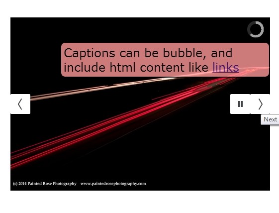
sliderSE is a responsive, powerful, highly customizable and feather rich jQuery content slider plugin that supports image captions, HTML and video content, interval indicator, auto-play and much more.
Basic Usage:
1. Include the latest jQuery javascript library together with jQuery sliderSe plugin's files in the html document.
<link href="scripts/sliderSE.css" rel="stylesheet" />
<script src="http://ajax.googleapis.com/ajax/libs/jquery/1.11.0/jquery.min.js"></script>
<script type="text/javascript" src="scripts/sliderSE.js"></script>
2. Include jQuery easing plugin for easing functions.
<script type="text/javascript" src="scripts/jquery.easing.1.3.js"></script>
3. Markup Html structure.
<div id="slider" class="sliderSE">

<div data-src="media/PIC_1.jpg" data-thumb="media/thumbs/PIC_1.jpg">
<div class="sliderCaption top shutter"> Caption 1 </div>
</div>

<div data-src="media/PIC_2.jpg" data-thumb="media/thumbs/PIC_2.jpg">
<div class="sliderCaption bubble_1"> Caption 2 </div>
</div>

<div data-src="media/PIC_3.jpg" data-thumb="media/thumbs/PIC_3.jpg" data-link="http://www.google.com" data-target="_blank">
<div class="sliderCaption bubble_2"> Linkable Caption </div>
</div>

...

</div>
4. Initialize the plugin with basic options.
<script type='text/javascript'>
jQuery('#slider').sliderSE({
height:'67%',
});
</script>
5. All the available options.
<script type='text/javascript'>
jQuery('#slider').sliderSE({
animateOpening: true,// true, false: add a fade in for initial display
animateOpeningTime: 500,// miliseconds for animated opening - careful if slideshow is set to start automatically, can cause strange behaviour
advancePagThumb: false, // true, false: whether or not the thumbnail gallery and pagination should advance when mouse is hovering
alignment: 'center', // topLeft, topCenter, topRight, centerLeft, center, centerRight, bottomLeft, bottomCenter, bottomRight
autoAdvance: true,// true, false
barDirection: 'leftToRight',// 'leftToRight', 'rightToLeft', 'topToBottom', 'bottomToTop'
barPosition: 'bottom',// 'bottom', 'left', 'top', 'right', 'special' - special CSS designated positioning - see .sliderBarSpecial
cols: 6,// number of columns in some transition effects
easing: 'easeInOutExpo',// for the complete list http://jqueryui.com/demos/effect/easing.html
fx: 'simpleFade',// 'random', 'none', 'simpleFade', 'stampede', 'mosaic', 'mosaicReverse', 'mosaicRandom', 'mosaicSpiral', 'mosaicSpiralReverse', 'slide'(left or right as appropriate)
// 'slideLeft', 'slideRight', 'slideUp', 'slideDown'
gallery: false,// true or false to show a gallery view as well as slideshow
galleryBox: 100,// pixels: a square box surrounding each thumbnail, the largest dimension of each thumbnail is maxed out by this number
height: '50%',// here you can type pixels (for instance '300px'), a percentage (relative to the width of the slideshow, for instance '50%')
// this is necessary in a fluid site since total height is calculated only after all elements of the DOM have been written.
hover: true,// true, false. Pause on state hover. Not available for mobile devices
keyboard: false,// true, fase: Whether or not to capture keyboard events for right and left arrow.  Can intefere with other elements on a page that use keyboard input
loader: 'pie',// none, bar, pie (IE9+) - in the event that Pie (canvas) cannot be initiated, the bar will be displayed
loaderColor: '#cccccc',
loaderBgColor: '#333333',
loaderOpacity: .8,//0, .1, .2, .3, .4, .5, .6, .7, .8, .9, 1
loaderPadding: 1,//how many empty pixels you want to display between the loader and its background
loaderStroke: 6,//the thickness both of the pie loader and of the bar loader. Remember: for the pie, the loader thickness must be less than a half of the pie diameter
minHeight: '200px',// minimum height
navigation: true,// true or false, to display or not the navigation buttons
navigationHover: true,// if true the navigation button (prev, next and play/stop buttons) will be visible on hover state only, if false they will be visible always
mobileAutoAdvance: true, // true, false. Auto-advancing for mobile devices
mobileEasing: '',// same as easing
mobileFx: '',// FX for mobile device
mobileNavHover: true,// same as above, but only for mobile devices
overlayer: true,// a layer on the images to prevent the users from grabbing them simply by clicking the right button of their mouse
pagination: false,// true, false: whether or not to show pagination icons
playPause: true,// true or false, to display or not the play/pause buttons
pauseOnClick: true,// true, false. It stops the slideshow when you click the sliders.
pieDiameter: 40,// diameter of the pie loader
piePosition: 'topRight',// 'topLeft', 'bottomLeft', 'topRight', 'bottomRight'
portrait: true,// true, false. Select true to resize images to fit (no cropping of odd-size images)
readDir: '',// directory from which to read images   ex: '../media/images/large/'
readThumbs: '',// directory from which to read thumbnailsex: '../media/images/large/'
readPrepend: '',// prepend to readThumbs and readDir needed for varying relative paths
rows: 4,// number of rows for some transitions
stopAt: '',// 'html', 'last', 'slide:#'  :   to tell the slider to stop at specific places if playing - 'html' includes iFrames, videos, etc
thumbnails: false,// true, false: whether or not to load thumbnails
thumbnailPos: 'bottom',// top, bottom, right, left - position for the thumbnail viewer (not including pagination)
time: 4000,// milliseconds between the end of the sliding effect and the start of the nex one
toolTips: true,// true,false : show tool tips
toolTipPrevious: '< Previous Slide',
toolTipNext: 'Next Slide >',
toolTipPlay: 'Play Slideshow',
toolTipPause: 'Pause Slideshow',
transPeriod: 1500,// lenght of the sliding effect in milliseconds

// callbacks

onEndTransition: function() {  },// this callback is invoked when the transition effect ends
onLoaded: function() {  },// this callback is invoked when the image on a slide has completely loaded
onStartLoading: function() {  },// this callback is invoked when the image on a slide start loading
onStartTransition: function() {  }// this callback is invoked when the transition effect starts
});
</script>
This awesome jQuery plugin is developed by bredlen. For more Advanced Usages, please check the demo page or visit the official website.
