Stacked Card Carousel/Slider With jQuery And CSS3 Animations
| File Size: | 6.92 KB |
|---|---|
| Views Total: | 15099 |
| Last Update: | |
| Publish Date: | |
| Official Website: | Go to website |
| License: | MIT |

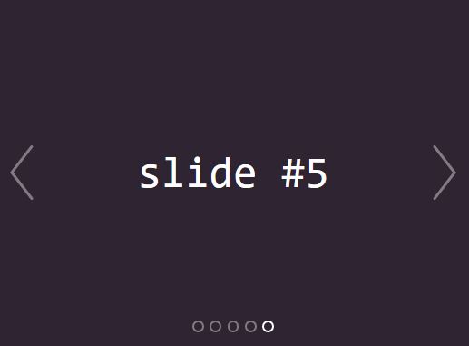
A fancy carousel slider that makes use of jQuery and CSS3 animations to loop through a stack of cards with navigation arrows.
For a conventional responsive slider that also supports mixed content, review this responsive jQuery content slider.
How to use it:
1. Create a list of cards with navigation arrows on the webpage.
<div class="card-stack">

  <!-- Prev Navigation -->
  <a class="buttons prev" href="#"><</a>

  <!-- Card List -->
  <ul class="card-list">
  <li class="card">
    <img src="1.jpg" class="card-list__image">
    <h3 class="card-list__text">Card 1 Description</h3>
  </li>
  <li class="card">
    <img src="2.jpg" class="card-list__image">
    <h3 class="card-list__text">Card 2 Description</h3>
  </li>
  <li class="card">
    <img src="3.jpg" class="card-list__image">
    <h3 class="card-list__text">Card 3 Description</h3>
  </li>
  ... more cards here ...
  </ul>

  <!-- Next Navigation -->
  <a class="buttons next" href="#">></a>

</div>
2. The primary CSS styles for the stacked cards.
 .card-stack {
  width: 500px;
  height: 250px;
  position: absolute;
  margin: 20px auto;
}

.card-stack .card-list {
  width: 300px;
}

.card-stack .card-list__image {
  height: 200px;
}

.card-stack .card-list__text {
  color: #fff;
  font-weight: 300;
}

.card-stack .card-list li {
  display: flex;
  align-items: center;
  justify-content: center;
  transition: all 100ms ease-in-out;
  border-radius: 10px;
  position: absolute;
  list-style: none;
  height: 300px;
  left: 0;
  right: 0;
  margin: 0 auto;
  padding-top: 20px;
  text-align: center;
  -webkit-box-shadow: 0 2px 15px 1px rgba(225, 225, 225, 0.5);
  box-shadow: 0 1px 4px 1px rgba(0, 0, 0, 0.5);
}

.card-stack .card-list li:nth-child(1) {
  top: 24px;
  width: 60%;
}

.card-stack .card-list li:nth-child(2) {
  top: 36px;
  width: 70%;
}

.card-stack .card-list li:nth-child(3) {
  top: 48px;
  width: 80%;
}
3. Style & position the navigation buttons.
.card-stack .buttons {
  display: none;
  position: absolute;
  background: rgba(0, 0, 0, 0.46);
  border: 2px solid rgba(255, 255, 255, 0.7);
  border-radius: 50%;
  width: 35px;
  height: 35px;
  left: 0;
  top: 55%;
  color: rgba(255, 255, 255, 0.7);
  text-align: center;
  line-height: 35px;
  text-decoration: none;
  font-size: 22px;
  z-index: 100;
  outline: none;
  transition: all 0.2s ease;
}

.card-stack .buttons:hover {
  transform: scale(1.3, 1.3);
}

.card-stack .prev {
  left: 15px;
  right: auto;
}

.card-stack .next {
  left: auto;
  right: 15px;
}

.card-stack .carousel .buttons:hover {
  color: #C01313;
  background: #fff;
}

.card-stack:hover > .buttons.prev {
  display: block;
  animation: bounceInLeft 200ms;
}

.card-stack:hover > .buttons.next {
  display: block;
  animation: bounceInRight 200ms;
}
4. The CSS3 animations for the transition effect when navigating between cards.
.transformThis {
  animation: scaleDown 500ms;
}

.transformPrev {
  animation: scaleUp 100ms;
  display: none;
}

@keyframes scaleUp {
  0% {
    transform: scale(1.2) translateY(50px);
    opacity: 0;
  }
  20% {
    transform: scale(1.15) translateY(40px);
    opacity: 0.1;
  }
  40% {
    transform: scale(1.1) translateY(30px);
    opacity: 0.2;
  }
  60% {
    transform: scale(1.05) translateY(20px);
    opacity: 0.4;
  }
  80% {
    transform: scale(1.01) translateY(10px);
    opacity: 0.8;
  }
  100% {
    transform: scale(1) translateY(0);
    opacity: 1;
  }
}

@keyframes scaleDown {
  0% {
    transform: scale(1) translateY(0);
    opacity: 1;
  }
  20% {
    transform: scale(1.01) translateY(20px);
    opacity: 0.8;
  }
  40% {
    transform: scale(1.05) translateY(40px);
    opacity: 0.4;
  }
  60% {
    transform: scale(1.1) translateY(60px);
    opacity: 0.2;
  }
  80% {
    transform: scale(1.15) translateY(80px);
    opacity: 0.1;
  }
  100% {
    transform: scale(1.2) translateY(100px);
    opacity: 0;
  }
}

@keyframes scaleCard {
  0% {
    top: 5px;
  }
  100% {
    top: 24px;
  }
}

@keyframes bounceInLeft {
  0% {
    opacity: 0;
    transform: translateX(40px);
  }
  100% {
    transform: translateX(0);
  }
}

@keyframes bounceInRight {
  0% {
    opacity: 0;
    transform: translateX(-40px);
  }
  100% {
    transform: translateX(0);
  }
}
5. Include the needed jQuery JavaScript library right before the closing body tag.
<script src="/path/to/jquery.min.js"></script>
6. The core JavaScript (jQuery script) to enable the card slider.
var $card = $('.card');
var lastCard = $(".card-list .card").length - 1;

$('.next').click(function(){
  var prependList = function() {
    if( $('.card').hasClass('activeNow') ) {
      var $slicedCard = $('.card').slice(lastCard).removeClass('transformThis activeNow');
      $('ul').prepend($slicedCard);
    }
  }
  $('li').last().removeClass('transformPrev').addClass('transformThis').prev().addClass('activeNow');
  setTimeout(function(){prependList(); }, 150);
});

$('.prev').click(function() {
  var appendToList = function() {
    if( $('.card').hasClass('activeNow') ) {
      var $slicedCard = $('.card').slice(0, 1).addClass('transformPrev');
      $('.card-list').append($slicedCard);
    }}

  $('li').removeClass('transformPrev').last().addClass('activeNow').prevAll().removeClass('activeNow');
  setTimeout(function(){appendToList();}, 150);
});
This awesome jQuery plugin is developed by maleekcodes. For more Advanced Usages, please check the demo page or visit the official website.