Full-featued CRUD Data Grid Component - tui.grid
| File Size: | 378 KB |
|---|---|
| Views Total: | 23496 |
| Last Update: | |
| Publish Date: | |
| Official Website: | Go to website |
| License: | MIT |
tui.grid is a robust data grid component helps you dynamically render larger data in a performant, feature-rich data grid in a minute.
Key features:
- Dynamic data rendering.
- Pagination controls.
- Create/Remove/Update/Delete data.
- Data sorting & selection.
- Keyboard interactions.
- Inline editing just like the spreadsheet.
- Data validator, formatter & converter.
- 3 built-in themes.
- And more...
Basic usage:
1. Install the tui.grid with NPM.
# NPM
$ npm install tui-grid --save
2. Import the tui.grid's files in the document.
// ES module
import Grid from 'tui-grid';
<!-- Browser -->
<link rel="stylesheet" href="/dist/tui-grid.css" />
<script src="/dist/tui-grid.js"></script>
3. Create a container in which the data grid will be placed.
<div id="myGrid"></div>
4. Define your own data in a JavaScript array.
var myData = [
{
id: 549731,
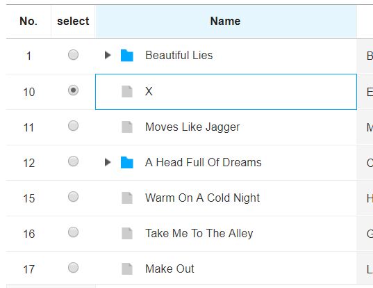
name: 'Beautiful Lies',
artist: 'Birdy',
release: '2016.03.26',
type: 'Deluxe',
typeCode: '1',
genre: 'Pop',
genreCode: '1',
grade: '4',
price: 10000,
downloadCount: 1000,
listenCount: 5000
},
// more data here
]
5. Render a basic data grid inside the placeholder element.
var gridInstance = new tui.Grid({
    el: document.getElementById('myGrid'),
    data: myData,
    columns: [
      {
          title: 'Name',
          name: 'name'
      },
      {
          title: 'Artist',
          name: 'artist'
      },
      {
          title: 'Type',
          name: 'type'
      },
      {
          title: 'Release',
          name: 'release'
      },
      {
          title: 'Genre',
          name: 'genre'
      }
    ]
});
6. Add a custom context menu the data grid.
var gridInstance = new tui.Grid({
    contextMenu:  () => [
    [
      {
        name: 'id1',
        label: 'menu1',
        action: 'copyRows',
        classNames: ['my']
      },
      {
        name: 'id2',
        label: 'menu2',
        action: () => {
          console.log('menu2');
        },
        subMenu: [
          {
            name: 'id3',
            label: 'subMenu1',
          },
        ],
      },
    ],
    [
      {
        name: 'id4',
        label: 'menu3',
        action: () => {
          console.log('menu3');
        }
      },
    ],
  ],
});
7. All possible options, callbacks and functions.
- data: Grid data for making rows.
- header: Options object for header.
- header.height: The height of the header area.
- header.complexColumns: This options creates new parent headers of the multiple columns, which includes the headers of spcified columns, and sets up the hierarchy.
- virtualScrolling: If set to true, use virtual-scrolling so that large amount of data can be processed performantly. When using this option that sets true, the rowHeight option must set value.
- rowHeight: The height of each rows. The default value is 'auto', the height of each rows expands to dom's height. If set to number, the height is fixed.
- minRowHeight: The minimum height of each rows. When this value is larger than the row's height, it set to the row's height.
- bodyHeight: The height of body area. The default value is 'auto', the height of body area expands to total height of rows. If set to 'fitToParent', the height of the grid will expand to fit the height of parent element. If set to number, the height is fixed.
- minBodyHeight: The minimum height of body area. When this value is larger than the body's height, it set to the body's height.
- columnOptions: Option object for all columns
- columnOptions.minWidth: Minimum width of each columns
- columnOptions.resizable: If set to true, resize-handles of each columns will be shown.
- columnOptions.frozenCount: The number of frozen columns. The columns indexed from 0 to this value will always be shown on the left side. {@link Grid#setFrozenColumnCount} can be used for setting this value dynamically.
- columnOptions.frozenBorderWidth: The value of frozen border width. When the frozen columns are created by "frozenCount" option, the frozen border width set.
- treeColumnOptions: Option object for the tree column.
- treeColumnOptions.name: The name of column that makes tree column.
- treeColumnOptions.useIcon: If set to true, the folder or file icon is created on the left side of the tree cell data.
- treeColumnOptions.useCascadingCheckbox: If set to true, a cascading relationship is created in the checkbox between parent and child rows.
- treeColumnOptions.indentWidth: set tree grid indent width
- copyOptions: Option object for clipboard copying
- copyOptions.useFormattedValue: Whether to use formatted values or original values as a string to be copied to the clipboard
- useClientSort: If set to true, sorting will be executed by client itself without server.
- editingEvent: If set to 'click', editable cell in the view-mode will be changed to edit-mode by a single click.
- scrollX: Specifies whether to show horizontal scrollbar.
- scrollY: Specifies whether to show vertical scrollbar.
- showDummyRows: If set to true, empty area will be filled with dummy rows.
- keyColumnName: The name of the column to be used to identify each rows. If not specified, unique value for each rows will be created internally.
- heightResizable: If set to true, a handle for resizing height will be shown.
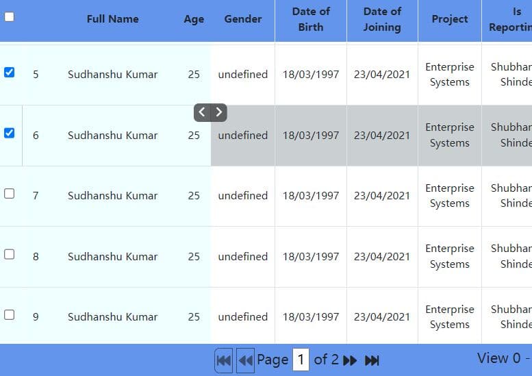
- pagination: Options for tui.Pagination. If set to null or false, pagination will not be used.
- selectionUnit: The unit of selection on Grid. ('cell', 'row')
- rowHeaders: Options for making the row header. The row header content is number of each row or input element. The value of each item is enable to set string type. (ex: ['rowNum', 'checkbox'])
- rowHeaders.type: The type of the row header. ('rowNum', 'checkbox', 'radio')
- rowHeaders.title: The title of the row header on the grid header area.
- rowHeaders.width: The width of the row header.
- rowHeaders.template: Template function which returns the content(HTML) of the row header. This function takes a parameter an K-V object as a parameter to match template values.
- columns: The configuration of the grid columns.
- columns.name: The name of the column.
- columns.ellipsis: If set to true, ellipsis will be used for overflowing content.
- columns.align: Horizontal alignment of the column content. Available values are 'left', 'center', 'right'.
- columns.valign: Vertical alignment of the column content. Available values are 'top', 'middle', 'bottom'.
- columns.className: The name of the class to be used for all cells of the column.
- columns.title: The title of the column to be shown on the header.
- columns.width: The width of the column. The unit is pixel. If this value isn't set, the column's width is automatically resized.
- columns.minWidth: The minimum width of the column. The unit is pixel.
- columns.hidden: If set to true, the column will not be shown.
- columns.resizable: If set to false, the width of the column will not be changed.
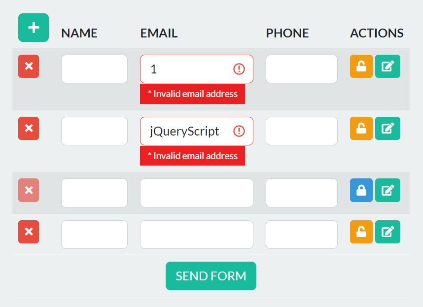
- columns.validation: The options to be used for validation. Validation is executed whenever data is changed or the {@link Grid#validate} is called.
- columns.validation.required: If set to true, the data of the column will be checked to be not empty.
- columns.validation.dataType='string': Specifies the type of the cell value. Avilable types are 'string' and 'number'.
- columns.defaultValue: The default value to be shown when the column doesn't have a value.
- columns.formatter: The function that formats the value of the cell. The retrurn value of the function will be shown as the value of the cell.
- columns.useHtmlEntity: If set to true, the value of the cell will be encoded as HTML entities.
- columns.ignored: If set to true, the value of the column will be ignored when setting up the list of modified rows.
- columns.sortable: If set to true, sort button will be shown on the right side of the column header, which executes the sort action when clicked.
- columns.onBeforeChange: The function that will be called before changing the value of the cell. If stop() method in event object is called, the changing will be canceled.
- columns.onAfterChange: The function that will be called after changing the value of the cell.
- columns.editOptions: The object for configuring editing UI.
- columns.editOptions.type: The string value that specifies the type of the editing UI. Available values are 'text', 'password', 'select', 'radio', 'checkbox'.
- columns.editOptions.useViewMode: If set to true, default mode of the cell will be the 'view-mode'. The mode will be switched to 'edit-mode' only when user double click or press 'ENTER' key on the cell. If set to false, the cell will always show the input elements as a default.
- columns.editOptions.listItems: Instant applying of built-in editor
- columns.editOptions.instantApply: Specifies the option items for the 'select', 'radio', 'checkbox' type. The item of the array must contain properties named 'text' and 'value'. (e.g. [{text: 'option1', value: 1}, {...}])
- columns.editOptions.onFocus: The function that will be called when a 'focus' event occurred on an input element
- columns.editOptions.onBlur: The function that will be called when a 'blur' event occurred on an input element
- columns.editOptions.onKeyDown: The function that will be called when a 'keydown' event occurred on an input element
- columns.editOptions.prefix: The HTML string to be shown left to the input element. If it's a function, the return value will be used.
- columns.editOptions.postfix: The HTML string to be shown right to the input element. If it's a function, the return value will be used.
- columns.editOptions.converter: The function whose return value (HTML) represents the UI of the cell. If the return value is
- falsy(null|undefined|false), default UI will be shown.
- columns.copyOptions: Option object for clipboard copying. This option is column specific, and overrides the global copyOptions.
- columns.copyOptions.useFormattedValue: Whether to use formatted values or original values as a string to be copied to the clipboard
- columns.copyOptions.useListItemText: Whether to use concatenated text or original values as a string to be copied to the clipboard
- columns.copyOptions.customValue: Whether to use customized value from "customValue" callback or original values as a string to be copied to the clipboard
- columns.relations: Specifies relation between this and other column.
- columns.relations.targetNames: Array of the names of target columns.
- columns.relations.disabled: If returns true, target columns will be disabled.
- columns.relations.editable: If returns true, target columns will be editable.
- columns.relations.listItems: The function whose return value specifies the option list for the 'select', 'radio', 'checkbox' type. The options list of target columns will be replaced with the return value of this function.
- columns.whiteSpace: If set to 'normal', the text line is broken by fitting to the column's width. If set to 'pre', spaces are preserved and the text is braken by new line characters. If set to 'pre-wrap', spaces are preserved, the text line is broken by fitting to the column's width and new line characters. If set to 'pre-line', spaces are merged, the text line is broken by fitting to the column's width and new line characters.
- columns.component: Option for using tui-component
- columns.component.name: The name of the compnent to use for this column
- columns.component.options: The options object to be used for creating the component
- summary: The object for configuring summary area.
- summary.height: The height of the summary area.
- summary.positio: The position of the summary area. ('bottom', 'top')
- summary.columnContent: The object for configuring each column in the summary. Sub options below are keyed by each column name.
- summary.columnContent.useAutoSummary: If set to true, the summary value of each column is served as a paramater to the template function whenever data is changed.
- summary.columnContent.template: Template function which returns the content(HTML) of the column of the summary. This function takes an K-V object as a parameter which contains a summary values keyed by 'sum', 'avg', 'min', 'max' and 'cnt'.
- usageStatistics: Send the hostname to google analytics. If you do not want to send the hostname, this option set to false.
Changelog:
v4.21.22 (2024-01-11)
- fix: finish editing when type enter from last cell when using moveDirectionOnEnter
v4.21.21 (2023-12-20)
- fix: cannot edit after sort
v4.21.20 (2023-12-13)
- fix: occur error when call validate with sort
v4.21.19 (2023-11-17)
- feat: export to xls for compatibility mode
- feat: validate on specific rows
v4.21.18 (2023-10-28)
- fix: move focus on enter regardless cell editable
- feat: improve check between
v4.21.17 (2023-09-18)
- feat: define move direction on enter
- fix: check/uncheck event emitted when multi check/uncheck via shift click
v4.21.16 (2023-08-28)
- feat: custom header by passing html element
v4.21.15 (2023-07-14)
- bugfix
v4.21.13 (2023-07-03)
- bugfix
v4.21.13 (2023-07-01)
- bugfix
v4.21.12 (2023-06-18)
- feat: export to txt format
v4.21.11 (2023-05-28)
- fix: missing update history in DataManger
v4.21.10 (2023-05-23)
- fix: not work correctly when the row span is 1
- perf: large data with tree grid
v4.21.9 (2023-03-17)
- fix: filter input not reset on clear filter
- perf: improve performance of setRows
v4.21.8 (2023-02-17)
- fix: filter layer shows inside container
v4.21.7 (2022-11-08)
- BugFixes
v4.21.6 (2022-10-19)
- BugFixes
v4.21.5 (2022-09-24)
- feat: add setRows api for setting multiple rows
v4.21.4 (2022-08-10)
- fix: change filtered summary properly when no filter is set
- fix: fit to parent height without padding
v4.21.3 (2022-07-18)
- feat: (i18n) add Italian translation
- bugfixes
v4.21.2 (2022-05-27)
- Added i18n language support. (PT, NL)
- Bugfixes
v4.21.1 (2022-05-06)
- Add removeRows API
- BugFixes
v4.21.0 (2022-03-24)
- Added feature to reset auto-sizing column widths in resetColumnWidths.
- Added the feature that is instant applying of built-in editor, which works only for built-in select, checkbox(radio), datePicker editor.
v4.20.3 (2022-02-17)
- Fixed that destroyed the editor before editing was finished
v4.20.1 (2022-01-28)
- Added option to set tree grid indent width
- Added APIs that return added class names
- Bugfixes
v4.20.0 (2021-12-10)
- Added feature to export filtered data
- Added feature to disable context menu
- Added feature to column drag and drop
- Added API to return specific column model
- Added feature to enable/disable specific cell
- Added feature that dynamic rowspan
- Fixed a problem that was submitted when a button in the grid inside the Form element was clicked
v4.19.4 (2021-11-09)
- Bugfixes
v4.19.3 (2021-11-04)
- Bugfixes
v4.19.2 (2021-10-07)
- Fixed that the grid body is hidden after resizing the grid.
- Fixed that the wrong tree rowKey is generated in case of multi grid instance.
v4.19.1 (2021-09-16)
- Fixed wrong external dependency module(SheetJS) name.
v4.19.0 (2021-09-15)
- Added exporting to csv or excel feature.
- Bugfixes
v4.18.0 (2021-07-14)
- Fixed infinite loop when appending the tree row.
v4.18.0 (2021-07-01)
- Added context menu feature.
- Added keydown custom event. (Does not occur during editing).
- Bugfixes.
v4.17.3 (2021-06-02)
- Fixed drop event property
v4.17.2 (2021-05-24)
- Fixed that cannot move tree node to last when last node has children
- Fixed that cannot paste the data in chrome
v4.17.1 (2021-05-13)
- Added appended property to drag event
- Fixed the script error in IE11 when checking filtered value
v4.17.0 (2021-04-27)
- Added drag and drop functionality to change the order between rows.
- Added setPerPage API option to send additional parameters.
- Bugfixes
v4.16.1 (2020-12-18)
- Added styles, attributes, classNames for default renderer. Users can configure styles, attributes, classNames options to apply some styles or attributes in default renderer.
v4.1 (2019-07-11)
- Fixed that wrong left position of the editing layer.
- Fixed that changing wrong selection, focus and clipboard area with row headers.
- Fixed that calculating row span in case the specific row has multi row span.
- Fixed that calculating column width when resizes the specific column.
- Added sortingType option for changing initial sort order.
- Added finishEditing instance method for destroying the editing layer.
- Users need to destroy the custom editor by calling the specific method. Sometimes, they have to select or modify editor's value thorough their custom layer created outside our custom editor area.
- For example, element ui date-picker is that case. Due to date-picker dropdown attached document as an another root element, cannot modify the editing grid value. Because editing layer would be destroyed when mousedown event emitted outside editing area(based DOM element). So we will provide finishEditing method and the editing layer is only destroyed by changing the focused cell.
v3.9.0 (2019-07-11)
- Added global jquery to commonJS.
- Fixed that expanded, collapsed event.
- Fixed that scroll sticking with header selection.
- Fixed that column resizable option is not applicable.
- Apply GA option to TOAST UI dependencies.
- Added sortingType option for changing initial sort order.
v3.8 (2019-05-14)
- Added setHeader() API
- Add string type of the rowHeaders option
v3.7 (2019-04-09)
- Added setColumnTitles() API
- Fixed after showColumn(), hideColumn()
- Fixed Native Keyboard UI pops up when selecting cells in Mobile web
v3.6 (2019-02-28)
- Changed TypeScript export style to default export
- Fixed Unexpected change of fixedHeight
v3.5 (2019-01-31)
- Added getSummaryValue() API
- Added summary.defaultContent options
- Added object type support for setSummaryColumnContent()
- Added string type support for summary.columnContent options
- Fixed Use checkedOnly options of net.request() only when button column exists
- Fixed Prevent dragmove when mouse button is not pressed
- Fixed addCellClassName(), removeCellClassName() does not work
- Fixed validation.dataType does not work
v3.4 (2019-01-15)
- Added the bundle file including jQuery + backbone + underscore that named tui-grid.full.js on dist folder. (Use it only if you need to use a different version of jQuery together)
- Added the declaration file(./index.d.ts) for TypeScript support.
2018-12-27
- v3.3.1: update
2018-12-21
- v3.3.0: fix: edit wrong type of annotation
2018-11-08
- Feature/convert image base64
2018-10-18
- Feature/convert image base64
This awesome jQuery plugin is developed by nhnent. For more Advanced Usages, please check the demo page or visit the official website.