Simplest jQuery Responsive Table Solution - responsivetables.js
| File Size: | 6.37 KB |
|---|---|
| Views Total: | 1974 |
| Last Update: | |
| Publish Date: | |
| Official Website: | Go to website |
| License: | MIT |

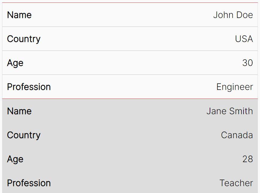
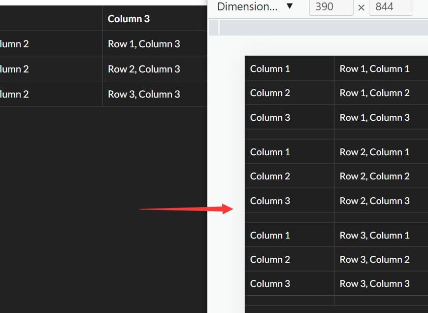
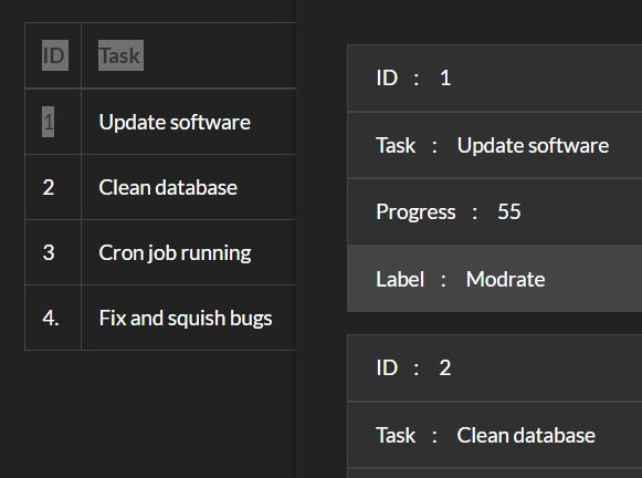
responsivetables.js is an extremely lightweight (~1kb) jQuery responsive table plugin that listens to screen size and transforms a regular html table cells into grouped blocks on small screen devices.
How to use it:
1. Add the responsivetables.css for basic responsive table styles.
<link rel="stylesheet" href="responsivetables.css">
2. Load jQuery library and the jQuery responsivetables.js at the bottom of the document so the page loads faster.
<script src="//code.jquery.com/jquery-1.11.2.min.js"></script>
<script src="responsivetables.min.js"></script>
3. Call the plugin on the html table and specify the breakpoint to trigger the resize function.
$( "table" ).ResponsiveTable({
  breakpoint: 1024 // default: 640
});
This awesome jQuery plugin is developed by warv. For more Advanced Usages, please check the demo page or visit the official website.