jQuery Plugin For Responsive Mobile-friendly Tables - Table MB
| File Size: | 8.51 KB |
|---|---|
| Views Total: | 1336 |
| Last Update: | |
| Publish Date: | |
| Official Website: | Go to website |
| License: | MIT |
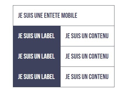
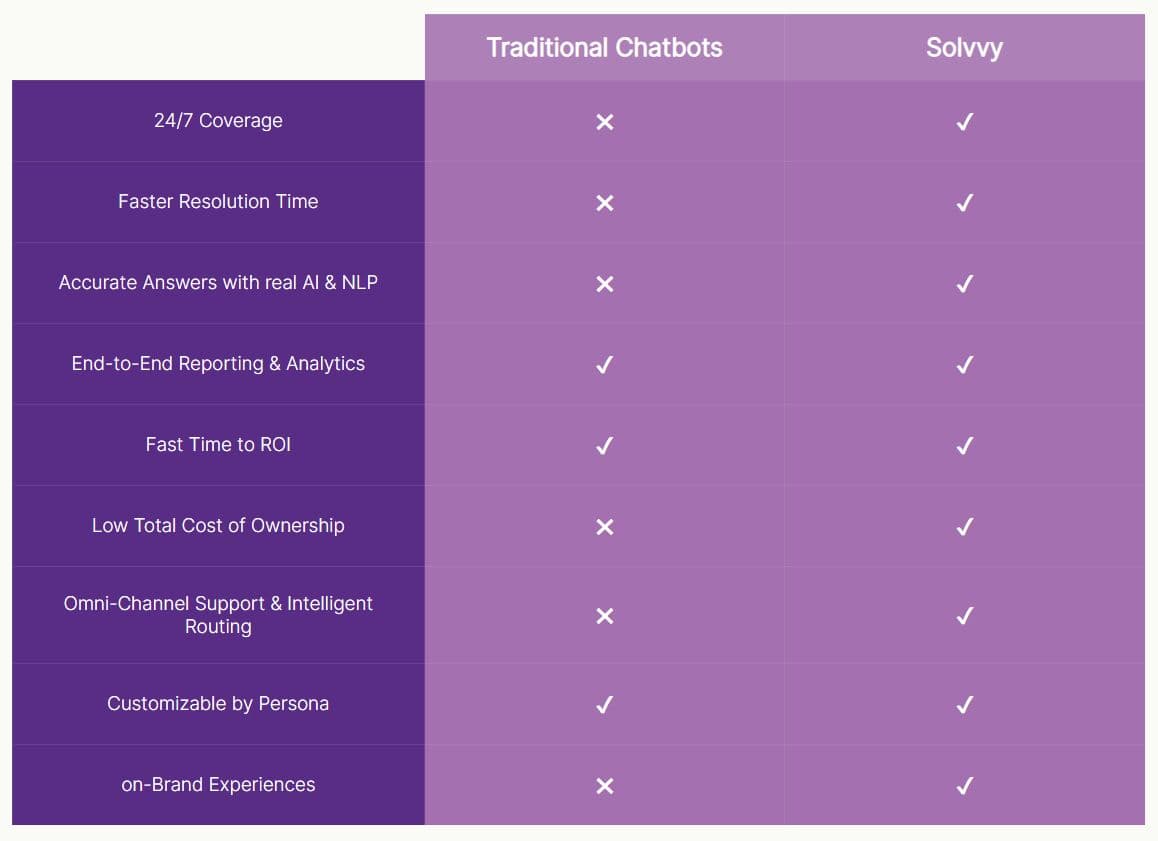
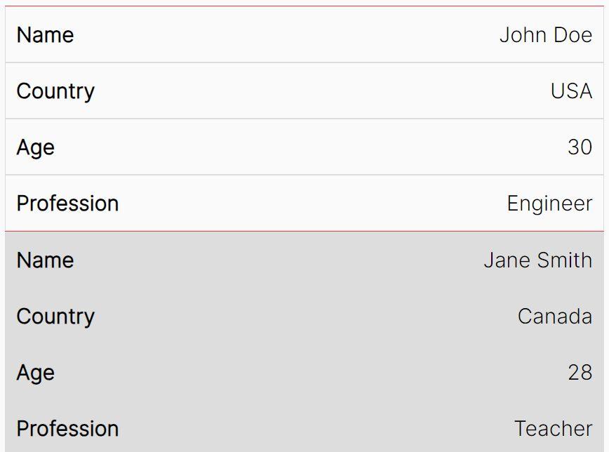
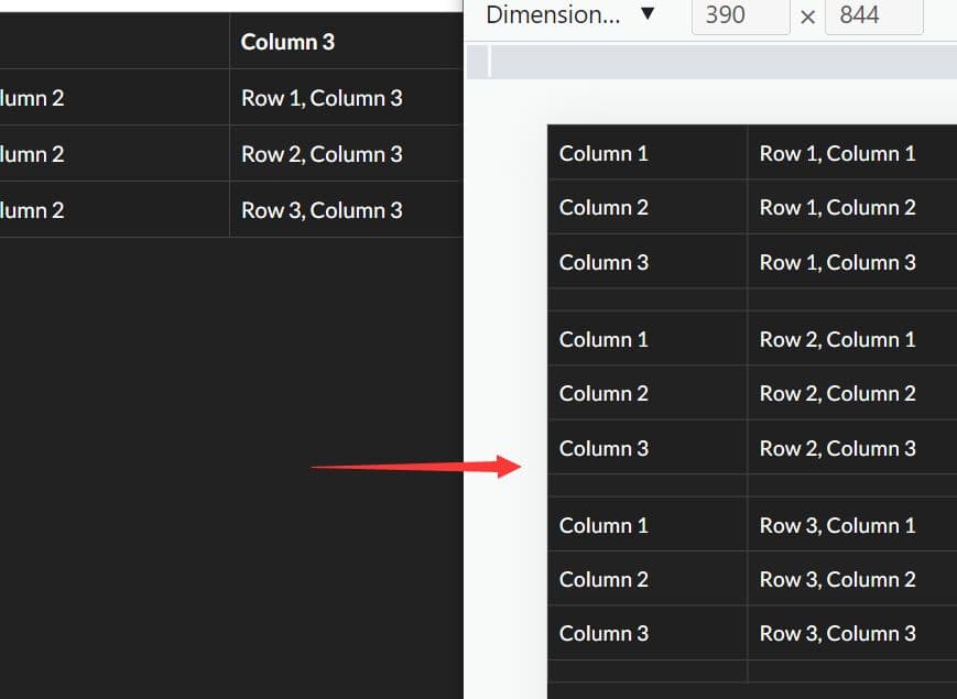
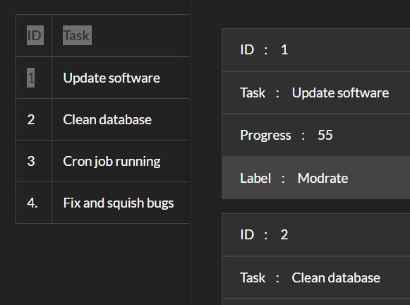
Table MB is a jQuery responsive table plugin that converts your multi-column table into a two-column table to provide better user experience on mobile devices.
How to use it:
1. Place jQuery library and the jQuery table mb plugin at the bottom of your web page.
<script src="//code.jquery.com/jquery-1.11.3.min.js"></script>
<script src="js/jquery.table-mb.js"></script>
2. Add required CSS classes to your table as follow.
<div id="demo">

<table class="demo">
  <tr>
      <td>
      Je ne suis pas un label
      </td>
      <td class="labelMb">
      Je suis un label
      </td>
      <td class="labelMb">
      Je suis un label
      </td>
      <td class="labelMb">
      Je suis un label
      </td>
  </tr>
  <tr>
      <td class="thMb">
      Je suis une entete mobile
      </td>
      <td class="contentMb">
      Je suis un contenu
      </td>
      <td class="contentMb">
      Je suis un contenu
      </td>
      <td class="contentMb">
      Je suis un contenu
      </td>
  </tr>
  <tr>
      <td class="thMb">
      Je suis une entete mobile
      </td>
      <td class="contentMb">
      Je suis un contenu
      </td>
      <td class="contentMb">
      Je suis un contenu
      </td>
      <td class="contentMb">
      Je suis un contenu
      </td>
  </tr>
  ...
</table>

</div>
3. Call the plugin on the table and done. By default, the responsive table behavior will be triggered when the screen size is smaller than 640px.
jQuery("#demo table").tableMb();
4. Advanced call.
jQuery("#demo table").tableMb({

  // parent container
  parent: '#demo',

  // default class for th
  thClass: 'thMb',

  // default class for label
  labelClass: 'labelMb',

  // default class for content
  contentClass: 'contentMb',

  // default selector for refresh table
  refreshClass: 'theTable'

});
This awesome jQuery plugin is developed by teamexodraw. For more Advanced Usages, please check the demo page or visit the official website.