Minimal Responsive Reavealing Menu with jQuery and CSS3 - Snazzy Nav
| File Size: | 6.22 KB |
|---|---|
| Views Total: | 2875 |
| Last Update: | |
| Publish Date: | |
| Official Website: | Go to website |
| License: | MIT |
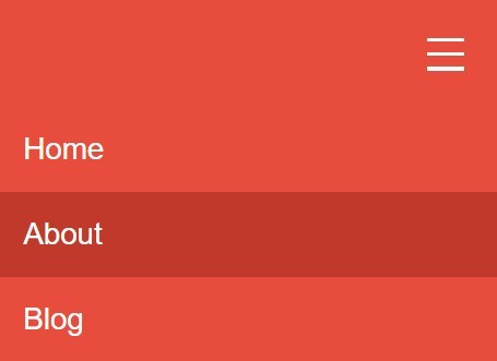
Snazzy Nav is a responsive, mobile-friendly navigation system that utilizes CSS media queries to detect the screen size of devices browsing your website, and turns the regular navigation into a toggleable slide down menu on mobile view.
How to use it:
1. Create a nav list for your navigation menu.
<nav>
  <div class="nav-handle-container">
    <div class="nav-handle"></div>
  </div>
  <ul id="nav">
    <li><a href="#">Home</a></li>
    <li><a href="#">About</a></li>
    <li><a href="#">Blog</a></li>
    <li><a href="#">Contact</a></li>
  </ul>
</nav>
2. Style the navigation menu.
nav ul {
  list-style: none;
  background-color: #E74C3C;
  overflow: hidden;
  color: white;
  margin: 0;
  padding: 0;
  text-align: center;
  -webkit-transition: max-height 0.4s ease-in-out;
  transition: max-height 0.4s ease-in-out;
}

nav ul li {
  display: inline-block;
  padding: 20px;
}

nav ul li a {
  text-decoration: none;
  color: inherit;
}

nav ul li:hover { background: #C0392B; }
3. Style the menu toggle control.
nav .nav-handle-container {
  box-sizing: border-box;
  width: 100%;
  padding: 30px;
  min-height: 150px;
  background: #E74C3C;
  cursor: pointer;
  -webkit-transition: all 0.3s ease-in-out;
  transition: all 0.3s ease-in-out;
  display: none;
}

nav .nav-handle-container .nav-handle {
  height: 5px;
  width: 50px;
  background: white;
  position: absolute;
  display: block;
  left: -webkit-calc(100% - 100px);
  left: calc(100% - 100px);
  top: 75px;
}

nav .nav-handle-container .nav-handle:before, nav .nav-handle-container .nav-handle:after {
  content: "";
  height: 5px;
  width: 50px;
  background: white;
  position: absolute;
  display: block;
}

nav .nav-handle-container .nav-handle:before { top: -20px; }

nav .nav-handle-container .nav-handle:after { bottom: -20px; }
4. Style the navigation menu on mobile view.
@media screen and (max-width: 760px) {

nav .showing { max-height: 30.5em; }

nav ul { max-height: 0px; }

nav ul li {
  box-sizing: border-box;
  width: 100%;
  padding: 35px;
  text-align: left;
  font-size: 2.5em;
}

nav .nav-handle-container { display: block; }

}
5. Include the jQuery library at the bottom of the webpage.
<script src="//code.jquery.com/jquery-1.11.3.min.js"></script>
6. The JavaScript to toggle the CSS classes as you click on the menu toggle button.
$('.nav-handle-container').on('click', function() {
  $('#nav').toggleClass('showing');
});
This awesome jQuery plugin is developed by ben-powley. For more Advanced Usages, please check the demo page or visit the official website.