jQuery Based Bootstrap Popover Enhancement Plugin - Bootstrap Popover X
| File Size: | 32.7 KB |
|---|---|
| Views Total: | 14506 |
| Last Update: | |
| Publish Date: | |
| Official Website: | Go to website |
| License: | MIT |
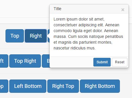
A simple, lightweight jQuery plugin that enhance the default Bootstrap popover component with some additional and useful features.
Key Features:
- Modal style popovers.
- Smart auto position.
- Supports more placements.
- Supports Bootstrap contextual color styles: default, primary, info, success, danger, and warning.
- Close button.
- Custom trigger events: hover, click and focus.
- Compatible with Bootstrap 3/4/5.
See also:
How to use it:
1. To use this plugin, makes sure you have jQuery library and Bootstrap framework installed in your web project.
<link href="/path/to/bootstrap.min.css" rel="stylesheet">
<script src="/path/to/jquery.min.js"></script>
<script src="/path/to/bootstrap.min.js"></script>
2. Include the Bootstrap Popover X plugin's JavaScript and files in the page.
<link href="bootstrap-popover-x.css" rel="stylesheet">
<script src="bootstrap-popover-x.js"></script>
3. Create the Bootstrap Popover X content as follow:
<div id="myPopover" class="popover popover-default">
<div class="arrow"></div>
<h3 class="popover-title">
<span class="close pull-right" data-dismiss="popover-x">×</span>
Title here
</h3>
<div class="popover-content">
Popover content goes here
</div>
<div class="popover-footer">
Footer here
</div>
</div>
4. Create a trigger button to toggle the popover.
<button data-toggle="popover-x"
        data-target="#myPopover">
        Click me
</button>
5. Override the default styles of the popover. Accepted CSS classes:
- popover-default
- popover-primary
- popover-info
- popover-success
- popover-danger
- popover-warning
<div id="myPopover" class="popover popover-danger">
  ...
</div>
6. Specify where to position the popover using data-placement attribute. Accepted position classes:
- right
- left
- top
- bottom
- top top-left
- top top-right
- bottom bottom-left
- bottom bottom-right
- left left-top
- left left-bottom
- right right-top
- right right-bottom
- auto
- auto-top
- auto-right
- auto-bottom
- auto-left
- horizontal
- vertical
<button data-toggle="popover-x"
        data-target="#myPopover"
        data-placement="top">
        Click me
</button>
7. By default the popover will be opened by click on the trigger button. You're able to change the default trigger event in the data-trigger attribute as follows:
<button data-toggle="popover-x"
        data-target="#myPopover"
        data-trigger="hover focus">
        Click me
</button>
8. You're also allowed to initialize the plugin via custom JS.
$('#myCustomButton').popoverButton({
  target: '#myCustomDialog',
  placement: 'auto'
});
Changelog:
v1.5.4 (2024-03-13)
- Correct isBs method logic.
v1.5.3 (2024-03-11)
- Fix and correct jQuery deprecated methods
v1.5.2 (2023-07-24)
- Fix breaking changes for Boostrap library version > 5.1.3
v1.5.1 (2021-09-24)
- Correct android keyboard disappearing issue in popover-x embedded inputs
v1.5.0 (2021-09-20)
- Simplify NPM module handling.
v1.4.9 (2021-09-11)
- Enhance popover-x to be initialized effectively via custom JS. Popover-x can be initialized separately via custom javascript using the popoverButton plugin.
- Enhancements to popover-x to work effectively with bootstrap modals.
- Enhance plugin to work better with NPM module.
v1.4.8 (2020-01-29)
- Correct arrow CSS styles
- Enhancements to support Bootstrap v5.x.
- Correct jQuery load.
v1.4.7 (2018-09-14)
- Enhance bootstrap 4 arrow positioning via CSS class is-bs4 on popover container.
- New dialogCss property to allow setting dialog CSS style attributes before load.
v1.4.5 (2017-09-08)
- Enhancements to support Bootstrap v4.x framework
v1.4.4 (2017-09-07)
- Code enhancements for jQuery 3.x
v1.4.3 (2017-01-09)
- Correct popover marker div rendering
- More correct styles for popover-x positioning behind BS navbar
This awesome jQuery plugin is developed by kartik-v. For more Advanced Usages, please check the demo page or visit the official website.