Stylish jQuery Accordion Plugin with CSS3 Animations
| File Size: | 56.5 KB |
|---|---|
| Views Total: | 4631 |
| Last Update: | |
| Publish Date: | |
| Official Website: | Go to website |
| License: | MIT |
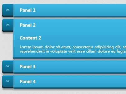
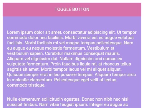
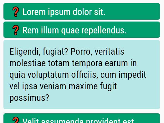
A minimalist jQuery/HTML5/CSS based accordion which allows you to show/hide panels of content with CSS3 powered animations.
How to use it:
1. Build the Html structure for the accordion.
<div id="demo" class="accordion">

  <artical class="ac-panel">
    <header class="ac-header">Header 1</header>
    <section class="ac-content">
      <h3>Title 1</h3>
      <p>Content 1</p>
    </section>
  </artical>

  <artical class="ac-panel">
    <header class="ac-header">Header 2</header>
    <section class="ac-content">
      <h3>Title 2</h3>
      <p>Content 2</p>
    </section>
  </artical>

  <artical class="ac-panel">
    <header class="ac-header">Header 3</header>
    <section class="ac-content">
      <h3>Title 3</h3>
      <p>Content 3</p>
    </section>
  </artical>

</div>
2. The core CSS/CSS3 style rules for the accordion.
* {
  -webkit-box-sizing: border-box;
  -moz-box-sizing: border-box;
  box-sizing: border-box;
}

.accordion { }

.ac-panel { display: block; }

.ac-panel.open .ac-content { }

.ac-header {
  display: block;
  cursor: pointer;
}

.ac-content {
  height: 0;
  padding: 0 20px;
  display: block;
  overflow: hidden;
  -webkit-transition: all .3s linear;
  -moz-transition: all .3s linear;
  -o-transition: all .3s linear;
  transition: all .3s linear;
}
3. The sample CSS to style the accordion. Change or override the CSS snippets as shown below to create your own styles.
.ac-panel {
  background-color: #3bb3e0;
  font-size: 12px;
  text-align: left;
  text-decoration: none;
  color: #fff;
  position: relative;
  border-left: solid 1px #2ab7ec;
  margin: 10px 0;
  margin-left: 35px;
  background-image: linear-gradient(bottom, rgb(44,160,202) 0%, rgb(62,184,229) 100%);
  background-image: -o-linear-gradient(bottom, rgb(44,160,202) 0%, rgb(62,184,229) 100%);
  background-image: -moz-linear-gradient(bottom, rgb(44,160,202) 0%, rgb(62,184,229) 100%);
  background-image: -webkit-linear-gradient(bottom, rgb(44,160,202) 0%, rgb(62,184,229) 100%);
  background-image: -ms-linear-gradient(bottom, rgb(44,160,202) 0%, rgb(62,184,229) 100%);
  background-image: -webkit-gradient( linear, left bottom, left top, color-stop(0, rgb(44,160,202)), color-stop(1, rgb(62,184,229)) );
  -webkit-border-top-right-radius: 5px;
  -webkit-border-bottom-right-radius: 5px;
  -moz-border-radius-topright: 5px;
  -moz-border-radius-bottomright: 5px;
  border-top-right-radius: 5px;
  border-bottom-right-radius: 5px;
  -webkit-box-shadow: inset 0px 1px 0px #2ab7ec, 0px 5px 0px 0px #156785, 0px 10px 5px #999;
  -moz-box-shadow: inset 0px 1px 0px #2ab7ec, 0px 5px 0px 0px #156785, 0px 10px 5px #999;
  -o-box-shadow: inset 0px 1px 0px #2ab7ec, 0px 5px 0px 0px #156785, 0px 10px 5px #999;
  box-shadow: inset 0px 1px 0px #2ab7ec, 0px 5px 0px 0px #156785, 0px 10px 5px #999;
}

.ac-header {
  font-size: 14px;
  font-weight: bold;
  padding: 10.5px 20px;
}

.ac-panel:before {
  background-color: #2561b4;
  content: "\00BB";
  text-align: center;
  width: 35px;
  max-height: 29px;
  height: 100%;
  position: absolute;
  display: block;
  padding-top: 8px;
  top: 0px;
  left: -36px;
  font-size: 16px;
  font-weight: bold;
  color: #8fd1ea;
  text-shadow: 1px 1px 0px #07526e;
  border-right: solid 1px #07526e;
  background-image: linear-gradient(bottom, rgb(10,94,125) 0%, rgb(14,139,184) 100%);
  background-image: -o-linear-gradient(bottom, rgb(10,94,125) 0%, rgb(14,139,184) 100%);
  background-image: -moz-linear-gradient(bottom, rgb(10,94,125) 0%, rgb(14,139,184) 100%);
  background-image: -webkit-linear-gradient(bottom, rgb(10,94,125) 0%, rgb(14,139,184) 100%);
  background-image: -ms-linear-gradient(bottom, rgb(10,94,125) 0%, rgb(14,139,184) 100%);
  background-image: -webkit-gradient( linear, left bottom, left top, color-stop(0, rgb(10,94,125)), color-stop(1, rgb(14,139,184)) );
  -webkit-border-top-left-radius: 5px;
  -webkit-border-bottom-left-radius: 5px;
  -moz-border-radius-topleft: 5px;
  -moz-border-radius-bottomleft: 5px;
  border-top-left-radius: 5px;
  border-bottom-left-radius: 5px;
  -webkit-box-shadow: inset 0px 1px 0px #2ab7ec, 0px 5px 0px 0px #032b3a, 0px 10px 5px #999;
  -moz-box-shadow: inset 0px 1px 0px #2ab7ec, 0px 5px 0px 0px #032b3a, 0px 10px 5px #999;
  -o-box-shadow: inset 0px 1px 0px #2ab7ec, 0px 5px 0px 0px #032b3a, 0px 10px 5px #999;
  box-shadow: inset 0px 1px 0px #2ab7ec, 0px 5px 0px 0px #032b3a, 0px 10px 5px #999;
}

.ac-panel:active {
  top: 3px;
  background-image: linear-gradient(bottom, rgb(62,184,229) 0%, rgb(44,160,202) 100%);
  background-image: -o-linear-gradient(bottom, rgb(62,184,229) 0%, rgb(44,160,202) 100%);
  background-image: -moz-linear-gradient(bottom, rgb(62,184,229) 0%, rgb(44,160,202) 100%);
  background-image: -webkit-linear-gradient(bottom, rgb(62,184,229) 0%, rgb(44,160,202) 100%);
  background-image: -ms-linear-gradient(bottom, rgb(62,184,229) 0%, rgb(44,160,202) 100%);
  background-image: -webkit-gradient(  linear,  left bottom,  left top,  color-stop(0, rgb(62,184,229)),  color-stop(1, rgb(44,160,202))  );
  -webkit-box-shadow: inset 0px 1px 0px #2ab7ec, 0px 2px 0px 0px #156785, 0px 5px 3px #999;
  -moz-box-shadow: inset 0px 1px 0px #2ab7ec, 0px 2px 0px 0px #156785, 0px 5px 3px #999;
  -o-box-shadow: inset 0px 1px 0px #2ab7ec, 0px 2px 0px 0px #156785, 0px 5px 3px #999;
  box-shadow: inset 0px 1px 0px #2ab7ec, 0px 2px 0px 0px #156785, 0px 5px 3px #999;
}

.ac-panel:active::before {
  top: -3px;
  -webkit-box-shadow: inset 0px 1px 0px #2ab7ec, 0px 5px 0px 0px #032b3a, 1px 1px 0px 0px #044a64, 2px 2px 0px 0px #044a64, 2px 5px 0px 0px #044a64, 6px 4px 2px #0b698b, 0px 10px 5px #999;
  -moz-box-shadow: inset 0px 1px 0px #2ab7ec, 0px 5px 0px 0px #032b3a, 1px 1px 0px 0px #044a64, 2px 2px 0px 0px #044a64, 2px 5px 0px 0px #044a64, 6px 4px 2px #0b698b, 0px 10px 5px #999;
  -o-box-shadow: inset 0px 1px 0px #2ab7ec, 0px 5px 0px 0px #032b3a, 1px 1px 0px 0px #044a64, 2px 2px 0px 0px #044a64, 2px 5px 0px 0px #044a64, 6px 4px 2px #0b698b, 0px 10px 5px #999;
  box-shadow: inset 0px 1px 0px #2ab7ec, 0px 5px 0px 0px #032b3a, 1px 1px 0px 0px #044a64, 2px 2px 0px 0px #044a64, 2px 5px 0px 0px #044a64, 6px 4px 2px #0b698b, 0px 10px 5px #999;
}
4. Load jQuery library and the accordion.js script in your web page.
<script src="http://ajax.googleapis.com/ajax/libs/jquery/2.1.3/jquery.min.js"></script>
<script src="accordion.js"></script>
5. Initialize the accordion plugin and we're done.
$('#demo').Accordion();
6. Default options.
$('#demo').Accordion({

// close the panel if you click somewhere outside of the accordion
outsideClose:true,

// // close the panel if you click on open panel
selfClose:true

});
Change log:
2015-02-16
- Add self close option
This awesome jQuery plugin is developed by vlada-j. For more Advanced Usages, please check the demo page or visit the official website.