Expand And Collapse Anything W1ith jQuery - Expander
| File Size: | 145 KB |
|---|---|
| Views Total: | 2695 |
| Last Update: | |
| Publish Date: | |
| Official Website: | Go to website |
| License: | MIT |
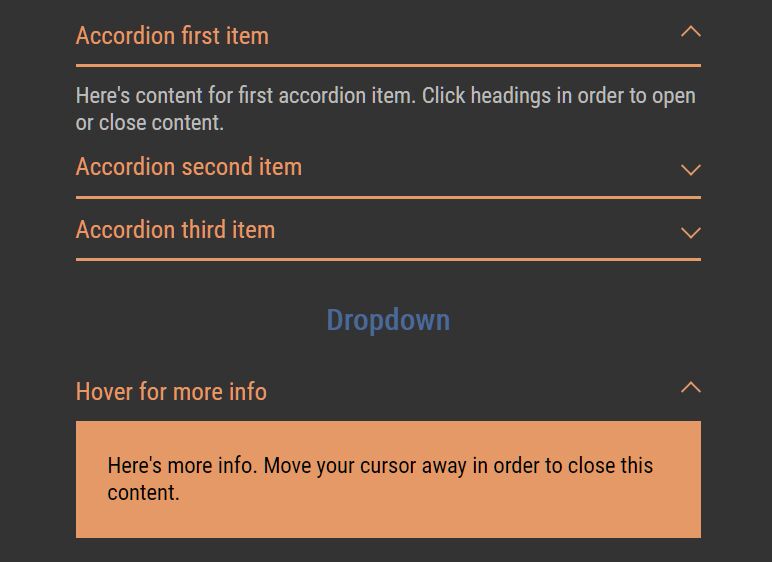
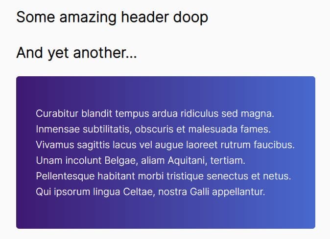
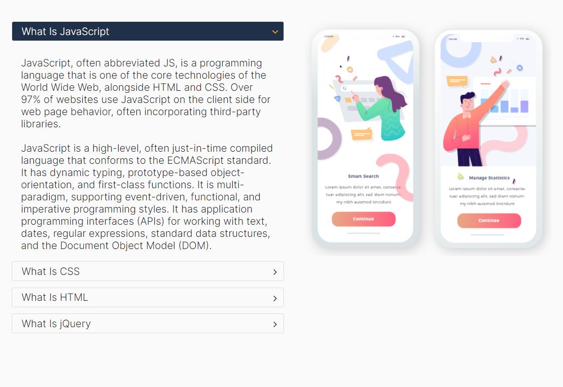
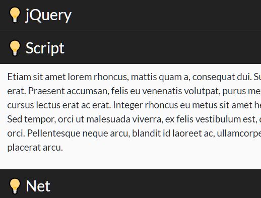
Expander is a powerful and multipurpose jQuery content toggle plugin for toggling the visibility of any content blocks with slide up & slide down animations.
It uses Popper.js library to provides a smart auto-position functionality that automatically re-position the content to make it stay within the screen.
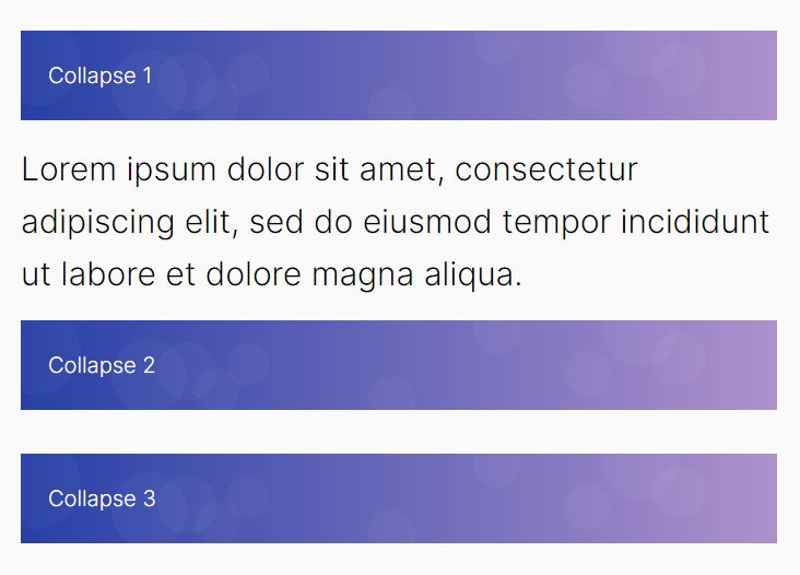
Ideal for creating smooth accordion and dropdown components on your web app.
How to use it:
1. Insert the Expander plugin's files into the HTML file.
<!-- Required -->
<script src="/path/to/cdn/jquery.slim.min.js"></script>
<!-- Expander files -->
<link rel="stylesheet" href="/path/to/dist/jquery.expander.min.css" />
<script src="/path/to/dist/jquery.expander.min.js"></script>
2. Create a single expanding block with the following data attributes:
- data-expander: Required
- data-toggle: Toggle element
- data-body: Element to toggle
<div class="accordion" data-expander>
  <div class="accordion__head" data-toggle>
    Click Me To Toggle
  </div>
  <div class="accordion__body" data-body>
    Any Content Here
  </div>
</div>
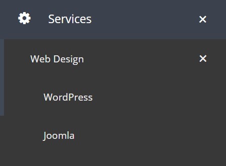
3. Create connected expanding blocks (accordion):
<div class="accordion" data-expander="my-accordion">
  <div class="accordion__head" data-toggle>
    Click Me To Toggle
  </div>
  <div class="accordion__body" data-body>
    Any Content Here
  </div>
</div>

<div class="accordion" data-expander="my-accordion">
  <div class="accordion__head" data-toggle>
    Click Me To Toggle
  </div>
  <div class="accordion__body" data-body>
    Any Content Here
  </div>
</div>

...
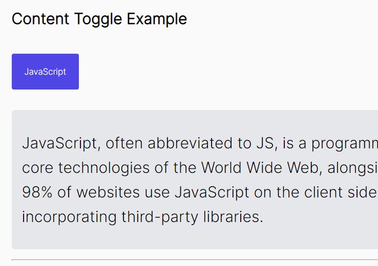
3. Create a dropdown component that allows the user to expand/collapse content by hovering over the toggle element.
<div class="dropdown">
  <div class="dropdown__head" data-toggle>Hover Me</div>
  <div class="dropdown__body" data-body>
    Any Content Here
  </div>
</div>
$('.dropdown').expander({
  dropdown: 'bottom'
});
4. All possible options to customize the expander plugin.
$('element').expander({

  // determine whether to show the content on page load
  opened: false,

  // additional CSS class(es)
  class: false,

  // determine the content is closeable
  closeable: true,

  // prevent default actions
  preventDefault: true,

  // duration of the animation in ms
  animationDuration: 300,

  // elements that will be shown/hidden
  body: [],

  // elements that will toggle the visibility
  toggle: [],

  // elements that will expand the content
  open: [],

  // elements that will collapse the content
  close: [],

  // enable dropdown mode here
  dropdown: false,

  // determine if the dropdown is hoverable
  dropdownHoverable: true,

  // popper.js options
  popper: {},

});
5. Callback functions.
$('element').expander({

  onOpen: function(event, expander){
    // on open
  },

  onClose: function(event, expander){
    // on close
  },

  onToggle: function(event, expander){
    // on toggle
  },

  onInit: function(expander){
    // on init
  }

});
Changelog:
2020-11-25
- Added popper options
- Fixed minor bugs
This awesome jQuery plugin is developed by goodleby. For more Advanced Usages, please check the demo page or visit the official website.