10 Best Range Slider Plugins In JavaScript (2026 Update)
A range slider lets visitors adjust numeric values by dragging a handle. A single-value slider works well for settings like volume or image quality. Dual-handle sliders allows you to select a minimum and maximum for price filters, numeric settings, or data selection.
The 10 best JavaScript and jQuery range slider libraries here address these uses through jQuery plugins, a Bootstrap-compatible slider, native HTML input enhancements, and vanilla JavaScript components. You will find focused controls for simple forms alongside configurable sliders with multiple handles, scale labels, tooltips, and keyboard interactions.
Originally Published Oct 09 2019, updated Oct 13 2026
JavaScript Range Slider Plugins: Quick Comparison
| Library | Technology and features |
|---|---|
| Bootstrap Slider | Bootstrap; JavaScript, optional jQuery. Single/dual handles, ticks, logarithmic scale. |
| jQuery UI Price Range Slider | jQuery + jQuery UI. Dual-handle price filter with numeric inputs. |
| jQuery Range Slider With Synchronized Inputs | jQuery. Dual handles synchronized with number fields. |
| Ion.RangeSlider | jQuery. Single/dual sliders, grids, formatting, skins. |
| AlRangeSlider | jQuery; TypeScript source. Dual handles, themes, tooltips, value inputs. |
| rSlider.js | Vanilla JavaScript. Discrete values, scale labels, tooltips. |
| range-slider-input | Vanilla JavaScript; ESM/UMD. Dual handles, vertical mode, range dragging. |
| noUiSlider | Vanilla JavaScript; TypeScript distribution. Multiple handles, accessible controls, pips. |
| ToolCool Range Slider | Vanilla JavaScript Web Component; TypeScript source. Multi-handle slider, RTL, storage, plugins. |
| dual-range-input | Vanilla JavaScript / TypeScript + native inputs. Two native range inputs, CSS variables. |
Best jQuery Range Slider Plugins
Highly Customizable Range Slider Plugin For Bootstrap - Bootstrap Slider
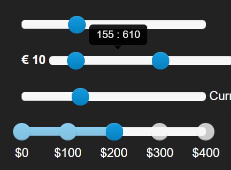
Bootstrap Slider creates single-value and two-handle controls for Bootstrap-styled forms. Version 11 supports Bootstrap 4, and its plain JavaScript constructor works independently of the optional jQuery plugin. Tick labels, logarithmic scales, and formatted tooltips help communicate the selected values.
Features
- Single-value and two-handle range selection.
- Horizontal and vertical orientations, including right-to-left layouts.
- Custom handle shapes, filled selections, and highlighted intervals.
- Tick marks, tick labels, snapping, and fixed steps.
- Optional logarithmic scales.
- Tooltips with custom value formatting and separate labels for each handle.
- Keyboard navigation and configurable ARIA labels.
- Decimal precision, reversed direction, and enabled/disabled states.
- Methods and events for reading values and reacting to changes.
Convenient Price Range Slider With jQuery UI
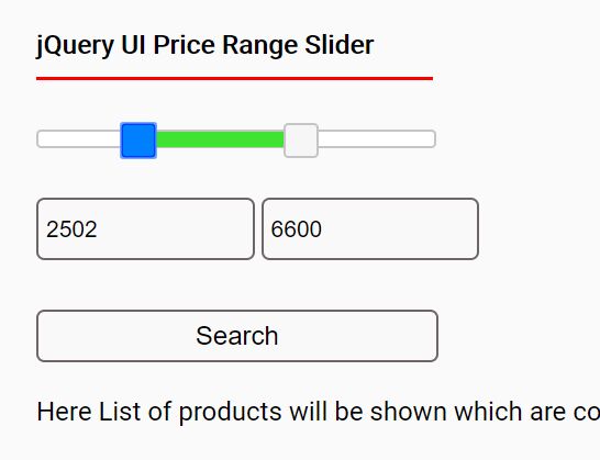
This price filter uses the jQuery UI Slider widget to keep two drag handles and minimum/maximum text fields in sync. Shoppers can move either handle or enter an exact amount, and the script validates the numbers before updating the selected interval. It is a focused example for stores that already load jQuery UI.
Features
- Two handles for the minimum and maximum price.
- Editable input fields linked to the slider positions.
- Numeric and boundary validation for typed values.
- Handle overlap prevention.
- Configurable minimum, maximum, and step values.
- jQuery UI dependency and existing form-markup integration.
jQuery Range Slider Plugin with Synchronized Inputs (1.34KB)
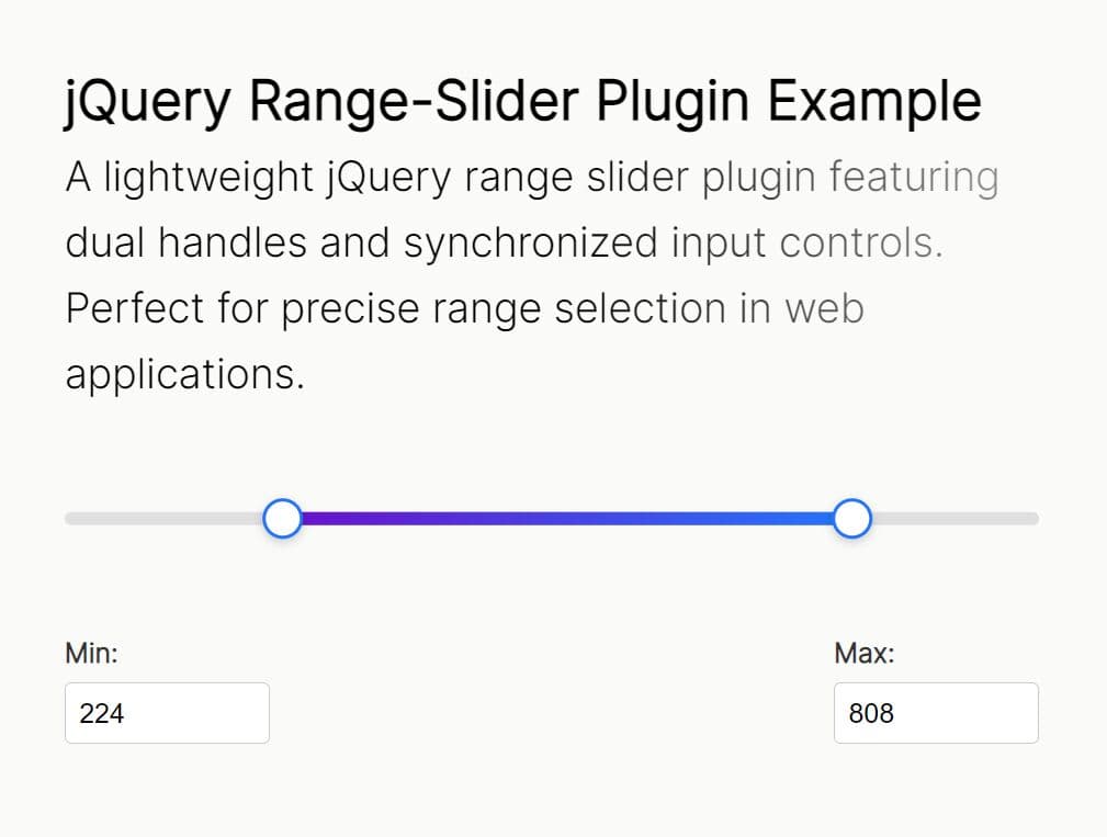
A compact jQuery implementation connects a two-handle slider to editable number inputs. The highlighted track follows the selected minimum and maximum as people drag the handles, and typing a value updates the slider position. Its small implementation is aimed at forms that need a straightforward numeric interval.
Features
- Minimum and maximum handles with a filled selection track.
- Two-way synchronization between handles and numeric fields.
- Input validation and range-bound handling.
- Mouse and touch drag events.
- Recalculation on viewport resize.
Flexible and Touch-Friendly jQuery Range Slider Plugin - Ion.RangeSlider
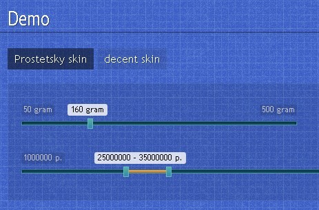
Ion.RangeSlider transforms a text input into a touch-friendly single-value or dual-handle slider. Currency and date-like values, configurable skins, and value grids make it suitable for filters that need formatted labels. The selected values stay connected to the underlying input, and the plugin exposes callbacks and methods for interactive forms.
Features
- Single-handle and double-handle selection modes.
- Touch interactions, keyboard control, and multiple independent instances.
- Six supplied skins and CSS-based appearance customization.
- Numeric steps, snapping, negative values, and fractional values.
- Custom values, value arrays, and formatted labels.
- Grid lines and optional minimum, maximum, and current-value labels.
- Currency prefixes, suffixes, custom prettifiers, and value separators.
- Date and time values.
- Drag the selected interval as a unit.
- Input data attributes for configuration and values.
- Callbacks for initialization and value changes.
- Programmatic update, reset, and remove methods.
Beautiful Custom Slider Control Plugin - jQuery AlRangeSlider
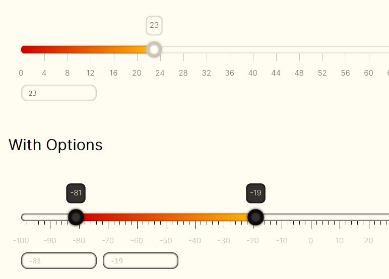
AlRangeSlider creates customizable jQuery sliders with horizontal or vertical layouts, light and dark themes, and editable numeric inputs. The project also handles mapped or discrete values, making it useful for selectors that need labeled stops beyond a continuous number scale.
Features
- Horizontal and vertical range sliders.
- Light and dark color themes.
- Minimum, maximum, steps, and decimal precision.
- Custom value arrays and mapped scale values.
- Tick marks, grids, labels, and tooltips.
- Optional numeric input fields linked to the slider.
- Configurable knob collisions and tooltip behavior.
- Initialization, change, finish, and update callbacks.
- Methods to disable, restart, and update slider values.
Best Vanilla JavaScript Range Slider Libraries
Animated Customizable Range Slider In Pure JavaScript – rSlider.js
rSlider.js replaces a text field with a slider that can select one value or an interval from a defined set. Scale labels and tooltips work well for year ranges, discrete numeric values, and other selections where visitors need to recognize exact stops along the track.

Features
- Single-value and dual-handle range selection.
- Custom arrays of numbers or text values.
- Visible scale marks and labels.
- Tooltips showing the chosen values.
- Configurable steps and initial selection.
- Change callbacks.
- Read, set, disable, and destroy methods.
- Dependency-free browser JavaScript.
Lightweight Fast Custom Range Slider Input With JavaScript
range-slider-input draws a customizable single-value or dual-handle selector in a JavaScript container. Its two thumbs can move independently, and a selected interval can be dragged along the track. Vertical layouts, individual handle controls, and styling hooks make it useful for forms that need direct control over range behavior.

Features
- Single-value and dual-handle range modes.
- Horizontal and vertical slider layouts.
- Minimum, maximum, step, and initial values.
- Independent control of the lower and upper handles.
- Touch and keyboard interaction.
- Negative values and configurable numeric bounds.
- Disable the slider, the range drag behavior, or individual thumbs.
- Drag the selected range along the track.
- Input callbacks and thumb/range drag hooks.
- Methods to read and change values, limits, and orientation.
- Custom thumb, track, and selection styles in CSS.
- ES module and UMD distributions with no jQuery dependency.
Accessible Touch-friendly Range Slider Plugin - noUiSlider
noUiSlider creates single-value, dual-handle, and multi-handle sliders with a plain JavaScript API. It handles dragging, keyboard input, touch interaction, and readable value updates. Custom scales, handle-distance constraints, and formatted tooltips give numeric filters detailed control over the selected interval.

Features
- Single, dual, and multiple slider handles.
- ARIA attributes and keyboard interaction.
- Mouse, multi-touch, and drag interactions.
- Horizontal and vertical orientation with RTL direction.
- Nonlinear scales and configurable step behavior.
- Minimum spacing, maximum handle distance, and edge padding.
- Tooltips with numeric value formatting.
- Pips, tick marks, and labeled scales.
- Connected track segments and draggable selected ranges.
- Events for update, slide, change, start, and end.
- Methods to set, get, reset, disable, and destroy instances.
- ES module and browser script distribution with no jQuery dependency.
Touch-enabled Custom Range Slider Web Component – ToolCool Range Slider
ToolCool Range Slider exposes a custom HTML element for one, two, or several draggable handles. It supports numeric and discrete text values, vertical or right-to-left layouts, and keyboard or touch input. Optional extensions bring marks, moving tooltips, themes, labels, and saved selections into the component.

Features
- One, two, or multiple adjustable handles.
- Native custom-element markup and no jQuery dependency.
- Horizontal and vertical orientation, plus RTL direction.
- Numeric steps or discrete text and numeric values.
- Touch, keyboard, and mouse-wheel interactions.
- ARIA attributes for handle accessibility.
- Handle overlap and distance controls.
- Range dragging and nonlinear scales.
- Custom handles, colors, sizes, and CSS themes.
- Optional marks, moving tooltips, and generated labels.
- Optional localStorage and sessionStorage integration.
- Programmatic changes and enable/disable controls.
Modern Range Sliders Based On Native Range Inputs – dual-range-input
dual-range-input turns two standard HTML range inputs into a coordinated min/max slider. The inputs keep their native events and values, so existing form code can read each endpoint normally. CSS custom properties control the track and thumb appearance, with minimal additional JavaScript.

Features
- Two native HTML range inputs for a dual-handle selector.
- Editable minimum, maximum, step, and initial values in markup.
- Native input event handling for each endpoint.
- CSS custom properties for track, thumb, and selection styling.
- Configurable decimal precision.
- TypeScript package with no jQuery dependency.
Styling a Native HTML Range Input
HTML <input type="range"> selects one numeric value. CSS can change its thumb and track appearance. A dual-handle control requires coordinated inputs or a slider library. The code here styles the thumb of a single native range input.
<label for="volume-slider">Volume</label>
<input type="range" class="slider" id="volume-slider" min="0" max="100" value="40" step="5">
.slider {
  -webkit-appearance: none;
  appearance: none;
  display: block;
  width: 100%;
  height: 8px;
  border-radius: 4px;
  background: #d3d3d3;
  cursor: pointer;
}

.slider:focus-visible {
  outline: 2px solid #145da0;
  outline-offset: 4px;
}

.slider::-webkit-slider-thumb {
  -webkit-appearance: none; /* Override default look */
  appearance: none;
  width: 25px; /* Set a specific slider handle width */
  height: 25px; /* Slider handle height */
  background: #4CAF50; /* Green background */
  cursor: pointer; /* Cursor on hover */
}

.slider::-moz-range-thumb {
  width: 25px; /* Set a specific slider handle width */
  height: 25px; /* Slider handle height */
  background: #4CAF50; /* Green background */
  cursor: pointer; /* Cursor on hover */
}
Related Range Slider Resources
- Slim Custom Range Input Plugin With jQuery - html-input-range
- Range Slider Plugin With Dual Handles and Ticks - CuiSlider
- Custom Range Slider With Sliding Value
- Find More jQuery Range Slider Plugins
- Find More Vanilla JavaScript & CSS range slider
- 10 Best Custom Range Slider JavaScript Libraries
- 10 Best Range Slider Components For React And React Native