Highly Customizable Range Slider Plugin For Bootstrap - Bootstrap Slider
| File Size: | 213 KB |
|---|---|
| Views Total: | 121000 |
| Last Update: | |
| Publish Date: | |
| Official Website: | Go to website |
| License: | MIT |
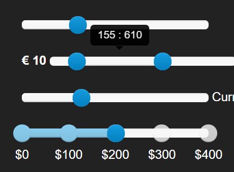
Bootstrap Slider is a jQuery plugin that uses native Bootstrap styling to generate highly configurable, accessible, touch-friendly single value sliders or range sliders from normal range inputs.
For a smaller range-control option without the Bootstrap-specific interface layer, compare this customizable jQuery range input plugin.
Features:
- Supports both single value and multiple range sliders.
- Custom handles, labels, tooltips, tick marks, step intervals.
- Supports logarithmic scale.
- Vertical or horizontal modes.
- Accessibility with ARIA labels.
- Callback events.
- Allows to specify the number of places after the decimal.
- Compatible with Bootstrap 4
See Also:
Basic usage:
1. Download and include the jQuery Bootstrap Slider plugin's CSS and JS files on your web project which has jQuery library and Bootstrap framework installed.
<link href="bootstrap-slider.css" rel="stylesheet">
<script src="bootstrap-slider.js"></script>
2. Create a basic single value slider from a regular range input.
$("#input").slider();
3. Configuration options. The following options can be passed via data attributes or JavaScript. For data attributes, append the option name to data-slider-*, as in data-slider-min="0".
$("#input").slider({

  // the id of the slider element
  id: "",

  // minimum value
  min: 0,

  // maximum value
  max: 10,

  // increment step
  step: 1,

  // the number of digits shown after the decimal.
  precision: 0,

  // 'horizontal' or 'vertical'
  orientation: 'horizontal',

  // initial value
  value: 5,

  // enable range slider
  range: false,

  // selection placement.
  // 'before', 'after' or 'none'.
  // in case of a range slider, the selection will be placed between the handles
  selection: 'before',

  // 'show', 'hide', or 'always'
  tooltip: 'show',

  // show two tooltips one for each handler
  tooltip_split: false,

  // lock to ticks
  lock_to_ticks: false,

  // 'round', 'square', 'triangle' or 'custom'
  handle: 'round',

  // whether or not the slider should be reversed
  reversed: false,

  // RTL mode
  rtl: 'auto',

  // whether or not the slider is initially enabled
  enabled: true,

  // callback
  formatter: function formatter(val) {
    if (Array.isArray(val)) {
      return val[0] + " : " + val[1];
    } else {
      return val;
    }
  },

  // The natural order is used for the arrow keys.
  // Arrow up select the upper slider value for vertical sliders, arrow right the righter slider value for a horizontal slider - no matter if the slider was reversed or not.
  // By default the arrow keys are oriented by arrow up/right to the higher slider value, arrow down/left to the lower slider value.
  natural_arrow_keys: false,

  // Used to define the values of ticks.
  // Tick marks are indicators to denote special values in the range.
  // This option overwrites min and max options.
  ticks: [],

  // Defines the positions of the tick values in percentages.
  // The first value should always be 0, the last value should always be 100 percent.
  ticks_positions: [],

  // Defines the labels below the tick marks. Accepts HTML input.
  ticks_labels: [],

  // Used to define the snap bounds of a tick.
  // Snaps to the tick if value is within these bounds.
  ticks_snap_bounds: 0,

  // Used to allow for a user to hover over a given tick to see it's value.
  ticks_tooltip: false,

  // Position of tooltip, relative to slider.
  // Accepts 'top'/'bottom' for horizontal sliders and 'left'/'right' for vertically orientated sliders.
  // Default positions are 'top' for horizontal and 'right' for vertical slider.
  tooltip_position: null,

  // Set to 'logarithmic' to use a logarithmic scale.
  scale: 'linear',

  // Focus the appropriate slider handle after a value change.
  focus: false,

  // ARIA labels for the slider handle's, Use array for multiple values in a range slider.
  labelledby: null,

  // Defines a range array that you want to highlight
  rangeHighlights: []

});
4. API methods.
// enable the slider
$("#input").slider("enable");

// disable the slider
$("#input").slider("disable");

// toggle the slider
$("#input").slider("toggle");

// refresh the slider
$("#input").slider("refresh");

// Renders the tooltip again, after initialization.
// Useful in situations when the slider and tooltip are initially hidden.
$("#input").slider("relayout");

// destroy the slider
$("#input").slider("destroy");

// get the current value from the slider
$("#input").slider("getValue");

// get the div slider element
$("#input").slider("getElement");

// Returns true if enabled, false if disabled
$("#input").slider("isEnabled");

// Set a new value for the slider.
// If optional triggerSlideEvent parameter is true, 'slide' events will be triggered.
// If optional triggerChangeEvent parameter is true, 'change' events will be triggered.
// This function takes newValue as either a Number or Array.
setValue(newValue, triggerSlideEvent, triggerChangeEvent)

// When the slider event eventType is triggered, the callback function will be invoked
$("#input").slider().on(eventType, callback);

// Remove the callback function from the slider event eventType
$("#input").slider().off(eventType, callback);
5. Events.
var demo = $('#inpit').slider()

// This event fires when the slider is dragged
.on(slide, callback);

// This event fires when dragging starts
.on(slideStart, callback);

// This event fires when the dragging stops or has been clicked on
.on(slideStop, callback);

// This event fires when the slider value has changed
.on(change, callback);

// This event fires when the slider is enabled
.on(slideEnabled, callback);

// This event fires when the slider is disabled
.on(slideDisabled, callback);
Changelog:
v11.0.3 (2024-09-10)
- Resolves issue with page scale factor.
v11.0.2 (2020-06-04)
- Bootstrap 4 Compatibility
v10.6.2 (2019-07-12)
- Bug Fix: Fixes bridget bug with empty jquery object.
v10.6.1 (2019-02-15)
- Bug Fix: Fix slider for touch-enabled devices.
v10.6.0 (2019-01-07)
- New Feature: Add new feature to persist the value after a refresh.
- Bug Fix: Fix unit tests to execute event callbacks asynchronously.
v10.5.0 (2019-01-04)
- New Feature: Add lock to ticks feature.
- Bug Fix: Fix mouseup event should trigger 'change' event.
v10.4.2 (2018-12-19)
- Bug Fix: Fix 'change' event should trigger when either values change for range sliders.
- Bug Fix: Remove unnecessary call to parseFloat(). See here for further details.
- Bug Fix: Fix namespace handling. See here for further details.
- Bug Fix: Fix tooltip when option is set to 'always'. See here for further details
- Bug Fix: Hovering over ticks displays the tick index.
v10.4.0 (2018-12-13)
- Minor API Update: Update behaviour so that min/max tick values do not overwrite min/max settings.
- Bug Fix: Remove unnecessary function calls. See here for further details.
- Bug Fix: Fix calculation of percentage values. See here for further details.
- Bug Fix: Recalculate the percentage on mouseup event.
v10.3.3 (2018-12-06)
- Bug Fix: Add _copyState() function to create a temporary copy of slider state.
v10.3.2 (2018-11-29)
- Bug Fix: Allow range slider to snap to ticks within bounds.
v10.3.1 (2018-11-25)
- Bug Fix: Remove duplicate call to relayout() in _layout() function.
- New Feature: Add selection CSS classes to tick labels
- Bug Fix: Check if getComputedStyle() returns null. Addresses issue with Firefox browsers running version < 62.
v10.2.2 (2018-11-06)
- Bugfix
v10.2.1 (2018-09-26)
- Bug Fix Hovering next to slider does not show the tooltip.
- New Feature Show pointer cursor on slider ticks.
v10.0.2 (2018-04-29)
- Fixes an issue when determining mouse coords when pageXOffset >= 0 .
- Fixing an issue where DOM elements were being selected on slide in FF and IE.
v10.0.0 (2017-11-09)
- Bug Fix Refactoring tooltip CSS to use transform for positioning.
v9.9.0 (2017-09-24)
- New Feature LESS/CSS: refactor colors into variables file.
v9.8.1 (2017-07-07)
- Bug Fix Addresses issue where the max value calculation was wrong due to the cutoff when the max option value was not a multiple of the step option value.
v9.8.0 (2017-04-25)
- New Feature: Ability to add a custom class to the ranges of a slider with the rangeHightlights option specified.
v9.7.3 (2017-04-09)
- Bug Fix Resolves PhantomJS error that was occurring while running the unit test suite.
v9.7.2 (2017-02-11)
- Bug Fix Resolves accesibility issue in range sliders.
v9.7.1 (2017-01-30)
- Bug Fix Resolves "'slider' of undefined" error.
v9.7.0 (2017-01-05)
- Performance Enhancement Use passive event listeners for touch-enabled devices.
v9.6.1 (2017-01-04)
- New Feature: Adds ability to set direction (using HTML5 dir attribute).
- Fix breaking issue with SASS compilation
v9.6.0 (2017-01-04)
- New Feature: Adds ability to set direction (using HTML5 dir attribute).
v9.5.4 (2016-12-19)
- Bug Fix: Fixes issue where dragging slider handle outside of modal and releasing cursor would close the modal.
v9.5.3 (2016-12-02)
- Bug Fix: Fixes typo from previous update to SCSS rules.
v9.5.2 (2016-12-01)
- Fixes SCSS rules.
v9.5.1 (2016-11-24)
- Bug Fix: Removes 'none' classes after selection change.
v9.5.0 (2016-11-22)
- New Feature: Adds aria-valuetext attribute to each slider handle element, which is set to be the current formatted value of the slider (based on the formatter option).
v9.4.1 (2016-11-05)
- Documentation Fix: Fixing an inconsistency with the licensing information in the source files.
v9.4.0 (2016-11-01)
- New Feature: Adds the ability to set the slider value using stringified numbers.
v9.3.2 (2016-10-30)
- Bug Fix: Fixes reported bug where a slider was unable to be destroyed and re-created if there were event listeners bound to it.
v9.3.0 (2016-10-21)
- New Feature: Adds the ability to enable/disable tooltips when hovering over ticks via the ticks_tooltip option.
v9.2.2 (2016-10-20)
- Bug Fix: Resolves issue where range highlights were not being applied properly for reversed sliders.
v9.2.0 (2016-08-27)
- New Feature: Adding the ability to target certain ranges of the slider track via CSS in order to highlight them.
v9.1.3 (2016-08-06)
- Bug Fix: Checks for window object before attempting to attach console polyfills.
v9.1.1 (2016-07-15)
- New Feature: Always binding to the $.fn.bootstrapSlider namespace and printing a console warning when the $.fn.slider namespace is already bound.
v9.0.0 (2016-07-14)
- New Feature: Wraps all of the ticks within a single container element with the class .slider-tick-container as opposed to being within the .slider-track element. This enables individual ticks to be more easily targeted with CSS selectors such as nth-of-type(n).
v7.0.3 (2016-04-27)
- Bug Fix: Fixes overlap issue with range slider.
2016-04-04
- Fixes issue where slider accidently scrolls when user taps on mobile device.
2016-02-05
- Bug Fix: Attempted Bug fix from 6.0.11 was refined to ensure so side effects.
This awesome jQuery plugin is developed by seiyria. For more Advanced Usages, please check the demo page or visit the official website.