jQuery Plugin For Custom Tags Input and Select Box - selectize.js
| File Size: | 36.8 MB |
|---|---|
| Views Total: | 59230 |
| Last Update: | |
| Publish Date: | |
| Official Website: | Go to website |
| License: | MIT |
selectize.js is a useful and lightweight plugin for creating solid and user-friendly tags input field and select list with clean and powerful APIs & Codes.
Also compatible with the latest Bootstrap 5/4/3 framework.
Please check the demo page to see it in action.
For IE 8 support, you should include es5-shim on your web page.
See Also:
- jQuery Tags Manager with Twitter Bootstrap - tagmanager
- Select Boxes Replacement Plugin For jQuery - Select2
- Tag input & Autocomplete Plugin - TextExt
- Advanced tag filtering with jQuery - filtrify
- 10 Best Multiple Select Plugins
Basic Usage:
1. Include jQuery library and selectize.js in the head section
<script src="/path/to/jquery.min.js"></script>
<script src="/path/to/selectize.js"></script>
2. Include jQuery selectize CSS to style the plugin
<link rel="stylesheet" href="selectize.css">
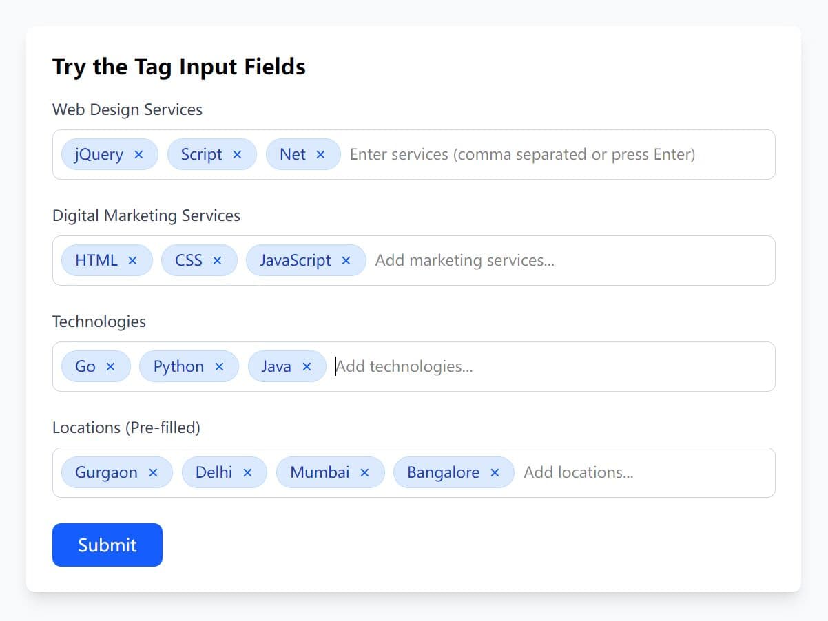
3. Create a container for the tags input
<input type="text" id="input-tags" class="demo-default" value="awesome,neat">
4. Call the function on the input field to initialize the plugin.
$('#input-tags').selectize({
// An array of the initial options available to select; array of objects.
// By default this is populated from the original input element.
// If your element is a <select> with <option>s specified this property gets populated automatically.
// Setting this property is convenient if you have your data as an array and want to automatically generate the <option>s.
options: [],
// Initial selected values.
items: []
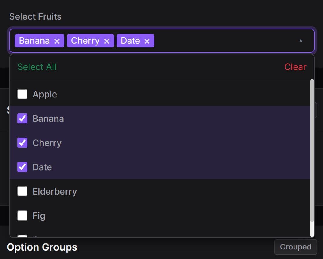
// Option groups that options will be bucketed into.
// If your element is a <select> with <optgroup>s this property gets populated automatically.
// Make sure each object in the array has a property named whatever optgroupValueField is set to.
optgroups: [],
// Custom delimiter character to separate items
delimiter: ',',
// All plugins live in their own folders in "src/plugins".
plugins: [],
// regexp or string for splitting up values from a paste command
splitOn: null,
// If false, items created by the user will not show up as available options once they are unselected.
persist: true,
// Enable or disable international character support.
diacritics: true,
// Allows the user to create new items that aren't in the initial list of options.
// This setting can be any of the following: true, false (disabled), or a function to process input.
// The function can take one of two forms: synchronous (with signature function(input){} or asynchronous (with signature function(input, callback).
// In the synchronous case, the function should return an object for the options (eg, with defaults: return { 'value': value, 'text': text };).
// The asynchronous version should invoke the callback with the result in the same format as the object above (eg, callback( { 'value': value, 'text': text});)
create: false,
// If true, when user exits the field (clicks outside of input), a new option is created and selected (if create setting is enabled).
createOnBlur: false,
// Specifies a RegExp or a string containing a regular expression that the current search filter must match to be allowed to be created.
// May also be a predicate function that takes the filter text and returns whether it is allowed.
createFilter: null,
// Toggles match highlighting within the dropdown menu.
highlight: true,
// Show the dropdown immediately when the control receives focus.
openOnFocus: true,
// The max number of items to render at once in the dropdown list of options.
maxOptions: 1000,
// The max number of items the user can select. Null allows an unlimited number of items
maxItems: 1,
// If true, the items that are currently selected will not be shown in the dropdown list of available options.
hideSelected: false,
// If true, the "Add..." option is the default selection in the dropdown.
addPrecedence: false,
// If true, the tab key will choose the currently selected item.
selectOnTab: false,
// If true, the load function will be called upon control initialization (with an empty search). Alternatively it can be set to 'focus' to call the load function when control receives focus.
preload: false,
// Allows empty options.
allowEmptyOption: false,
// Shows empty option in the dropdown
showEmptyOptionInDropdown: false,
// Label for empty option
emptyOptionLabel: '--',
// Enable setting the first option in the list as active.
setFirstOptionActive: false,
// If true, the dropdown will be closed after a selection is made.
closeAfterSelect: false,
// in ms
closeDropdownThreshold: 250,
// The animation duration (in milliseconds) of the scroll animation triggered when going [up] and [down] in the options dropdown.
scrollDuration: 60,
// The number of milliseconds to wait before requesting options from the server or null.
// If null, throttling is disabled. Useful when loading options dynamically while the user types a search / filter expression.
loadThrottle: 300,
// or 'top'
deselectBehavior: 'previous',
// The class name added to the wrapper element while awaiting the fulfillment of load requests.
loadingClass: 'loading',
// The number of milliseconds to wait before requesting options from the server or null.
// If null, throttling is disabled. Useful when loading options dynamically while the user types a search / filter expression.
loadThrottle: 300,
// The placeholder of the control (displayed when nothing is selected / typed).
// Defaults to input element's placeholder, unless this one is specified.
placeholder: undefined,
// The <option> attribute from which to read JSON data about the option.
dataAttr: 'data-data',
// The name of the property to group items by.
optgroupField: 'optgroup',
// The name of the property to use as the value when an item is selected.
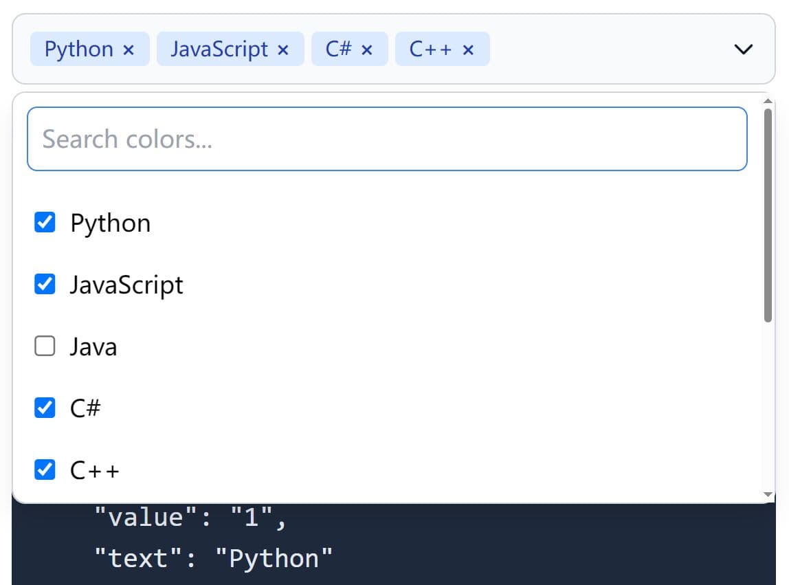
valueField: 'value',
// The name of the property to render as an option / item label (not needed when custom rendering functions are defined).
labelField: 'text',
// The name of the property to disabled option and optgroup.
disabledField: 'disabled',
// The name of the property to render as an option group label (not needed when custom rendering functions are defined).
optgroupLabelField: 'label',
// The name of the option group property that serves as its unique identifier.
optgroupValueField: 'value',
// If truthy, Selectize will make all optgroups be in the same order as they were added (by the `$order` property).
// Otherwise, it will order based on the score of the results in each.
lockOptgroupOrder: false,
// A single field or an array of fields to sort by.
// Each item in the array should be an object containing at least a field property.
// Optionally, direction can be set to 'asc' or 'desc'.
// The order of the array defines the sort precedence.
sortField: '$order',
// An array of property names to analyze when filtering options.
searchField: ['text'],
// When searching for multiple terms (separated by space), this is the operator used. Can be 'and' or 'or' .
searchConjunction: 'and',
// multi or single
mode: null,
// Default classes
wrapperClass: 'selectize-control',
inputClass: 'selectize-input',
dropdownClass: 'selectize-dropdown',
dropdownContentClass: 'selectize-dropdown-content',
// The element the dropdown menu is appended to. This should be 'body' or null. If null, the dropdown will be appended as a child of the Selectize control.
dropdownParent: null,
// Copy the original input classes to the dropdown element.
copyClassesToDropdown: true,
// Custom rendering functions. Each function should accept two arguments: data and escape and return HTML (string or DOM element) with a single root element.
// The escape argument is a function that takes a string and escapes all special HTML characters. This is very important to use to prevent XSS vulnerabilities.
render: {
/*
item: null,
optgroup: null,
optgroup_header: null,
option: null,
option_create: null
*/
}
});
5. Callback functions.
load                 : null, // function(query, callback) { ... }
score                : null, // function(search) { ... }
onInitialize         : null, // function() { ... }
onChange             : null, // function(value) { ... }
onItemAdd            : null, // function(value, $item) { ... }
onItemRemove         : null, // function(value) { ... }
onClear              : null, // function() { ... }
onOptionAdd          : null, // function(value, data) { ... }
onOptionRemove       : null, // function(value) { ... }
onOptionClear        : null, // function() { ... }
onOptionGroupAdd     : null, // function(id, data) { ... }
onOptionGroupRemove  : null, // function(id) { ... }
onOptionGroupClear   : null, // function() { ... }
onDropdownOpen       : null, // function($dropdown) { ... }
onDropdownClose      : null, // function($dropdown) { ... }
onType               : null, // function(str) { ... }
onDelete             : null, // function(values) { ... }
6. API methods.
// initialize the Selectize control
var $select = $('#input-tags').selectize(options);
// fetch the instance
var selectize = $select[0].selectize;
// add options, string or array
selectize.addOption(data);
// update options
selectize.updateOption(value, data)
// remove an option
selectize.removeOption(value);
// clear options
selectize.clearOptions(silent);
// get options
selectize.getOption(value)
// retrieve the jQuery element for the previous or next option, relative to the currently highlighted option
// the direction argument should be 1 for "next" or -1 for "previous"
selectize.getAdjacentOption(value, direction);
// refresh options
selectize.refreshOptions(triggerDropdown);
// clear all selected items
selectize.clear(silent);
// get item
selectize.getItem(value);
// add an item
selectize.addItem(value, silent);
// remove an item
selectize.removeItem(value, silent);
// create a new item
selectize.createItem(value, [triggerDropdown], [callback]);
// refresh items
selectize.refreshItems();
// add a new optgroup
selectize.addOptionGroup(id, data);
// remove a optgroup
selectize.removeOptionGroup(id);
// clear all optgroups
selectize.clearOptionGroups();
// open the autocomplete dropdown
selectize.open();
// close the autocomplete dropdown
selectize.close();
// re-position the autocomplete dropdown
selectize.positionDropdown();
// destroy the instnace
selectize.destroy();
// load options
selectize.load(fn)
// focus on the control
selectize.focus();
// move the focus out of the control
selectize.blur();
// lock/unlock the control
selectize.lock();
selectize.unlock();
// disable/enable user input
selectize.disable();
selectize.enable();
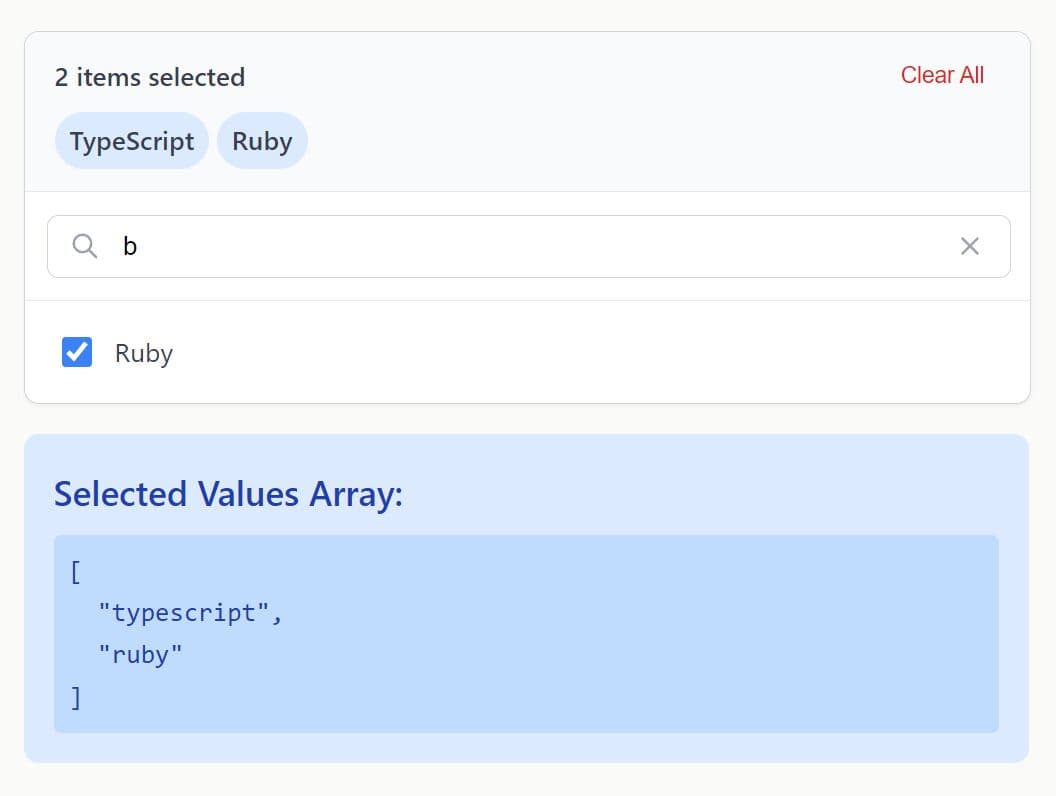
// get the value of the control
selectize.getValue();
// set the selected items
selectize.setValue(value, silent);
// set the selected item
selectize.setActiveItem($item, e);
// reset the number of max items to the given value
selectize.setMaxItems(value);
// move the caret to the specified position
selectize.setCaret(index);
// check if is reaching the limit
selectize.isFull();
// clear cache
selectize.clearCache(template);
// update place holder
selectize.updatePlaceholder();
// add an event listener
selectize.on(event, handler);
// remove an event listener
selectize.off(event, handler);
// remove all event listeners
selectize.off(event);
// trigger event listeners
selectize.trigger(event, ...);
7. Events.
selectize.on('initialize', function(){
  // do something
});

selectize.on('focus', function(){
  // do something
});

selectize.on('blur', function(){
  // do something
});

selectize.on('clear', function(){
  // do something
});

selectize.on('option_clear', function(){
  // do something
});

selectize.on('optgroup_clear', function(){
  // do something
});

selectize.on('destroy', function(){
  // do something
});

selectize.on('change', function(value){
  // do something
});

selectize.on('item_add', function(value, $item){
  // do something
});

selectize.on('item_remove', function(value, $item){
  // do something
});

selectize.on('option_add', function(value, data){
  // do something
});

selectize.on('option_remove', function(value){
  // do something
});

selectize.on('optgroup_add', function(id, data){
  // do something
});

selectize.on('optgroup_remove', function(id){
  // do something
});

selectize.on('dropdown_open', function($dropdown){
  // do something
});

selectize.on('dropdown_close', function($dropdown){
  // do something
});

selectize.on('type', function(str){
  // do something
});

selectize.on('load', function(data){
  // do something
});
More examples:
- Basic Example
- Examples of how to interact with the control programmatically
- Contact Lists Example
- Customizing Appearance Example
- Dynamic Example
- Example of integrating third-party data, loaded asynchronously.
- Performs Example
Changelog:
v0.15.2 (2023-01-07)
- Removed source maps from minified assets per discussion
- Update libs
- minor tweaks
- Updating Autofill_Disable plugin to fix regression.
v0.15.1 (2022-11-18)
- New feature: dynamically add option groups
v0.15.0 (2022-11-15)
- refreshItems(): add "silent" option
- Selectize classes has been lost / Watch mode
- A more performant updateOriginalInput
- Open drop-down on mouse-click if openOnFocus is false and when clicking on the options
- Ensure plugins load in a predictable order
- Adding sifter's respect-word-boundary option. initial default is true
- several and enhancements
- bugfixes
v0.14.0 (2022-10-03)
- Added a throttle on mousedown preveting the dropdown from reopening after click to close.
- Avoid referencing _events property of potentially deleted this object.
- Allow filter option for sifter.
- Feature clear button.
- Feature : add 'size' option for custom dropdown height.
- Fixed bugs.
- Updated packages.
v0.13.7 (2022-09-23)
- Fixed missing style for dropdown_header plugin
- Fixed Scroll left when clicking on a selectized item and page is scrolled right
- Added option to enable setting the first option in the list as active.
v0.13.6 (2022-07-10)
- Use navigator.userAgentData for platform detection when available
- Use correct semver syntax for JQuery peerDependency
- Fix bootstrap3 select-width-item-border incompatible value
- Fix typo
- Using application/xhtml+xml results in 'invalid or illegal string
v0.13.4 (2022-02-06)
- Fix missing px unit on $select-width-item-border.
v0.13.3 (2022-01-28)
- update deps. add bootstrap 5 support
- bugfix
v0.13.3 (2021-06-05)
- update dependencies
v0.13.2 (2020-12-01)
- added warning when getSelection cannot find input control
- added event 'item_before_remove' just before item is removed
v0.13.0 (2020-12-01)
- add setMaxItems API
v0.13.0 (2020-11-19)
- updating sass implementation. compressing css files on build
v0.13.0 (2020-11-04)
- Support for Bootstrap v4.x
- Adding SASS styles, LESS styles still available for bootstrap 2.x
- Fixed bug for placeholder text clipping
- Fixed bug for remove button plugin closing bootstrap modals
- Adding silent option to clearOptions function
v0.12.6 (2018-07-13)
- Update
v0.12.5 (2018-06-28)
- Allow the dropdown to reopen on click if it is closed without losing focus by closeAfterSelect: true
- Fixed bug making clearOptions function. Now it doesn't remove already selected options.
- New feature: allow to disable single options or complete optgroups
v0.12.4 (2016-12-07)
- added a new feature which allows to disable single options or complete optgroups
v0.12.4 (2016-10-13)
- JS update
v0.12.3 (2016-08-25)
- Make label[for] work after applying Selectize
- Output friendly error message when Microplguin is missing.
- Add local server command grunt server.
- Stop creating items automatically when text is pasted, only create them when pasted text contains delimiter.
- Fix regression 'Required fields can not be focusable' in Chrome
- Fix detection of Validity API, we had false negatives before.
- Fix open keyboard bug under iOS after closing selection
- Fix highlighting more than one character
v0.12.2 (2016-06-24)
- Fix issue preventing build ("Cannot assign to read only property 'subarray'") because of bug in uglifyjs.
- Fix tabbing issue on IE11.
- Fix jQuery initialization for jQuery >= 1.9
- Make remove_button work for single-option usage
- Fixed bug that made allowEmptyOption: true useless
- Functions in option render can now return a DOM node in addition to text
2016-01-03
- Released 0.12.1.
- Functions in option render can now return a DOM node in addition to text.
2015-01-30
- update+bugfix
v0.11.2 (2014-09-25)
- update.
v0.11.0 (2014-08-02)
- update.
v0.10.1 (2014-06-03)
- update.
v0.9.1 (2014-05-01)
- update.
v0.9.0 (2014-03-21)
- update.
v0.8.5 (2013-11-25)
- Fixed build script.
v0.8.4 (2013-11-15)
- Added "createOnBlur" option.
v0.8.3 (2013-11-13)
- Fix for initially-selected item not reappearing in dropdown after another option is selected (cache).
v0.8.2 (2013-11-03)
- Fix for "change" event being fired when value doesn't change
- Retain focus on ESC + close when already-selected option clicked ("single" mode)
v0.8.1 (2013-10-17)
- Fixed the destroy() method so that it restores original options, optgroups, and tabindex that existed originally before running Selectize
v0.8.0 (2013-10-13)
- Added right-to-left (RTL) environment support.
- Added multi-property sorting (with configurable direction per field).
- Added "required" attribute handling. Thanks to @sjhewitt.
- Added support for the same option in multiple optgroups.
- Improved width handling of inner textbox when leading/trailing whitespace is present. Thanks to @jacquelinewheeler.
- Clicking the control when focused now toggles the dropdown when in single mode.
- Highlight selected item in dropdown on focus.
- Added "searchConjunction" setting to allow multiple search terms to be joined by an "and" or "or" operator.
- Added "addPrecedence" setting to allow the "Add..." item to be selected by default when in create mode.
- Fixed bug causing "remove_button" and "drag_drop" plugins to still be usable when control is locked/disabled.
- Disabled native browser autocomplete on control.
v0.7.7 (2013-09-17)
- Fixed addOptionGroup method
v0.7.5 (2013-09-09)
- fixed typo
v0.7.3 (2013-08-31)
- Added jQuery to deps.
v0.7.2 (2013-08-28)
- Fix for .form-control style conflicts
- Only fire "change" DOM event once.
v0.7.0 (2013-08-25)
- Simplified addOption() to no longer require "value" to be explicitly declared.
v0.6.14 (2013-08-06)
- bugs fix
This awesome jQuery plugin is developed by selectize. For more Advanced Usages, please check the demo page or visit the official website.