jQuery Plugin For Multiple Select With Checkboxes - multi-select.js
| File Size: | 103 KB |
|---|---|
| Views Total: | 157926 |
| Last Update: | |
| Publish Date: | |
| Official Website: | Go to website |
| License: | MIT |
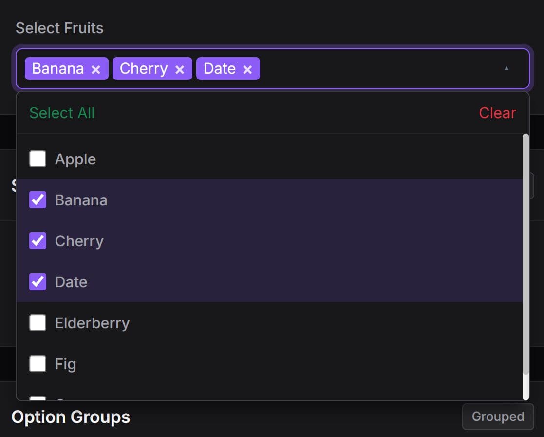
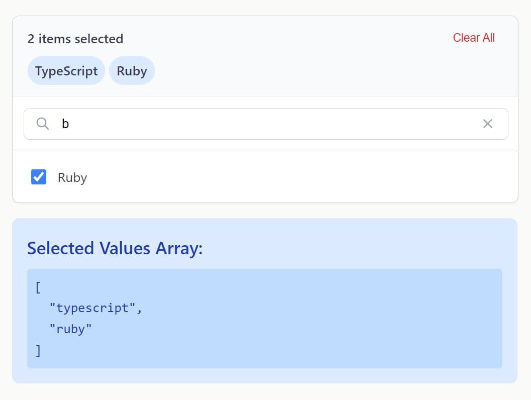
Just another jQuery plugin that converts the regular multiselect box into an easy to use dropdown list with checkboxes to simplify the selection of multiple options.
More Features:
- Supports optgroup and categories.
- Custom styles.
- Allows to select options from a modal.
For Bootstrap projects, compare this with a jQuery multiselect plugin for Bootstrap.
How to use it:
1. Add the jQuery multi-select.js script to the webpage, after you've loaded the latest version of jQuery library.
<script src="/path/to/cdn/jquery.slim.min.js"></script>
<script src="/path/to/src/jquery.multi-select.js"></script>
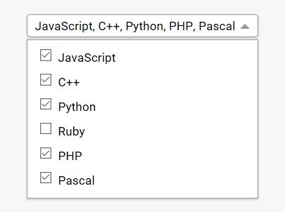
2. Let's say you have a multi-select list like this:
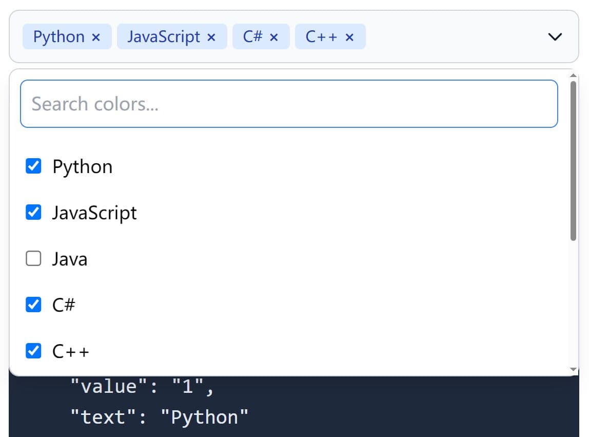
<select id="languages" name="languages" multiple>
  <option value="JavaScript">JavaScript</option>
  <option value="C++">C++</option>
  <option value="Python">Python</option>
  <option value="Ruby">Ruby</option>
  <option value="PHO">PHP</option>
  <option value="Pascal">Pascal</option>
</select>
3. Call the function .multiSelect() on the select element and we're done.
$('#languages').multiSelect();
4. Style the plugin in the CSS as follows:
.multi-select-container {
  display: inline-block;
  position: relative;
}

.multi-select-menu {
  position: absolute;
  left: 0;
  top: 0.8em;
  float: left;
  min-width: 100%;
  background: #fff;
  margin: 1em 0;
  padding: 0.4em 0;
  border: 1px solid #aaa;
  box-shadow: 0 1px 3px rgba(0, 0, 0, 0.2);
  display: none;
}

.multi-select-menu input {
  margin-right: 0.3em;
  vertical-align: 0.1em;
}

.multi-select-button {
  display: inline-block;
  font-size: 0.875em;
  padding: 0.2em 0.6em;
  max-width: 20em;
  white-space: nowrap;
  overflow: hidden;
  text-overflow: ellipsis;
  vertical-align: -0.5em;
  background-color: #fff;
  border: 1px solid #aaa;
  border-radius: 4px;
  box-shadow: 0 1px 3px rgba(0, 0, 0, 0.2);
  cursor: default;
}

.multi-select-button:after {
  content: "";
  display: inline-block;
  width: 0;
  height: 0;
  border-style: solid;
  border-width: 0.4em 0.4em 0 0.4em;
  border-color: #999 transparent transparent transparent;
  margin-left: 0.4em;
  vertical-align: 0.1em;
}

.multi-select-container--open .multi-select-menu { display: block; }

.multi-select-container--open .multi-select-button:after {
  border-width: 0 0.4em 0.4em 0.4em;
  border-color: transparent transparent #999 transparent;
}
5. Possible plugin options with default values.
$('#languages').multiSelect({

  // Custom templates
  'containerHTML': '<div class="multi-select-container">',
  'menuHTML': '<div class="multi-select-menu">',
  'buttonHTML': '<span class="multi-select-button">',
  'menuItemsHTML': '<div class="multi-select-menuitems">',
  'menuItemHTML': '<label class="multi-select-menuitem">',
  'presetsHTML': '<div class="multi-select-presets">',

  // sets some HTML (eg: <div class="multi-select-modal">) to enable the modal overlay.
  'modalHTML': undefined,

  // Active CSS class
  'activeClass': 'multi-select-container--open',

  // Text to show when no option is selected
  'noneText': '-- Select --',

  // Text to show when all options are selected
  'allText': undefined,

  // an array of preset option groups
  // presets: [{
  //   name: 'All categories',
  //   all: true // select all
  // },{
  //   name: 'My categories',
  //   options: ['a', 'c']
  // }]
  'presets': undefined,

  // CSS class added to the container, when the menu is about to extend beyond the right edge of the positionMenuWithin element
  'positionedMenuClass': 'multi-select-container--positioned',

  // If you provide a jQuery object here, the plugin will add a class (see positionedMenuClass option) to the container when the right edge of the dropdown menu is about to extend outside the specified element, giving you the opportunity to use CSS to prevent the menu extending, for example, by allowing the option labels to wrap onto multiple lines.
  'positionMenuWithin': undefined,

  // The plugin will attempt to keep this distance, in pixels, clear between the bottom of the menu and the bottom of the viewport, by setting a fixed height style if the menu would otherwise approach this distance from the bottom edge of the viewport.
  'viewportBottomGutter': 20,

  // minimal height
  'menuMinHeight': 200

});
Changelog:
2024-01-23
- Changed markup when using optgroup element
2022-02-04
- Close menu on focus leaving it.
2022-01-22
- Close menu on focus leaving it.
2021-05-22
- Changed deprecated selectors.
2021-03-24
- Add parameter to create a preset that selects all.
2020-01-30
- Add optgroup support.
2019-07-05
- Add up/down arrow support.
2019-06-13
- Option to enable a modal background element
2017-11-28
- Prevent long dropdowns from extending beyond viewport
2017-11-18
- Only one active menu at a time per page
2016-10-25
- Allow selection of preset groups of options
- Prevent updateButtonContents being called twice
2016-10-14
- Better alignment for checkboxes in menu.
- Add namespace to all listeners.
2016-10-05
- Ignore whitespace when constructing button label
This awesome jQuery plugin is developed by mysociety. For more Advanced Usages, please check the demo page or visit the official website.