Easy Responsive Multi-Select Plugin For jQuery - MagicSuggest
| File Size: | 41.6 KB |
|---|---|
| Views Total: | 16777 |
| Last Update: | |
| Publish Date: | |
| Official Website: | Go to website |
| License: | MIT |
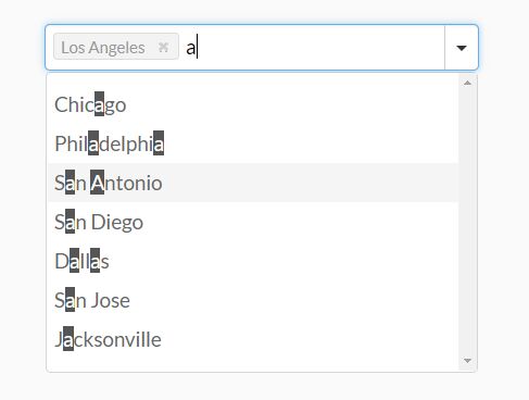
MagicSuggest is an easy-to-use jQuery plugin to create a combo list that enables you to select multiple items (for example tags, tokens, email addresses, etc) from a dropdown list with typeahead & autocomplete support.
More Features:
- Responsive design.
- Compatible with Bootstrap 5/4/3 frameworks.
- Dynamic data loading via AJAX.
- Custom query parameter.
- Data sorting and filtering.
- Complex Templating.
- Tons of configuration options.
Basic usage:
1. Load the jQuery MagicSuggest plugin's CSS and Bootstrap's stylesheet in the head section of the web page.
<link rel="stylesheet" href="/path/to/cdn/bootstrap.min.css" />
<link href="magicsuggest.css" rel="stylesheet" />
2. Create an empty container in which you want to generate the combo list.
<div id="example" class="form-control"></div>
3. Load both jQuery JavaScript library and the jQuery MagicSuggest plugin's JavaScript at the end of the document.
<script src="/path/to/cdn/jquery.min.js"></script>
<script src="magicsuggest.js"></script>
4. Prepare your JSON data used to populate the combo box. 3 options are available here:
- No Data Source (default): When left null, the combo box will not suggest anything. It can still enable the user to enter multiple entries if allowFreeEntries is * set to true (default).
- Static Source: You can pass an array of JSON objects, an array of strings or even a single CSV string as the data source. For ex. data: [* {id:0,name:"Paris"}, {id: 1, name: "New York"}]. You can also pass any json object with the results property containing the json array.
- URL: You can pass the url from which the component will fetch its JSON data.Data will be fetched using a POST ajax request that will * include the entered text as 'query' parameter.
- Function: You can pass a function which returns an array of JSON objects (ex: [{id:...,name:...},{...}]). The function can return the JSON data or it can use the first argument as function to handle the data. Only one (callback function or return value) is needed for the function to succeed.
var myData = ['New York','Los Angeles','Chicago', ...]
5. Initialize the jQuery MagicSuggest plugin and populate the combo list with your own data.
$(function() {
  var instance = $('#example').magicSuggest({
    data: myData
  });
});
6. Customize the template using the render function.
$(function() {
  var instance = $('#example').magicSuggest({
    data: myData,
    renderer: function(data){
      return '<div style="padding: 5px; overflow:hidden;">' +
          '<div style="float: left;"><img src="' + data.picture + '" /></div>' +
          '<div style="float: left; margin-left: 5px">' +
              '<div style="font-weight: bold; color: #333; font-size: 10px; line-height: 11px">' + data.name + '</div>' +
              '<div style="color: #999; font-size: 9px">' + data.email + '</div>' +
          '</div>' +
      '</div><div style="clear:both;"></div>'; // make sure we have closed our dom stuff
    }
  });
});
7. All default configuration options, functions and callbacks.
/**
 * Restricts or allows the user to validate typed entries.
 * Defaults to true.
 */
allowFreeEntries: true,

/**
 * Restricts or allows the user to add the same entry more than once
 * Defaults to false.
 */
allowDuplicates: false,

/**
 * Additional config object passed to each $.ajax call
 */
ajaxConfig: {},

/**
 * If ajaxJSONMode is true, form data must be send in JSON format
 */
ajaxJSONMode: false,

/**
 * If a single suggestion comes out, it is preselected.
 */
autoSelect: true,

/**
 * Auto select the first matching item with multiple items shown
 */
selectFirst: false,

/**
 * Allow customization of query parameter
 */
queryParam: 'query',

/**
 * A function triggered just before the ajax request is sent, similar to jQuery
 */
beforeSend: function () {
},

/**
 * A custom CSS class to apply to the field's underlying element.
 */
cls: '',

/**
 * JSON Data source used to populate the combo box. 3 options are available here:
 * No Data Source (default)
 *    When left null, the combo box will not suggest anything. It can still enable the user to enter
 *    multiple entries if allowFreeEntries is * set to true (default).
 * Static Source
 *    You can pass an array of JSON objects, an array of strings or even a single CSV string as the
 *    data source.For ex. data: [* {id:0,name:"Paris"}, {id: 1, name: "New York"}]
 *    You can also pass any json object with the results property containing the json array.
 * Url
 *     You can pass the url from which the component will fetch its JSON data.Data will be fetched
 *     using a POST ajax request that will * include the entered text as 'query' parameter. The results
 *     fetched from the server can be:
 *     - an array of JSON objects (ex: [{id:...,name:...},{...}])
 *     - a string containing an array of JSON objects ready to be parsed (ex: "[{id:...,name:...},{...}]")
 *     - a JSON object whose data will be contained in the results property
 *      (ex: {results: [{id:...,name:...},{...}]
 * Function
 *     You can pass a function which returns an array of JSON objects  (ex: [{id:...,name:...},{...}])
 *     The function can return the JSON data or it can use the first argument as function to handle the data.
 *     Only one (callback function or return value) is needed for the function to succeed.
 *     See the following example:
 *     function (response) { var myjson = [{name: 'test', id: 1}]; response(myjson); return myjson; }
 */
data: null,

/**
 * Additional parameters to the ajax call
 */
dataUrlParams: {},

/**
 * Start the component in a disabled state.
 */
disabled: false,

/**
 * Name of JSON object property that defines the disabled behaviour
 */
disabledField: null,

/**
 * Name of JSON object property displayed in the combo list
 */
displayField: 'name',

/**
 * Name of JSON object property used as tooltip of items selected
 */
tooltipField: 'title',

/**
 * Set to false if you only want mouse interaction. In that case the combo will
 * automatically expand on focus.
 */
editable: true,

/**
 * Set starting state for combo.
 */
expanded: false,

/**
 * Automatically expands combo on focus.
 */
expandOnFocus: false,

/**
 * JSON property by which the list should be grouped
 */
groupBy: null,

/**
 * Set to true to hide the trigger on the right
 */
hideTrigger: false,

/**
 * Set to true to highlight search input within displayed suggestions
 */
highlight: true,

/**
 * A custom ID for this component
 */
id: null,

/**
 * A class that is added to the info message appearing on the top-right part of the component
 */
infoMsgCls: '',

/**
 * Additional parameters passed out to the INPUT tag. Enables usage of AngularJS's custom tags for ex.
 */
inputCfg: {},

/**
 * The class that is applied to show that the field is invalid
 */
invalidCls: 'ms-inv',

/**
 * Set to true to filter data results according to case. Useless if the data is fetched remotely
 */
matchCase: false,

/**
 * Once expanded, the combo's height will take as much room as the # of available results.
 *    In case there are too many results displayed, this will fix the drop down height.
 */
maxDropHeight: 290,

/**
 * Defines how long the user free entry can be. Set to null for no limit.
 */
maxEntryLength: null,

/**
 * A function that defines the helper text when the max entry length has been surpassed.
 */
maxEntryRenderer: function (v) {
    return 'Please reduce your entry by ' + v + ' character' + (v > 1 ? 's' : '');
},

/**
 * The maximum number of results displayed in the combo drop down at once.
 */
maxSuggestions: null,

/**
 * The maximum number of items the user can select if multiple selection is allowed.
 *    Set to null to remove the limit.
 */
maxSelection: 10,

/**
 * A function that defines the helper text when the max selection amount has been reached. The function has a single
 *    parameter which is the number of selected elements.
 */
maxSelectionRenderer: function (v) {
    return 'You cannot choose more than ' + v + ' item' + (v > 1 ? 's' : '');
},

/**
 * The method used by the ajax request.
 */
method: 'POST',

/**
 * The minimum number of characters the user must type before the combo expands and offers suggestions.
 */
minChars: 0,

/**
 * A function that defines the helper text when not enough letters are set. The function has a single
 *    parameter which is the difference between the required amount of letters and the current one.
 */
minCharsRenderer: function (v) {
    return 'Please type ' + v + ' more character' + (v > 1 ? 's' : '');
},

/**
 * Whether sorting / filtering should be done remotely or locally.
 * Use either 'local' or 'remote'
 */
mode: 'local',

/**
 * The name used as a form element.
 */
name: 'MagicSuggest',

/**
 * The text displayed when there are no suggestions.
 */
noSuggestionText: 'No suggestions',

/**
 * The default placeholder text when nothing has been entered
 */
placeholder: 'Type or click here',

/**
 * A function used to define how the items will be presented in the combo
 */
renderer: null,

/**
 * Whether or not this field should be required
 */
required: false,

/**
 * Set to true to render selection as a delimited string
 */
resultAsString: false,

/**
 * Text delimiter to use in a delimited string.
 */
resultAsStringDelimiter: ',',

/**
 * Name of JSON object property that represents the list of suggested objects
 */
resultsField: 'results',

/**
 * A custom CSS class to add to a selected item
 */
selectionCls: '',

/**
 * An optional element replacement in which the selection is rendered
 */
selectionContainer: null,

/**
 * Where the selected items will be displayed. Only 'right', 'bottom' and 'inner' are valid values
 */
selectionPosition: 'inner',

/**
 * A function used to define how the items will be presented in the tag list
 */
selectionRenderer: null,

/**
 * Set to true to stack the selectioned items when positioned on the bottom
 *    Requires the selectionPosition to be set to 'bottom'
 */
selectionStacked: false,

/**
 * Direction used for sorting. Only 'asc' and 'desc' are valid values
 */
sortDir: 'asc',

/**
 * name of JSON object property for local result sorting.
 *    Leave null if you do not wish the results to be ordered or if they are already ordered remotely.
 */
sortOrder: null,

/**
 * If set to true, suggestions will have to start by user input (and not simply contain it as a substring)
 */
strictSuggest: false,

/**
 * Custom style added to the component container.
 */
style: '',

/**
 * If set to true, the combo will expand / collapse when clicked upon
 */
toggleOnClick: false,

/**
 * Amount (in ms) between keyboard registers.
 */
typeDelay: 400,

/**
 * If set to true, tab won't blur the component but will be registered as the ENTER key
 */
useTabKey: false,

/**
 * If set to true, using comma will validate the user's choice
 */
useCommaKey: true,

/**
 * Determines whether or not the results will be displayed with a zebra table style
 */
useZebraStyle: false,

/**
 * initial value for the field
 */
value: null,

/**
 * name of JSON object property that represents its underlying value
 */
valueField: 'id',

/**
 * regular expression to validate the values against
 */
vregex: null,

/**
 * type to validate against
 */
vtype: null
8. API methods.
var instance = $('#example').magicSuggest({
    // options here
  });


// adds items to the selection
instance.addToSelection([object] objs, [boolean] silent)

// clears the selection
instance.clear([boolean] silent)

// collapses the combo list
instance.collapse([boolean] silent)

// disables the combo list
instance.disable()

// removes what the user was typing
instance.empty()

// enables the compolist
instance.enable()

// expands the component
instance.expand()

// returns the combo suggestions
instance.getData()

// returns the status of the component
instance.isDisabled()

// checks if the selection is valid
instance.isValid()

// returns the list of extra URL paramaters set for AJAX requests
instance.getDataUrlParams()

// returns the name used for HTML form submission
instance.getName()

// returns an array of selected JSON objects
instance.getSelection()

// returns the current text being entered by the user
instance.getRawValue()

// returns an array containing only the selected JSON values
instance.getValue()

// removes items from the selection
instance.removeFromSelection([object] objs, [boolean] silent)

// sets the objects listed in the combo
instance.setData([array] cbItems)

// sets the name to be used for form submission
instance.setName([string] name)

// sets the selection with a given array of objects
instance.setSelection(object[])

// sets the selection according to given values
instance.setValue([array] ids)

// sets extra parameters for AJAX requests
instance.setDataUrlParams([object] params)
9. Events.
var instance = $('#example').magicSuggest({
    // options here
  });

instance.on( "beforeload", function(e, this) {
  // fired before the AJAX request is performed
});

instance.on( "blur", function(e, this) {
  // fired when the component looses focus
});

instance.on( "collapse", function(e, this) {
  // fired when the combo is collapsed
});

instance.on( "expand", function(e, this) {
  // fired when the combo is expanded
});

instance.on( "focus", function(e, this) {
  // fired when the combo gains focus
});

instance.on( "keydown", function(e, this, keyevent) {
  // fired when the user presses a key
});

instance.on( "keyup", function(e, this, keyevent) {
  // fired when the user releases a key
});

instance.on( "load", function(e, this, records[]) {
  // fired when the AJAX request has been performed
});

instance.on( "selectionchange", function(e, this, records[]) {
  // fired when the user has changed the selection
});

instance.on( "triggerclick", function(e, this) {
  // fired when the user has changed the selection
});
Changelog:
v2.1.7 (2024-03-31)
- Code clean up
- Stop errors
- Don't clear the when keyup event is fired for SHIFT
- Fix for pasting into input/ undefined error fix
- Added support for tooltips in selected items
- Adding config field: ajaxJSONMode to allow JSON request to remote server
- fix input placeholder bug
- The input becomes invisible when the row is filled
- Master refactor
- minified version
- updates deprecated jQuery methods such as trim(), $.isArray, and Proxy()
v2.1.6 (2022-04-01)
- Don't clear the when keyup event is fired for SHIFT
- Fixed: Disabled arbitrary HTML and SCRIPT execution on input.
- Handle case where attr('class') is undefined
v2.1.5 (2020-10-31)
- prepend close button instead of appending it.
- updated magicsuggest-min.js with current master code
- dynamically update max selection size
2020-10-30
- Minified version updated
2020-10-15
- Added a function that enables the ability to dynamically update the maximum selection size. It handle the new size being smaller that the selection by truncating the list down to the new size.
2020-10-08
- Prepend close button instead of appending it
This awesome jQuery plugin is developed by Magicsuggest. For more Advanced Usages, please check the demo page or visit the official website.