jQuery Multiple Select Plugin For Bootstrap - Bootstrap Multiselect
| File Size: | 3.38 MB |
|---|---|
| Views Total: | 720283 |
| Last Update: | |
| Publish Date: | |
| Official Website: | Go to website |
| License: | MIT |
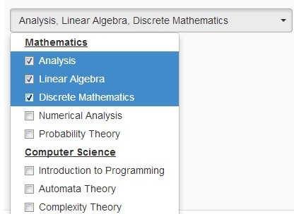
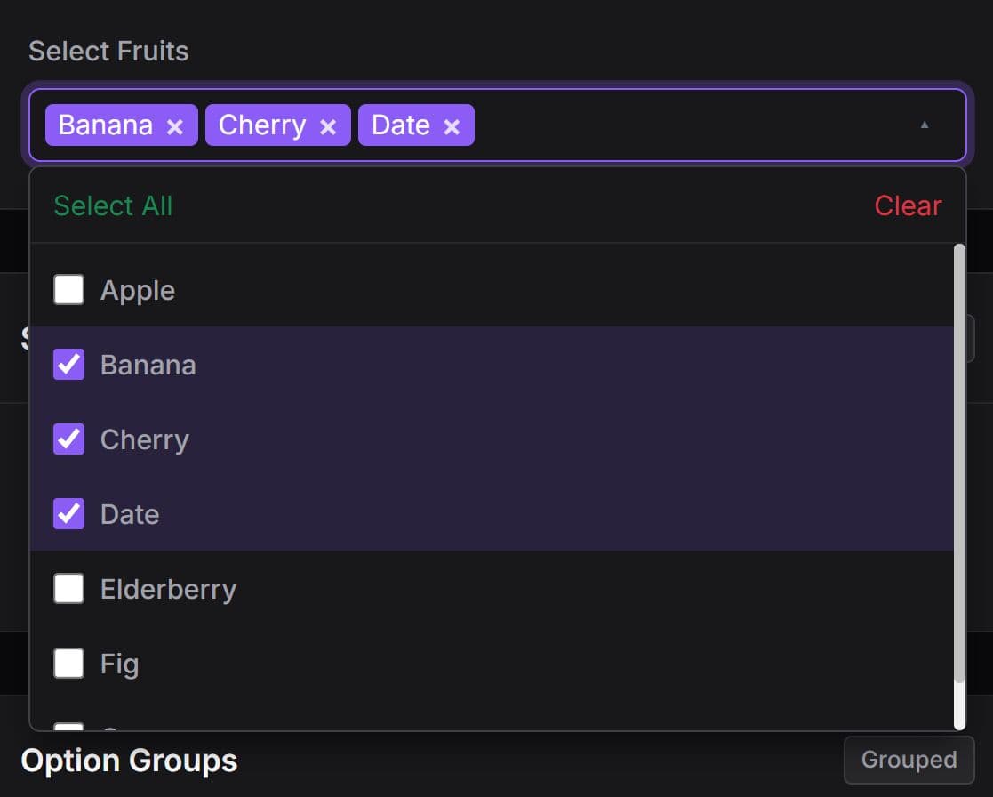
Bootstrap Multiselect is a jQuery and Bootstrap plugin that converts native <select> elements into checkbox dropdowns for single or multiple selection.
The plugin keeps the original select element in the form and adds filtering, Select All controls, optgroups, callbacks, and programmatic methods.
Features:
- Single-select and multiple-select dropdowns based on native select elements.
- Checkbox-style options inside a Bootstrap dropdown.
- Text and value filtering for long option lists.
- Select All, Deselect All, and reset controls.
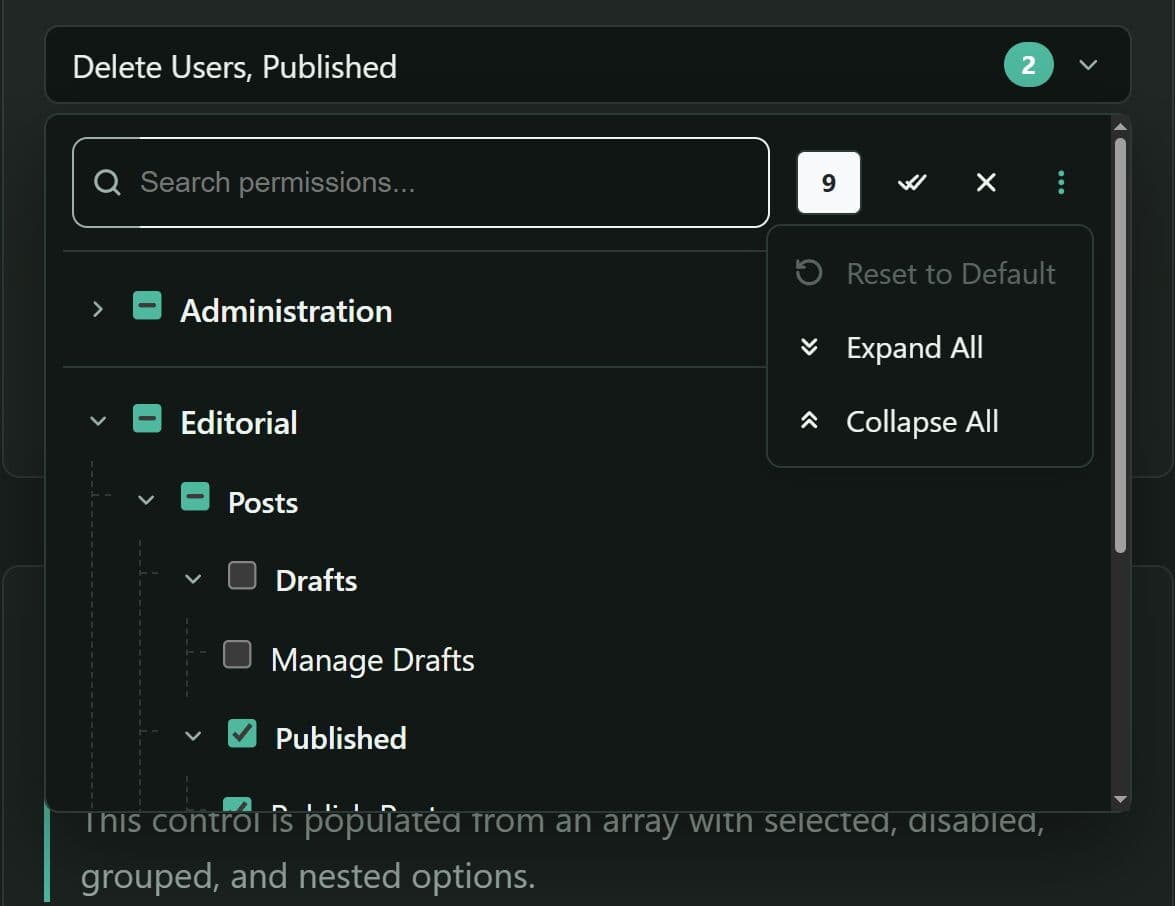
- Clickable and collapsible optgroups.
- Custom button labels, option labels, CSS classes, and generated templates.
- Callbacks for selection, filtering, initialization, and dropdown state changes.
- Methods for selection updates, rebuilding, dynamic data, and instance cleanup.
Use Cases:
- Product and content filters that accept several categories, brands, regions, or status values.
- Administration forms with searchable permission, department, or user-role lists.
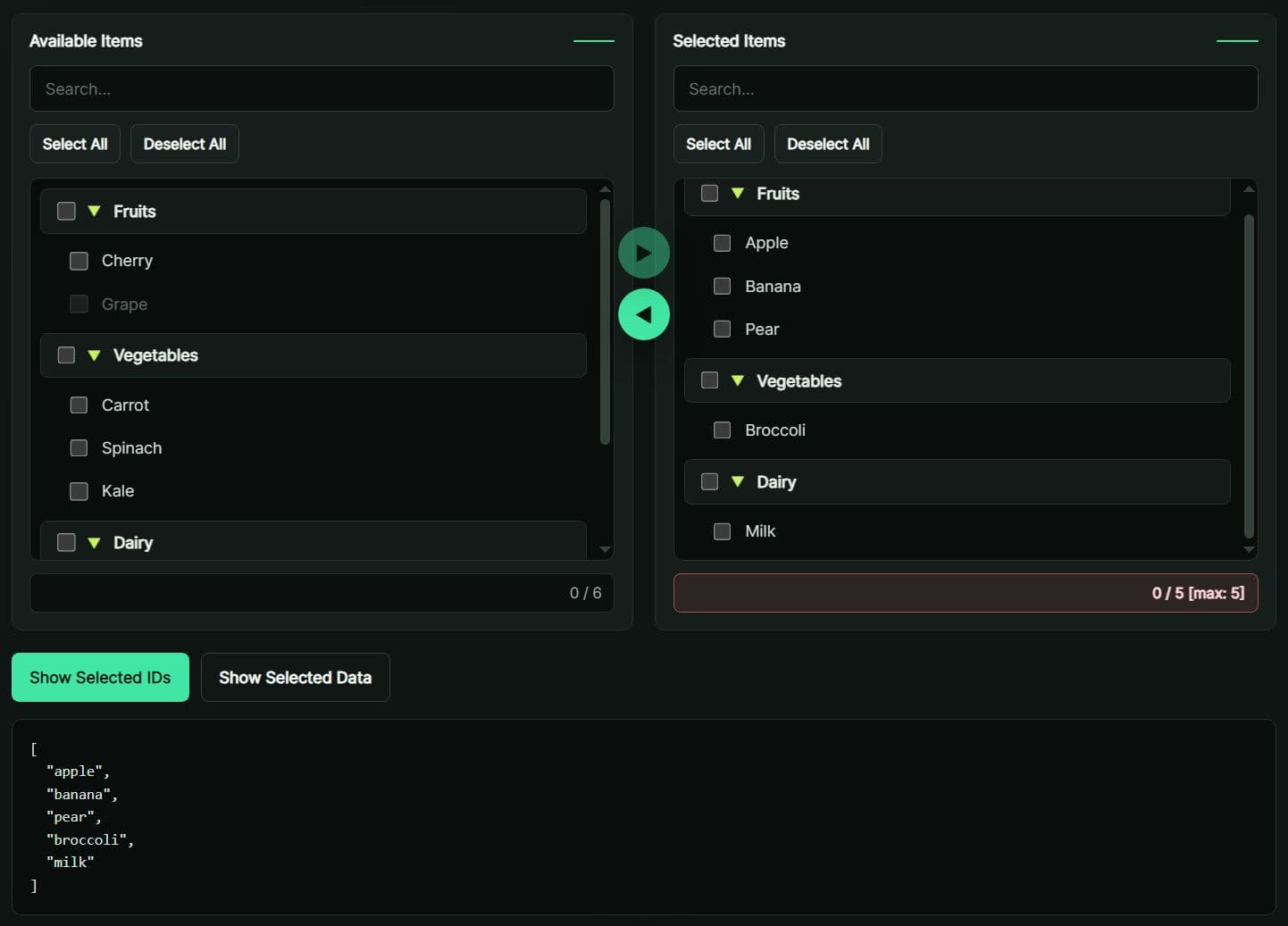
- Grouped selectors that organize countries, product families, or teams inside collapsible optgroups.
- Dynamic forms that replace or update select options after an AJAX request.
How To Use It:
Choose The Correct Version
| Project Stack | Bootstrap Multiselect Release |
|---|---|
| Bootstrap 5 | 2.0.0 |
| Bootstrap 4 | 1.1.2 |
| Bootstrap 3 | 0.9.16 |
Load The Required Files
<!-- Bootstrap CSS -->
<link rel="stylesheet"
      href="https://cdn.jsdelivr.net/npm/[email protected]/dist/css/bootstrap.min.css">

<!-- Bootstrap Multiselect CSS -->
<link rel="stylesheet"
      href="https://cdn.jsdelivr.net/npm/[email protected]/dist/css/bootstrap-multiselect.css">

<!-- jQuery must load before Bootstrap Multiselect -->
<script src="https://cdn.jsdelivr.net/npm/[email protected]/dist/jquery.min.js"></script>

<!-- Bootstrap bundle includes Popper -->
<script src="https://cdn.jsdelivr.net/npm/[email protected]/dist/js/bootstrap.bundle.min.js"></script>

<!-- Bootstrap Multiselect -->
<script src="https://cdn.jsdelivr.net/npm/[email protected]/dist/js/bootstrap-multiselect.js"></script>
Add A Multiple Select Element
<label for="technology-filter" class="form-label">Technologies</label>
<select id="technology-filter" name="technologies[]" multiple>
  <option value="javascript">JavaScript</option>
  <option value="typescript">TypeScript</option>
  <option value="jquery">jQuery</option>
  <option value="bootstrap">Bootstrap</option>
  <option value="react">React</option>
</select>
Initialize the Plugin.
The generated dropdown updates the original <select multiple> element. Standard form submission and jQuery form serialization continue to read the selected option values.
$(function () {
  $('#technology-filter').multiselect({
    buttonWidth: '100%',
    nonSelectedText: 'Choose technologies'
  });
});
Configuration Options:
Button And Dropdown Options
enableHTML: Accepts HTML inside generated labels. Type: Boolean. Default:false.buttonClass: Adds a CSS class to the generated button. Type: String. Default:custom-select.inheritClass: Copies classes from the original select to the button. Type: Boolean. Default:false.buttonWidth: Sets the button width. Type: String. Default:auto.buttonContainer: Defines the wrapper around the button and dropdown. Type: String. Default:<div class="btn-group" />.dropRight: Aligns the dropdown to the right side. Type: Boolean. Default:false.dropUp: Opens the dropdown above the button. Type: Boolean. Default:false.selectedClass: Sets the class for selected dropdown options. Type: String. Default:active.maxHeight: Adds a vertical scrollbar after the dropdown reaches the specified height. Type: Number or null. Default:null.widthSynchronizationMode: Synchronizes button and popup widths. Values arenever,always,ifPopupIsSmaller, andifPopupIsWider. Type: String. Default:never.buttonTextAlignment: Aligns the button label to the left, center, or right. Type: String. Default:center.
Selection Text And Empty-State Options
nonSelectedText: Sets the label when no options are selected. Type: String. Default:None selected.nSelectedText: Sets the suffix used after the selected count. Type: String. Default:selected.allSelectedText: Sets the label when every option is selected. Type: String. Default:All selected.numberDisplayed: Sets how many selected labels appear before the button switches to a count. Type: Number. Default:3.delimiterText: Separates selected labels in the button title. Type: String. Default:,.disableIfEmpty: Disables the control when the original select contains no options. Type: Boolean. Default:false.disabledText: Sets the button label for a disabled control. Type: String. Default: Empty string.
Select All Options
includeSelectAllOption: Adds a Select All row. Type: Boolean. Default:false.includeSelectAllIfMoreThan: Shows Select All only after the list exceeds the specified option count. Type: Number. Default:0.selectAllText: Sets the Select All label. Type: String. Default:Select all.selectAllValue: Sets the value assigned to the generated Select All item. Type: String. Default:multiselect-all.selectAllName: Sets the name assigned to the Select All checkbox. Type: Boolean or String. Default:false.selectAllNumber: Adds the selected option count to the All Selected label. Type: Boolean. Default:true.selectAllJustVisible: Limits Select All to options visible after filtering. Type: Boolean. Default:true.
Filtering Options
enableFiltering: Adds a search field to the dropdown. Type: Boolean. Default:false.enableCaseInsensitiveFiltering: Ignores letter case during filtering. Type: Boolean. Default:false.enableFullValueFiltering: Matches against the complete option value. Type: Boolean. Default:false.filterPlaceholder: Sets the search input placeholder. Type: String. Default:Search.filterBehavior: Searches optiontext,value, orboth. Type: String. Default:text.includeFilterClearBtn: Adds a clear control to the filter input. Type: Boolean. Default:true.preventInputChangeEvent: Prevents input change events generated by plugin interactions. Type: Boolean. Default:false.
Optgroup Options
enableClickableOptGroups: Lets a group label select or deselect its options. Type: Boolean. Default:false.enableCollapsibleOptGroups: Lets users expand and collapse option groups. Type: Boolean. Default:false.collapseOptGroupsByDefault: Starts collapsible groups in the closed state. Type: Boolean. Default:false.indentGroupOptions: Indents options that belong to an optgroup. Type: Boolean. Default:true.
Reset Options
includeResetOption: Adds a reset item inside the dropdown. Type: Boolean. Default:false.includeResetDivider: Adds a divider before the reset item. Type: Boolean. Default:false.resetText: Sets the reset item label. Type: String. Default:Reset.enableResetButton: Adds a reset button to the generated button group. Type: Boolean. Default:false.resetButtonText: Sets the button-group reset label. Type: String. Default:Reset.
Generated Templates
templates.button: Defines the Bootstrap dropdown button markup.templates.popupContainer: Defines the dropdown menu container.templates.filter: Defines the search field markup.templates.buttonGroup: Defines the wrapper for generated action buttons.templates.buttonGroupReset: Defines the reset button in the action-button group.templates.option: Defines each selectable option button.templates.divider: Defines separators inside the dropdown.templates.optionGroup: Defines optgroup headers.templates.resetButton: Defines the reset item inside the dropdown.
Callbacks And Rendering Functions:
Rendering Functions
buttonText(selectedOptions, select): Returns the visible button label.buttonTitle(options, select): Returns the button title attribute.checkboxName(option): Returns the generated checkbox name orfalse.optionLabel(element): Returns the visible label for an option.optionClass(element): Returns additional classes for an option.
Lifecycle And Selection Callbacks
onChange(option, checked): Runs after a user changes an option.onDropdownShow(event): Runs when the Bootstrap dropdown starts to open.onDropdownShown(event): Runs after the dropdown has opened.onDropdownHide(event): Runs when the dropdown starts to close.onDropdownHidden(event): Runs after the dropdown has closed.onSelectAll(selectedOptions): Runs after Select All selects options.onDeselectAll(deselectedOptions): Runs after Deselect All clears options.onInitialized($select, $container): Runs after the plugin creates the dropdown.onFiltering($filter): Runs when the filter value changes.
$('#technology-filter').multiselect({
  onChange: function (option, checked) {
    console.log(option.val(), checked);
  },
  onSelectAll: function (selectedOptions) {
    console.log(selectedOptions.length + ' options selected');
  },
  onFiltering: function ($filter) {
    console.log('Filter:', $filter.val());
  }
});
API Methods:
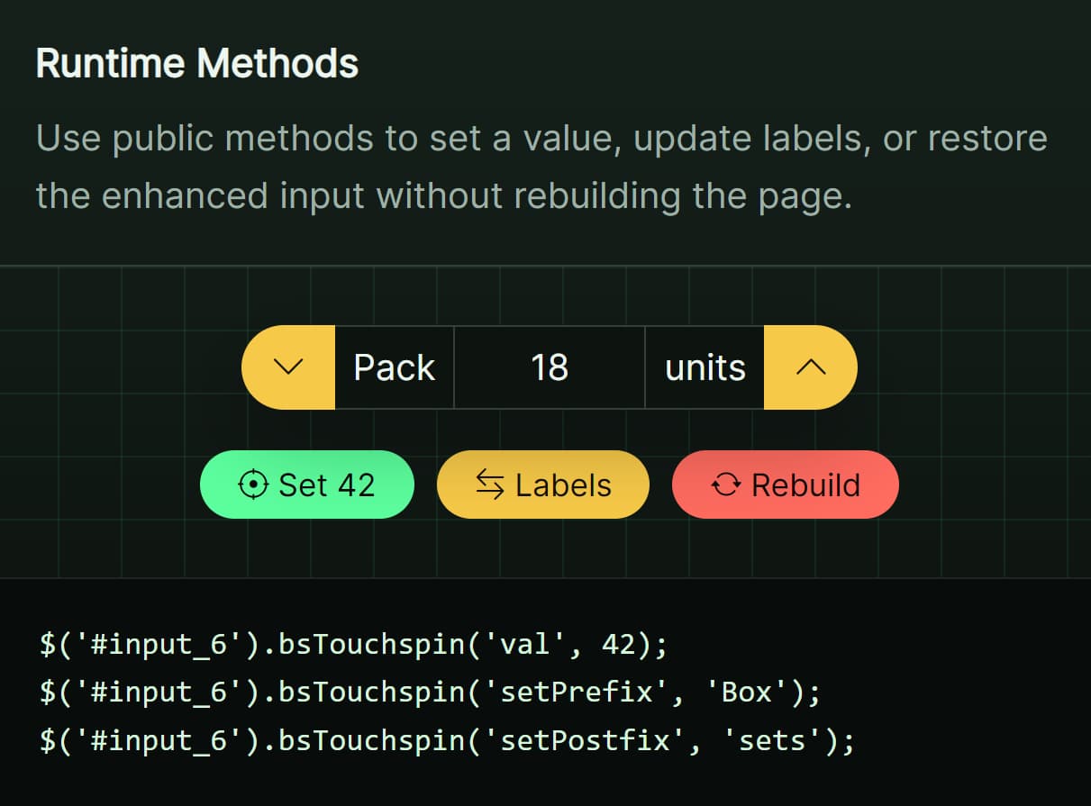
destroy(): Removes the generated dropdown and restores the original select.refresh(): Synchronizes checkbox and button state after selected values change on the original select.rebuild(): Recreates the dropdown after options, optgroups, or plugin settings change.select(values, triggerOnChange): Selects one value or an array of values.deselect(values, triggerOnChange): Deselects one value or an array of values.clearSelection(): Clears all selected values and updates the dropdown state.selectAll(justVisible, triggerOnSelectAll): Selects every option or only visible filtered options.deselectAll(justVisible, triggerOnDeselectAll): Deselects every option or only visible filtered options.updateButtonText(): Recalculates the button label and title.setOptions(options): Replaces the current configuration. Callrebuild()after structural changes.disable(): Disables the original select and generated button.enable(): Enables the original select and generated button.dataprovider(data): Replaces select options with JavaScript option and optgroup data.setAllSelectedText(text): Changes the All Selected label at runtime.
Refresh Selected Values
Use refresh when the original options remain in place and only their selected or disabled state changes.
$('#technology-filter').val(['javascript', 'jquery']);
$('#technology-filter').multiselect('refresh');
Rebuild After Changing Options
$('#technology-filter')
  .append('<option value="vue">Vue</option>')
  .multiselect('rebuild');
Use rebuild after adding or removing options, changing optgroups, or replacing structural settings.
Advanced Examples:
Searchable Checkbox Dropdown With Select All
$('#technology-filter').multiselect({
  buttonWidth: '100%',
  maxHeight: 320,
  enableFiltering: true,
  enableCaseInsensitiveFiltering: true,
  includeFilterClearBtn: true,
  includeSelectAllOption: true,
  selectAllJustVisible: true,
  filterPlaceholder: 'Filter technologies'
});
Clickable And Collapsible Optgroups
<select id="framework-filter" multiple>
  <optgroup label="JavaScript Frameworks">
    <option value="react">React</option>
    <option value="vue">Vue</option>
    <option value="angular">Angular</option>
  </optgroup>
  <optgroup label="CSS Frameworks">
    <option value="bootstrap">Bootstrap</option>
    <option value="tailwind">Tailwind CSS</option>
  </optgroup>
</select>
$('#framework-filter').multiselect({
  enableClickableOptGroups: true,
  enableCollapsibleOptGroups: true,
  collapseOptGroupsByDefault: true,
  includeSelectAllOption: true
});
Replace Options With JavaScript Data
<select id="department-filter" multiple></select>
var departmentData = [
  {
    label: 'Engineering',
    children: [
      { label: 'Frontend', value: 'frontend', selected: true },
      { label: 'Backend', value: 'backend' }
    ]
  },
  {
    label: 'Operations',
    children: [
      { label: 'Support', value: 'support' },
      { label: 'Finance', value: 'finance' }
    ]
  }
];

$('#department-filter').multiselect();
$('#department-filter').multiselect('dataprovider', departmentData);
Alternatives And Related Resources:
- Bootstrap Select: Searchable Select Picker for Bootstrap 5
- User-friendly Multi Select Plugin For Bootstrap 5/4
- jQuery Plugin For Multiple Select With Checkboxes - multi-select.js
- Multi-select Dropdown Component For JavaScript - slim-select
- Modern Tags Input Component for Next.js - shadcn-multi-select
- 10 Best Multiple Select Plugins In JavaScript
FAQs:
Q: Does Bootstrap Multiselect 2.0.0 require jQuery?
A: Yes. Version 2.0.0 targets Bootstrap 5.3.x but still requires jQuery 2.2.4 or later.
Q: Why does the dropdown fail after upgrading to Bootstrap 5?
A: Use Bootstrap Multiselect 2.0.0 and load the Bootstrap 5 bundle before the plugin script. Older releases use Bootstrap 3 or Bootstrap 4 dropdown markup and attributes.
Q: Should I call refresh or rebuild after changing the select?
A: Call refresh after changing selected or disabled states. Call rebuild after adding, removing, or regrouping options, or after changing structural settings.
Q: How do I select options from JavaScript?
A: Call multiselect('select', value) for one value or pass an array for several values. Use deselect, selectAll, deselectAll, or clearSelection for the related operations.
Q: Can the plugin load options from an AJAX response?
A: Convert the response into the option or optgroup structure accepted by dataprovider, then pass the array to multiselect('dataprovider', data).
Changelog:
- v2.0.0: Added the Bootstrap 5 release line.
- v1.1.2: Latest release for Bootstrap 4 projects.
- v0.9.15: Stable release for Bootstrap 3 projects.
This awesome jQuery plugin is developed by davidstutz. For more Advanced Usages, please check the demo page or visit the official website.