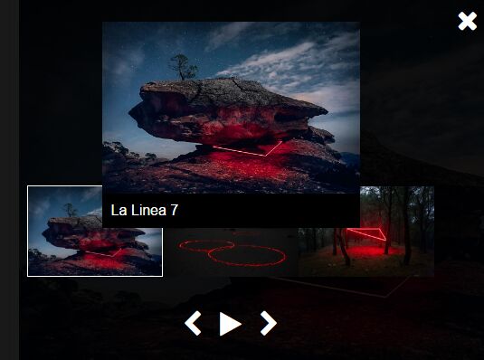
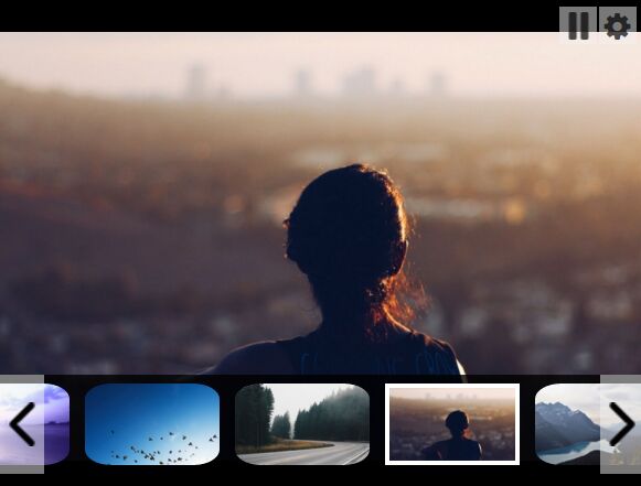
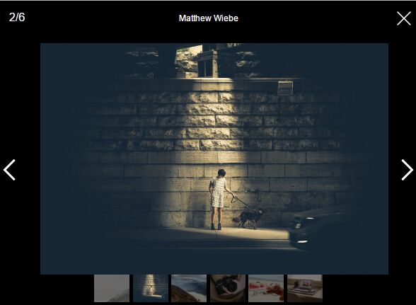
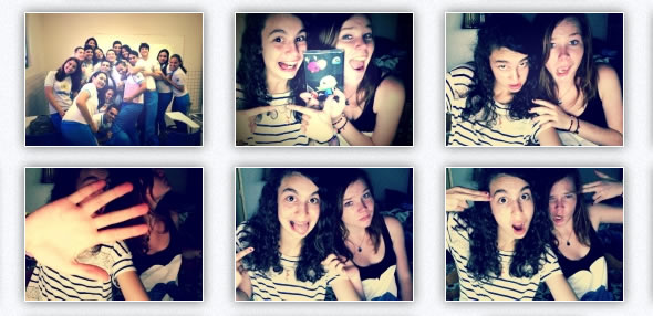
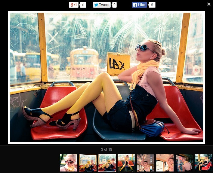
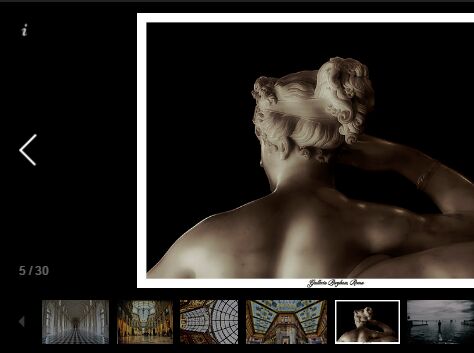
Simple Animated Gallery Plugin For jQuery
| File Size: | 6.21 MB |
|---|---|
| Views Total: | 3338 |
| Last Update: | |
| Publish Date: | |
| Official Website: | Go to website |
| License: | MIT |
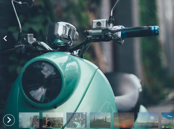
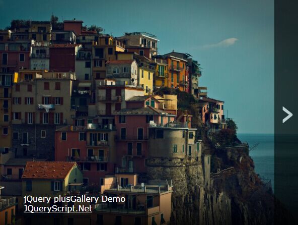
A simple to use jQuery image slideshow/gallery/carousel plugin that features thumbnails navigation, auto play, CSS3 powered transition effects, fullscreen mode, and more.
How to use it:
1. Include the Font Awesome Icon Font for essential gallery icons.
<link href="//netdna.bootstrapcdn.com/font-awesome/4.2.0/css/font-awesome.min.css" rel="stylesheet">
2. Prepare your images/thumbnails and place them under the images/presentation folder.
3. Create a container for the gallery.
<div data-pn="1"></div>
4. The required CSS styles for the gallery.
.pn-container {
  background-color: #1a1a1a;
  position: relative;
  overflow: hidden;
}
.pn-container:-webkit-full-screen {
 width: 100% !important;
 height: 100% !important;
}
.pn-container:-moz-full-screen {
 width: 100% !important;
 height: 100% !important;
}
.pn-container:-webkit-full-screen .pn-temp, .pn-container:-webkit-full-screen .pn-current {
 background-size: contain;
}
 .pn-container:-moz-full-screen .pn-temp, .pn-container:-moz-full-screen .pn-current {
 background-size: contain;
}

.pn-container .pn-fullscreen {
  color: white;
  position: absolute;
  z-index: 5;
  right: 10px;
  top: 9px;
  cursor: pointer;
  opacity: 0;
  -webkit-transition: opacity .3s;
  -moz-transition: opacity .3s;
  transition: opacity .3s;
}

.pn-container .pn-fullscreen:hover { opacity: 1 !important; }

.pn-container .pn-current,
.pn-container .pn-temp {
  background-position: center;
  background-repeat: no-repeat;
  background-size: cover;
  height: 100%;
  left: 0;
  position: absolute;
  top: 0;
  width: 100%;
  z-index: 1;
}

.pn-container .pn-temp { z-index: 2; }

.pn-container .pn-prev,
.pn-container .pn-next {
  left: 0;
  height: 100%;
  position: absolute;
  top: 0;
  width: 50%;
  z-index: 3;
  cursor: pointer;
}

.pn-container .pn-next {
  left: auto;
  right: 0;
}

.pn-container .pn-bar {
  bottom: 0;
  left: 0;
  position: absolute;
  right: 0;
  z-index: 5;
  opacity: 0;
  -wekkit-transition: opacity .3s;
  -moz-transition: opacity .3s;
  transition: opacity .3s;
}

.pn-container:hover .pn-bar { opacity: 1; }

.pn-container:hover .pn-fullscreen { opacity: .5; }

.pn-container.sleep:hover .pn-bar { opacity: 0; }

.pn-container.sleep:hover .pn-fullscreen { opacity: 0; }

.pn-container.sleep,
.pn-container.sleep > * { cursor: none; }

.pn-container .pn-ribbon {
  float: right;
  margin-right: 10px;
  overflow: hidden;
  width: 816px;
}

.pn-container .pn-train {
  display: block;
  left: 0;
  list-style: none;
  margin: 0 -6px;
  overflow: auto;
  padding: 0;
  position: relative;
  top: 0;
}

.pn-container .pn-train > li {
  background-color: white;
  background-position: center;
  background-repeat: no-repeat;
  background-size: 100%;
  cursor: pointer;
  display: block;
  float: left;
  height: 60px;
  margin: 6px;
  width: 80px;
  opacity: .6;
  -wekkit-transition: opacity .3s;
  -moz-transition: opacity .3s;
  transition: opacity .3s;
}

.pn-container .pn-train > li:hover,
.pn-container .pn-train > li.active { opacity: 1; }

.pn-container .pn-play {
  cursor: pointer;
  left: 14px;
  position: absolute;
  top: 14px;
  color: white;
  border: 2px solid;
  -webkit-border-radius: 50%;
  -moz-border-radius: 50%;
  border-radius: 50%;
  width: 44px;
  height: 44px;
  line-height: 39px;
  padding: 0px 0 0 15px;
  -webkit-transition: all .3s;
  -moz-transition: all .3s;
  transition: all .3s;
}

.pn-container .pn-play:hover:after {
  left: -1px;
  top: -1px;
  height: 42px;
  width: 42px;
}

.pn-container .pn-play:after {
  content: ' ';
  position: absolute;
  background: rgb(255,255,255);
  background: rgba(255,255,255,.5);
  -webkit-border-radius: 50%;
  -moz-border-radius: 50%;
  border-radius: 50%;
  width: 0;
  height: 0;
  left: 22px;
  top: 22px;
  -webkit-transition: all .15s;
  -moz-transition: all .15s;
  transition: all .15s;
}

.pn-container .pn-play.active { transform: rotate(180deg); }

.pn-container .pn-play > i {
  font-style: normal;
  -webkit-transition: all .3s;
  -moz-transition: all .3s;
  transition: all .3s;
  overflow: hidden;
  position: absolute;
  display: block;
}

.pn-container .pn-play > i.fa-angle-left {
  width: 0px;
  visibility: hidden;
  opacity: 0;
  margin-left: 3px;
}

.pn-container .pn-play.active > i.fa-angle-left {
  width: 15px;
  visibility: visible;
  opacity: 1;
}

.pn-container .pn-play.active > i.fa-angle-right { margin-left: -7px; }

.pn-container .pn-carret {
  background: rgba(255,255,255,.1);
  border: 2px solid #6495ED;
  cursor: pointer;
  height: 60px;
  margin-left: 6px;
  position: absolute;
  width: 80px;
  top: 6px;
  z-index: 1;
}

.pn-container .pn-prev i,
.pn-container .pn-next i {
  color: white;
  position: absolute;
  width: 42px;
  height: 42px;
  font-size: 37px;
  left: 0;
  top: 50%;
  text-align: center;
  margin-top: -21px;
  opacity: 0;
  -wekkit-transition: opacity .3s;
  -moz-transition: opacity .3s;
  transition: opacity .3s;
}

.pn-container .pn-next i {
  left: auto;
  right: 0;
}

.pn-container:hover .pn-prev i,
.pn-container:hover .pn-next i { opacity: 1; }

.pn-container.sleep:hover .pn-prev i,
.pn-container.sleep:hover .pn-next i { opacity: 0; }
5. Load the core gallery script after jQuery library and we're done.
<script src="//ajax.googleapis.com/ajax/libs/jquery/1.11.2/jquery.min.js"></script>
<script src="js/presentation.js"></script>
Change log:
2015-06-26
- added responsive styles.
This awesome jQuery plugin is developed by KoJI6ac9H. For more Advanced Usages, please check the demo page or visit the official website.